Making an impactful conference poster is both an art and a science. A well-designed poster can effectively showcase your research and engage your audience. But what should you avoid in a conference poster?
In a conference poster, avoid cluttered layouts, excessive text, small fonts, low-quality images, and complex jargon. Focus on clear, concise content, visually appealing design, and easy-to-read text that efficiently communicates your research findings.
This approach ensures your research findings are communicated efficiently and attractively. Stay tuned for more insights in the rest of our article, where we delve deeper into creating a winning conference poster.
Core Purpose of Conference Poster
A conference poster serves as a key communication tool, bridging the gap between complex research findings and a diverse audience. It’s designed to visually summarize a study or project, highlighting the main points in an easily digestible format. By using engaging graphics and concise language, it attracts viewers and encourages scholarly discussion.
The layout of a poster is crafted to guide the viewer through the research narrative in a logical, straightforward manner. This includes the introduction of the topic, methodology, results, and conclusions, all presented in an accessible and visually appealing way. The goal is to make the content approachable not just to experts in the field, but to anyone with an interest in the subject matter.
In essence, a conference poster is a storytelling medium, transforming academic research into a narrative that captivates and educates. It’s an opportunity for researchers to network, share ideas, and gain feedback in a collaborative environment. Ultimately, a well-designed poster can spark new ideas, foster connections, and drive forward the pursuit of knowledge.
Significance of a Well-Prepared Conference Poster
Conference posters are a crucial aspect of academic and professional gatherings, offering a visual summary of research or projects. They provide an engaging way to communicate complex ideas shortly. Posters can make or break the impact of your presentation in these settings.
- A well-prepared poster grabs attention quickly, making your research stand out in a crowded conference hall. It draws viewers in, sparking interest in your work.
- They facilitate networking, serving as a conversation starter with peers, mentors, and potential collaborators. This interaction often leads to valuable feedback and new perspectives.
- Posters allow for more interactive and personalized discussions than traditional presentations. Attendees can engage directly with the presenter, leading to in-depth conversations.
- By distilling complex research into an accessible format, they enhance comprehension and retention among the audience. This clarity is crucial for effective communication.
- Good posters can be a visual and academic representation of your professional brand. They reflect your dedication to clarity, design, and research integrity.
- They also offer the chance for wider recognition, as a compelling poster can be remembered long after the conference ends. This can open doors for future opportunities.
A well-prepared conference poster is not just a summary of your work; it’s a gateway to opportunities and professional growth. It’s a tool that transcends the confines of a conference hall, leaving a lasting impression on its viewers.
What Should You Avoid in a Conference Poster?
Creating a conference poster is an art that requires careful consideration to effectively communicate your research. The goal is to engage and inform, not overwhelm or confuse. Here, we explore key elements to avoid ensuring your poster makes a positive impact.
Cluttered Layouts
A cluttered layout can make your poster difficult to follow and understand. It’s essential to maintain a clean and organized design. Avoid overloading your poster with too much information or graphics. Stick to a simple layout that guides the viewer naturally through your content.
Excessive Text
Posters overloaded with text can deter viewers from engaging with your work. Keep the text concise and to the point. Use bullet points or short paragraphs to break up information. Remember, a poster should highlight key points, not present an entire research paper.
Small Fonts
Small fonts are challenging to read, especially from a distance. Choose an easily readable font size. The title should be visible from afar, and the main text should be legible from a comfortable viewing distance. Avoid fancy fonts that might reduce readability.
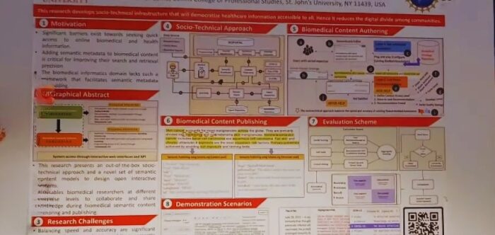
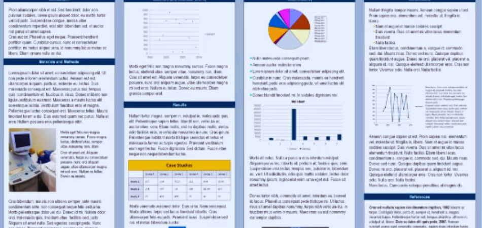
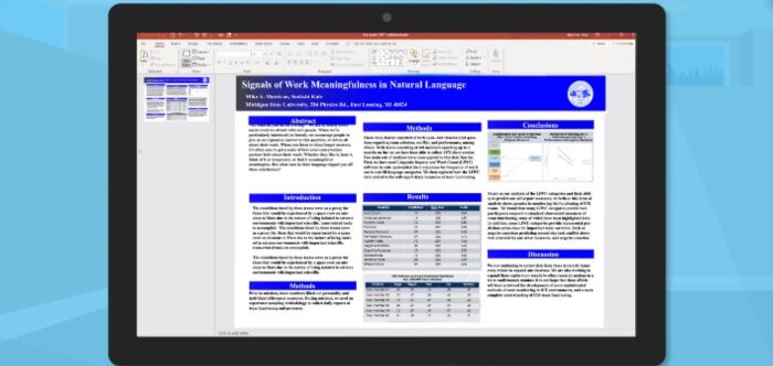
Low-Quality Images
Low-resolution images can make your poster look unprofessional. Use high-quality graphics and images to enhance your message. Ensure images are relevant and add value to your content. Remember, a picture is worth a thousand words, but only if it’s clear and relevant.
Complex Jargon
Overuse of technical jargon can alienate a broader audience. Aim for simplicity and clarity in your language. Use terms that are understandable to non-experts. The goal is to communicate your research, not to showcase your vocabulary.
Lack of Focus
A poster without a clear focus can leave viewers confused about the main message. Identify the core of your research and build your poster around it. Ensure each element of your poster contributes to this central theme. A focused approach makes for a more compelling presentation.
A well-prepared conference poster is a balance of aesthetics, clarity, and content. By avoiding these common pitfalls, your poster can effectively communicate your research and leave a lasting impression on your audience. Remember, the best posters are those that are informative yet engaging, inviting viewers into your research journey.
Types of Design You Can Implement in Your Conference Poster
Designing a conference poster is a creative process that requires a blend of aesthetic appeal and clarity in communication. The design you choose can significantly impact how your message is received. Here, we explore various design types that can make your conference poster stand out.
Minimalist Design
Minimalist designs focus on simplicity and space. Use a clean layout with plenty of white space to avoid clutter. This design highlights the key points of your research without overwhelming the viewer. It’s effective for conveying complex information in an easily digestible format.
Infographic Style
Infographic-style posters are visually engaging and informative. They use graphics and charts to simplify complex data. This style is ideal for presenting statistical information or research findings in a visually compelling way. It makes data accessible and understandable at a glance.
Collage Layout
A collage layout can create a visually dynamic poster. It involves combining various images, text, and color blocks in an organized chaos. This style is suitable for showcasing multiple aspects of research. It’s particularly effective for interdisciplinary studies or projects with diverse elements.
Narrative Flow
Narrative flow designs guide the viewer through a story. Begin with an introduction, followed by the body of research, and conclude with findings. This design mimics the structure of a research paper and is great for detailed studies. It helps the audience follow your research journey step by step.
Interactive Design
Interactive designs encourage viewer participation. Include QR codes linking to additional resources or videos. This approach engages the audience more deeply with your work. It’s an innovative way to provide more information without cluttering the poster.
The design of your conference poster plays a crucial role in how your research is perceived and understood. Whether you choose a minimalist approach, an infographic style, a collage layout, a narrative flow, or an interactive design, the key is to make sure your poster is both visually appealing and informative. A well-thought-out design not only attracts attention but also effectively communicates the essence of your research.
Consideration While Choosing the Right Conference Poster Design
Selecting the right design for your conference poster is crucial for effectively conveying your research. The design should not only be visually appealing but also align with the content and purpose of your presentation. Here are key considerations to guide your choice.
- Audience comprehension is paramount. Choose a design that resonates with your target audience, ensuring it’s accessible and understandable to them.
- The complexity of your research should influence the design. For intricate topics, a clear and structured layout is essential to facilitate understanding.
- Reflect on your poster’s main objective. If it’s data-heavy, consider an infographic style; for storytelling, a narrative flow might work best.
- Your style shouldn’t be overlooked. It’s important to choose a design that reflects your unique approach to research and presentation.
- The venue and setting of the conference can impact visibility. Ensure your design stands out in the specific environment where it will be displayed.
- Consider the time and resources available. Some designs require more effort and skills in graphic design than others.
In essence, the right conference poster design is a balance between aesthetic appeal, clarity of information, and practicality. Your choice should enhance the presentation of your research, making it both engaging and informative.
Essential Tips for Creating an Effective Conference Poster
Designing a conference poster is an art form that combines visual aesthetics with the clear communication of research. An effective poster not only attracts attention but also conveys your message efficiently. Let’s dive into some essential tips for creating a poster that stands out and effectively communicates your research.
Clarity of Content
Your poster should communicate your research clearly and concisely. Prioritize key findings and essential information over exhaustive details. Use bullet points or short, succinct sentences to make your content easily digestible. Remember, the goal is to engage viewers quickly and effectively.
Visual Appeal
A visually appealing poster is more likely to draw attention. Use color schemes that are pleasing to the eye and reflect the tone of your research. Balance text and visuals to create an engaging layout. Ensure that graphics and images are high quality and relevant to your topic.
Readability
Your poster should be readable from a distance. Use large, clear fonts for titles and headings and a readable size for body text. Avoid cluttering with too much text; leave ample white space for ease of reading. Choose fonts that are simple and professional.
Logical Flow
Organize your poster in a way that guides the viewer through your research story. Start with an introduction, followed by methodology, results, and conclusions. Use headings or visual cues to lead the viewer naturally from one section to another. Each section should seamlessly connect to the next.
Simplicity
Keep your design simple and avoid unnecessary embellishments. A simple design helps to highlight your research rather than distract from it. Focus on a few key elements and ensure they contribute to your main message. Overcomplicated designs can confuse and overwhelm the viewer.
Engaging Title
Your title is the first thing viewers will see, so make it count. It should be catchy, yet informative, clearly reflecting the essence of your research. Ensure the title is prominent and easily visible. A good title piques curiosity and invites further exploration.
An effective conference poster balances visual aesthetics with clear, concise content. It should be engaging, informative, and easy to understand. By following these tips, you can create a poster that not only stands out in a crowded conference hall but also effectively communicates the significance and findings of your research.
Conclusion
Crafting a conference poster requires thoughtful consideration to ensure it effectively communicates your research. It’s a delicate balance of design and content, aimed at engaging and informing your audience.
Central to this is knowing “What should you avoid in a conference poster?” Untidy layouts, excessive text, small fonts, low-quality images, and complex jargon are major pitfalls to steer clear of. Instead, opt for clarity, simplicity, and visual appeal to make your poster stand out.
By focusing on these elements, your conference poster can become a powerful tool in academic communication. It’s not just about displaying information, but about creating a lasting impact and sparking meaningful conversations in the scholarly community.

