Making a poster for a medical conference is a great way to share your work and ideas with others in a clear and creative way. It helps people understand your topic without reading long reports or papers. Now you might be interested in how to make a poster for medical conference?
To make a poster for a medical conference, choose one clear topic and keep your message simple. Use large, readable text and clean design. Add helpful images or charts to explain your points better. Keep your title short and your content easy to understand. Only include the most important points, and make sure everything looks neat and organized.
Do you want to know more about making a good medical conference poster? If yes, keep reading this article covers everything you need to know from start to finish.
How to Make a Poster for Medical Conference?
Creating a medical conference poster may sound complicated, but it is actually quite easy. You just need to know what to include and how to present it clearly. A good poster can help people understand your work better. It also helps share your ideas with others in a simple way. Let’s look at how to do it step by step:
Some presenters now use AI tools during early preparation, such as summarizing long abstracts into poster-ready points or simplifying technical language. These tools help speed up planning, but final wording and accuracy should always be reviewed carefully.
Step 1: Pick a Clear Topic
Start by choosing one topic that you want to show on your poster. It should be something simple and easy to explain. For example, if you’re making a poster for the nursing and healthcare management conference in Canada, you could focus on patient care tips or hospital safety ideas. If your topic is too wide, people might get confused. Make sure you know what your main point is. This will help you stay focused while making your poster.
Step 2: Keep the Design Simple
Don’t fill your poster with too much stuff. Use space wisely so that everything looks clean and easy to read. Stick to two or three colors that go well together. Choose fonts that are clear and large enough to read from far away. You can use these apps to help with design:
- Canva – Easy to use and has ready-made poster templates
- Microsoft PowerPoint – Good for custom layouts and simple designs
- Adobe Express – Great for creating clean and stylish posters
- Google Slides – Simple tool that works well for quick designs
Step 3: Add a Short Title
Your title should tell people what your poster is about. Keep it short and use simple words. Avoid using long or hard words that may confuse the reader. A good title can grab attention fast. Make sure it matches the main idea of your poster.
Step 4: Use Pictures and Charts
Images can help explain things better than words. If you have a graph or chart, use it to show your data clearly. Make sure all pictures are clear and not blurry. Add short labels so people understand what each image means. A good mix of words and visuals makes your poster more interesting.
Step 5: Write in Easy Words
Use everyday words that anyone can understand. Try not to use too many medical or scientific words. If you need to use them, explain what they mean in simple language. Keep your sentences short and clear. This helps everyone understand your work better.
Step 6: Share Key Points Only
Don’t try to put everything on the poster. Just show the most important points. You can always explain more if someone asks you. Break your text into small parts or bullet points. This makes it easier for people to read quickly.
Step 7: Make It Neat
Check your spelling and grammar before printing your poster. All text should line up nicely and not look messy. Keep spaces even and margins the same on each side. A neat poster looks more professional and shows you took care. People trust neat work more than messy work.
Step 8: Practice What to Say
Be ready to talk about your poster. You don’t have to memorize everything, just know your main points. Try to explain your topic in simple words. Smile and be friendly when people ask you questions. Being ready helps you feel more confident.
Understanding the “Better Poster” Movement in Medical Conferences
In recent years, many medical conferences have started promoting a newer poster style known as the “Better Poster” movement. This approach focuses on one clear message instead of long blocks of text. The main research finding becomes the center of attention, making it easy for viewers to understand the poster within seconds.
A Better Poster usually places the key takeaway in large, bold text at the center of the layout. Supporting details such as methods, data, and references are arranged in smaller sections around it. This structure helps people quickly decide whether they want to engage further, especially in busy conference halls where time is limited.
This format works well because it matches how posters are actually read. Most attendees scan first, then stop only if the message is clear and relevant. By highlighting the main finding upfront, the Better Poster style improves visibility, encourages conversation, and helps your research stand out without losing its scientific meaning.
Why Are Posters Important at Medical Conferences?
Posters are a big part of medical conferences and play a key role in sharing new ideas. They help people connect and understand different topics in a quick and simple way. Posters can catch attention even from far away. If you’re wondering why they matter, here’s everything you need to know.
Share New Ideas

Posters are a great way to share fresh ideas and research with others. They allow you to present your topic in a simple and clear format. People walking by can stop and learn something new just by reading your poster. You don’t need to give a long speech, your poster does the talking. It makes it easy for more people to learn your message.
Easy to Understand
Most posters use short sentences, simple words, and pictures or charts. This helps people understand the topic without much effort. Even if someone is not an expert, they can still get the main point. That’s why posters work so well at medical conferences. They turn big ideas into easy messages.
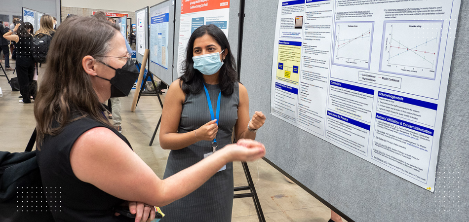
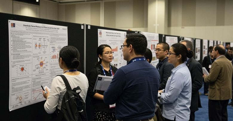
Start Good Talks
A good poster can start a nice conversation between people. Someone might read your poster and come up to you with a question. This can lead to sharing more ideas or even working together later. Posters are not just about showing facts, they help people connect. And that’s a big part of these events.
Save Time and Space
In a medical conference, there are many speakers and sessions. Not everyone has time to sit and listen to every talk. Posters give people a chance to learn while walking around. They can stop for a minute, read, and then move on. It saves time but still shares important information.
Easy to Remember
Posters use bold titles, bullet points, and pictures to help people remember the topic. A well-made poster stays in people’s minds longer. When someone sees a smart design or a strong point, it sticks with them. This makes your message more powerful. People may even take photos to read again later.
Great for First-Time Presenters
Posters are a good choice for people who are new to conferences. They’re easier to make and less scary than giving a long speech. You can talk about your poster in a calm way if someone asks. This helps build your confidence. Plus, it still gets your work noticed.
Helps Show Your Work
Making a poster is a way to show what you’ve worked on and what you’ve learned. It gives you a chance to tell others why your topic is important. Even a small idea can look big on a poster. When people stop and look, it feels good to be seen. That’s one of the best parts.
Modern Tools and Interactive Features Used in Medical Conference Posters
Medical conference posters have changed with how people read and interact at events. In 2025 and 2026, modern tools and interactive elements are shaping how posters are designed and presented.
- AI-Assisted Poster Layout Tools: AI-assisted design tools help presenters improve spacing, alignment, and visual hierarchy automatically, making posters easier to scan quickly while reducing design time and layout mistakes for first-time presenters.
- AI-Generated Diagrams and Visual Aids: Some presenters use AI image tools to create simple diagrams, workflow visuals, or concept illustrations when original images are unavailable, helping explain complex ideas without overcrowding the poster.
- QR Codes for Extended Content: QR codes are now widely used to link posters to full research papers, datasets, short videos, or author profiles, allowing deeper exploration without adding extra text to the poster.
- Short Video or Audio Summaries: Many modern posters include links to brief video or audio explanations, usually under one minute, helping attendees understand the research quickly in busy poster halls.
- Digital-First Poster Design Approach: Posters are increasingly designed for both print and digital viewing, as conferences now display posters on screens or share them online after events, requiring clear contrast and mobile-friendly layouts.
Thoughtful use of these tools helps presenters communicate ideas more clearly, attract attention in crowded spaces, and support meaningful conversations during poster sessions.
Who is the Target Audience for Your Medical Conference Poster?
You should consider who is going to see your medical conference poster when making one. Different people come to learn different things, and your poster should match what they care about. That’s why knowing your audience really matters. Let’s look at who your poster might be for and why that helps.
Doctors and Nurses
Doctors and nurses often attend medical conferences to learn about new treatments or ideas. If your poster is for them, use clear points and include helpful facts. Charts, short notes, and real examples can help a lot. Try to keep the message focused on things they use in their daily work. This makes your poster more useful to them.
Medical Students
Many people still learning about medicine come to conferences to explore new topics. For them, it helps if your poster explains things in a simple and easy way. You can add small definitions for tricky terms. Use pictures or steps to explain how something works. This helps them understand your topic better.
Researchers and Scientists
These people look for new findings and data. If your poster is for them, include strong facts and clear data. Use graphs or charts to show what you found. Keep your layout neat so they can read it fast. They often look at the results and what they mean.
Hospital Staff
Not everyone at a medical conference is a doctor or scientist. Some might work in hospital management or safety. Your poster should talk about real problems and simple solutions they can use. Keep your words simple and your points direct. Add tips or advice they can take back to work.
Conference Judges
Some posters are part of contests or reviews. Judges want to see if your poster is clear, useful, and well-designed. Make sure your main point is easy to find. Don’t add too much extra text. A good layout with clear headings can help your poster stand out.
General Visitors
Sometimes, people who are not from the medical field also visit. They may want to learn something new in a simple way. For this group, skip hard words and focus on clear ideas. Add photos or short stories if you can. It helps them connect with your topic.
People with Health Interests
Some visitors come because they care about health topics. They may not have medical training, but they want to learn. Your poster can help them if it gives easy advice or shares useful tips. Use everyday words and explain things step by step. This makes your poster friendly and helpful.
Mistakes You Might Overlook in Medical Conference Poster Design
Designing a poster for a medical conference sounds simple, but small mistakes can sneak in without you noticing. These little errors can make your poster hard to understand or easy to ignore. Knowing what to watch out for really helps. Here are some mistakes that people often make.
Too Much Text
One of the biggest mistakes in medical poster design is adding too many words. If your poster looks like a long essay, people won’t stop to read it. Keep your sentences short and easy to understand. Break up the text using bullet points or small sections. This makes your poster look clean and friendly.
Hard to Read Fonts
Using fancy or small fonts may seem cool, but they can make your poster hard to read. Always choose simple and bold fonts that are easy on the eyes. Make sure the text is big enough to read from a few steps away. Bad fonts can quickly turn people away. You want your poster to be clear at first glance.
Cluttered Layout
If your poster has too many pictures, charts, or blocks of text packed together, it can feel messy. When designing a poster for a conference, it’s important to keep things spaced out and organized. Give everything enough space to “breathe.” Use boxes or lines to keep sections separate. A tidy layout helps people find what they’re looking for. A crowded poster is hard to follow.
Missing Main Point
Sometimes posters have nice colors and pictures, but the main message is not clear. Your viewer should understand your key idea within a few seconds. Use a strong title and bold headings. Make sure your most important point stands out. Don’t hide your main idea in a corner.
Poor Image Quality
Blurry or pixelated pictures can make your poster look unprofessional. Always use high-quality images and charts. Make sure they are not stretched or cut off. Clear visuals help people understand your topic faster. Good pictures leave a strong impression.
Wrong Color Choices
Colors that are too bright or too dull can make your poster hard to look at. Use colors that go well together and keep the background light. Make sure the text color stands out against the background. Don’t use too many colors, as this can be distracting. Simple colors work best.
No Proofreading
Spelling or grammar mistakes can make your work look rushed or careless. Always check your poster more than once. Ask someone else to look at it as well. Even small errors can lower the quality of your poster. A clean, mistake-free poster shows you put effort into it.
How to Highlight Key Research Findings in Your Medical Conference Poster?
When making a medical conference poster, your research findings are the most important part. These are the results people want to see and understand quickly. But if they’re hidden or unclear, they might get ignored. Let’s explore how to make sure your key points stand out the right way.
Start with a Summary
Write a short summary that tells people what your research is about. Keep it simple and stick to the main idea. This helps readers understand what they’ll learn from your poster. Place the summary near the top where it’s easy to see. A good summary sets the tone for everything else.
Use Bold Headings
Clear and bold headings can guide the reader’s eyes. Break your research into small sections and give each one a title. Use a larger font for headings so they stand out. People should be able to scan your poster and still get the main points. Headings help them know where to look.
Add Visual Elements
Graphs, charts, and pictures are great for showing research findings. They turn numbers or long text into something easy to understand. Make sure your visuals are clean and labeled well. Place them near the related text so people can connect the two. Good visuals make your poster more interesting.
Keep It Short
Don’t write long blocks of text to explain your research. Just include what’s most important. Use short sentences and bullet points if needed. This makes it easier for people to read and remember. Short and clear works best on posters.
Highlight Key Numbers
If your research has important numbers, make them stand out. You can use bold text, colored boxes, or a larger font size. This helps the reader notice the results right away. Numbers are often what people look for first. Don’t hide them in the middle of a long sentence.
Note: Many medical posters now include QR codes to share full papers, datasets, or author contact details. These codes should be placed near the conclusion or results section and sized large enough to scan quickly without pulling attention away from the main message.
Use Color Wisely
Color can help draw attention to your key findings, but don’t overdo it. Use one or two colors to highlight important parts. Make sure the color stands out but still looks good with the rest of your poster. Keep the background simple so your key points pop. Smart color choices can lead the reader’s eyes.
Place Info Smartly
Think about where people’s eyes go first. Usually, they look from the top left and move down. Place your most important research findings in those spots. Don’t hide them at the bottom or off to the side. Good placement makes sure your main points get seen.
What to Bring With You to the Poster Presentation at a Medical Conference?
Bringing the right things to your poster presentation can make everything run smoothly. It helps you stay prepared for questions and small issues that might come up. Here’s a simple table with everything you should have with you at a medical conference poster presentation.
| What to Bring | Why It’s Useful |
| Printed Poster | Your main display for sharing your research. |
| Push Pins or Tape | For attaching your poster to the display board. |
| Extra Copies (Handouts) | To give out details or summaries to interested people. |
| Notepad and Pen | For writing down feedback or questions. |
| Business Cards | To share your contact information with others. |
| USB Drive | Backup of your poster in case you need to reprint. |
| Marker or Highlighter | For marking key points or making last-minute notes. |
| Water Bottle | Stay hydrated during long sessions. |
| Comfortable Shoes | You’ll be standing for a long time. |
| Snacks | Quick energy for busy conference days. |
| Phone Charger | To keep your phone ready for calls or taking photos. |
| Personal ID/Badge | Needed for entering the conference and networking. |
How to Export Your Medical Conference Poster File for Printing?
Once your poster is ready, the last step is saving it the right way so it prints clearly. A small mistake during this step can cause big printing problems. That’s why it’s important to follow a few simple steps. Let’s go over how to get your poster file ready for printing.
Choose the Right File Type
Always save your poster as a PDF. This keeps your fonts, images, and layout just the way you designed them. Avoid using file types like Word or PowerPoint when sending to the print shop. PDFs are easy to open and work well with most printers. It’s the safest choice.

Check the Size
Make sure your file size matches the actual size of the poster you want printed. If your poster is supposed to be 36 by 48 inches, the file must be set to that size before saving. Do not try to stretch a small file later. That will make your poster look blurry. Always design and save at full size.
Set the Right Resolution
Your file needs to be high quality so the print looks sharp. Use a resolution of 300 DPI (dots per inch). This gives you clear text and images. Lower resolution can make everything look fuzzy or pixelated. Always check this setting before saving your file.
Use CMYK Colors
Printers use CMYK colors, not the RGB colors you see on screens. If you save your poster in RGB, the colors may print differently. Before saving, change your file settings to CMYK. This helps make sure the printed colors match what you see on your screen.
Embed Your Fonts
If your fonts are not saved inside the file, they might change on another computer. To stop this from happening, always embed your fonts when exporting the PDF. Most programs let you do this in the save or export settings. It keeps your text looking just right.
Double-Check Everything
Before you send the file to print, check your spelling, images, and layout one more time. Zoom in to see if anything looks off. It’s also a good idea to decide where to print conference posters so you can follow their file rules. Ask someone else to take a quick look as well. A final check can catch small mistakes.
Save a Backup Copy
Always keep an extra copy of your file in a safe place. Use a USB drive, cloud storage, or email it to yourself. That way, if something goes wrong, you don’t have to start over. A backup saves time and stress.
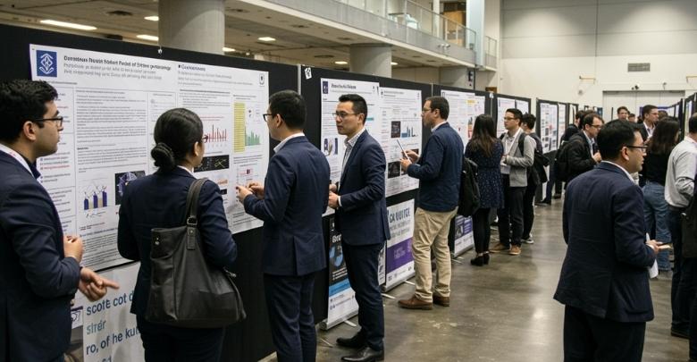
Tips for Networking Around Your Poster Session
Talking to people during your poster session can feel a bit tricky, but it’s also a great chance to connect. You don’t need to be a pro at public speaking to do well. Just a little confidence and some simple steps can go a long way. Check out these helpful tips to make networking easier and more enjoyable.
Be Friendly and Open
Smile and make eye contact when someone walks by your poster. A warm greeting like “Hi, would you like to hear about my topic?” can start a nice talk. Being polite and kind makes people feel comfortable around you. Don’t be shy, most people are happy to chat. A friendly attitude can lead to great conversations.
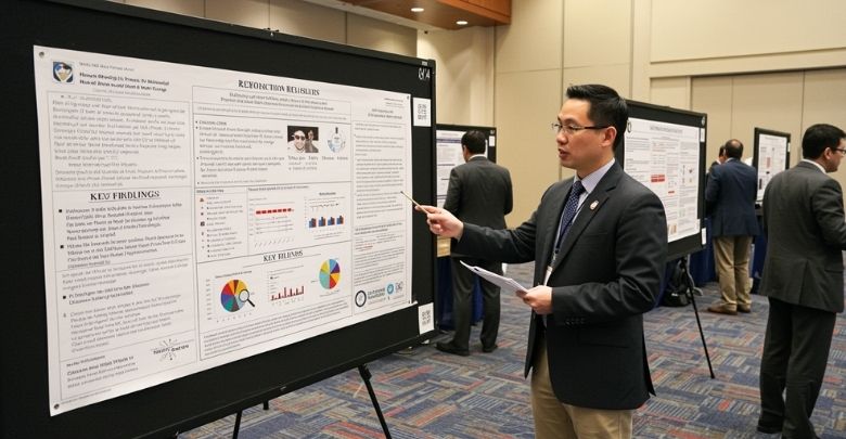
Know Your Poster
Before the session starts, read your poster a few times so you remember your key points. If someone asks a question, you’ll feel ready to answer. You don’t need to remember every word, just understand what each part means. When you’re doing a medical poster presentation, talk about your topic like you’re telling a story. This helps others enjoy and follow along.
Ask Simple Questions
When someone looks at your poster, ask them what they think. A question like “Does this make sense to you?” or “Would you do anything differently?” shows that you care about their opinion. This can start a good conversation. People like to share their ideas as well.
Have Short Answers
Keep your answers short and easy to understand. Long speeches can be hard to follow. Talk about your topic like you’re explaining it to a friend. If they want more details, they’ll ask. This keeps things easy and clear.
Bring Handouts
Small handouts with your poster’s main points can be useful. If someone wants to remember what you talked about, they can take it with them. Add your name and contact info in case they want to reach out later. This is a simple way to stay connected. It also shows that you came prepared.
Listen Carefully
Give someone your full attention when they are speaking to you. Don’t interrupt or look around while they’re speaking. Listening shows respect and helps you learn something new. Sometimes, you’ll get helpful feedback or ideas. Good listening is just as important as good talking.
Practice Beforehand
Try explaining your poster to a friend or family member before the event. This helps you feel more relaxed and ready. You can also fix anything that sounds confusing. A little practice can make a big difference. It helps you feel calm and confident.
Stay Until the End
Even if it gets quiet, don’t leave your poster early. Someone might come by near the end and want to talk. You never know who you’ll meet. Stay present and keep your smile ready. Being there the whole time shows that you care.
Frequently Asked Questions
If you’re planning to create a poster for a medical conference, you might still have a few questions in mind. This section covers extra details that weren’t included earlier but are just as useful. Here are some common questions with clear and simple answers to help you feel more prepared.
What Size Should a Medical Conference Poster Be?
Most medical conference posters are either 36×48 inches or 42×56 inches. Always check the specific size requirements for the event you’re attending. Using the correct size helps your poster fit properly on the display board. If the size is wrong, it could get cut off or look stretched, which may confuse or turn away viewers.
Can I Use PowerPoint to Make My Poster?
Yes, PowerPoint is a popular and easy tool for making posters. You can set custom slide sizes to match your poster size and add text, images, and shapes. It’s simple to use and works well for basic layouts. Just make sure to save your file as a high-quality PDF for printing.
How Much Text Should Be on My Poster?
Try to keep your text between 300 to 800 words total. That includes your title, headings, and body content. Avoid writing long paragraphs, and use bullet points to break up ideas. People at conferences usually glance at posters quickly, so short and clear is best.
Should I Add My Photo to the Poster?
It’s not required, but adding your small photo can help others remember who you are. Some people include it near their name and contact details. It adds a personal touch and helps with networking. Just make sure the photo looks professional and doesn’t take up too much space.
How Do I Make My Poster Stand Out?
Use bold headings, a clean layout, and a mix of visuals and text. Don’t overcrowd the space. Keep colors calm but clear. A good title and well-placed images catch people’s attention. The goal is to make your poster inviting and easy to scan.
Can I Use QR Codes on My Poster?
Yes, QR codes are a smart way to share more info without crowding your poster. You can link to your full research, contact info, or even a short video. Just make sure the code works, is placed in a visible spot, and is large enough to scan easily.
How Long Does It Take to Make a Poster?
It depends on your design skills and how much info you have ready. Most posters take about 1–3 days to complete if you’re focused. It’s best to start early so you have time to check spelling, layout, and print quality before the deadline.
What Should I Include in the Footer?
The footer can hold small but important details. Include your name, email, project title, and the name of your school or organization. Some also include the conference name or date. Keep it simple, small, and easy to find at the bottom.
Is It Okay to Use Stock Images?
Yes, but make sure the images are clear, high-quality, and allowed for public use. Avoid blurry or watermarked pictures. Choose images that support your topic and are easy to understand. Always check the source to make sure you’re using it legally.
Bottom Line
Creating a poster isn’t just about putting information on a board — it’s about sharing your ideas in a way people enjoy and remember. A well-made poster can grab attention, spark conversations, and make your work stand out in a room full of experts.
If you’ve been wondering how to make a poster for medical conference, the good news is you don’t need to be a design pro to get it right. With a clear topic, simple words, and smart layout, you can create something that really speaks to your audience. Add a touch of personality, and your poster will shine.
So, take your time, stay calm, and enjoy the process. Whether it’s your first time or not, your poster can leave a lasting impression, one that tells your story in a way others will remember.

