A conference poster is a visual summary of research, designed to provide key findings to an audience quickly. These posters often appear at academic events, where clear visuals and concise information draw interest from passersby. If you’re creating one, you might wonder: What programs can you use to make a conference poster?
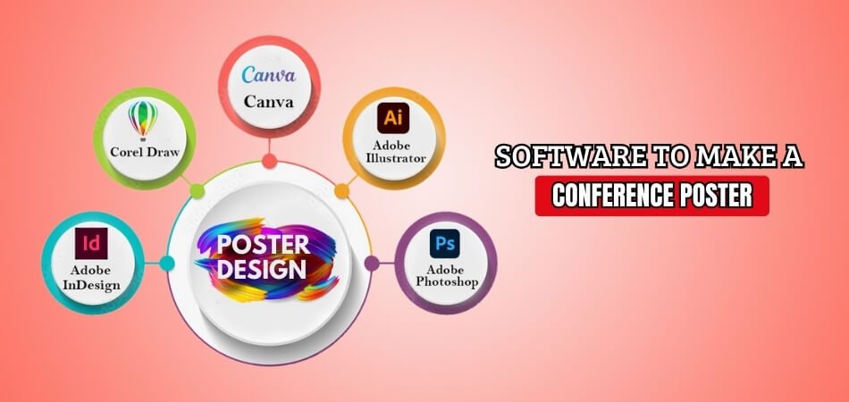
When designing a conference poster, various programs can help achieve professional results. PowerPoint, Adobe Illustrator, and Canva are popular for their intuitive interfaces and customizable templates. Programs like Inkscape and LaTeX with TikZ offer advanced features for those needing excellent graphics or complex formatting. Each tool has unique strengths to match different design needs.
Curious about which program best fits your design goals? Dive into this article for tips on creating an eye-catching, effective poster with any tool. Here, you’ll find essential insights to improve your poster’s visual appeal and impact, no matter your skill level.
Why Does a Well-Designed Conference Poster Matter?
Your research will be more clearly communicated with a well-designed conference poster. It lets people easily know what your work is about and its main findings. Visuals and simple text make the content more engaging. It helps you communicate your ideas effectively to a broader audience.
If your poster stands out, people will stop and talk to you. This creates networking opportunities, which can lead to collaborations. You want to make the most of these chances by explaining your work well. The more interest you generate, the better it is for your career.
Text and images should be balanced in a great poster. It should be easy to read, without overwhelming the viewer with too much information. When attendees participate a notable conference, having a clean and organized design can spark curiosity about your work. Keep it eye-catching but not overdone.
A poster that is succinct and organized invites questions. When people ask questions, you get to discuss your work further. This deeper interaction makes your research memorable. Designing a poster that attracts attention will increase your chance of being noticed by the right people.
What Programs Can You Use to Make a Conference Poster?
Creating a conference poster that captures attention and effectively presents your research is essential for academic success. With various design tools available, choosing the right program can enhance both style and impact. Explore the best software options below:

Microsoft PowerPoint
For making posters that look professional, PowerPoint provides an easy-to-use layout with well-known features. You can set custom poster dimensions, add visuals, and format text. Its design tools allow users to align, group, and layer objects for polished designs. With simple drag-and-drop features, PowerPoint is an ideal choice for users who want simplicity without compromising on professional presentation quality.
Adobe Illustrator
Vector-based tools for accurate and scalable conference posters are available in Adobe Illustrator. Users enjoy control over layers, typography, and complex design elements. The program’s vector graphics maintain quality at any size, making it perfect for detailed graphics. With a focus on professional-grade visuals, Illustrator suits those who want high-quality, intricate posters that stand out at academic events.
Canva
With its customizable templates and user-friendly drag-and-drop interface, Canva makes creating posters easier. Users can access thousands of fonts, icons, and images to make posters visually engaging. Canva’s web-based platform makes it convenient to work from any device and share designs easily. For users who need quick, visually appealing results, Canva is an excellent and accessible option.
Inkscape
For those on a tight budget, Inkscape, a free vector graphics program, provides sophisticated design tools. With similar features to Adobe Illustrator, Inkscape provides tools for layers, text manipulation, and object alignment. The program is compatible with multiple file types, making it easy to work with other design programs. Inkscape is a great choice for users who seek powerful design features without cost.
Adobe InDesign
When it comes to poster layouts that need organized text and images, Adobe InDesign is ideal. Its precise layout tools allow you to organize elements and align objects with ease.
Users can create and edit multi-column layouts, and integrate with other Adobe tools. With professional design controls, InDesign serves users looking to design intricate and organized posters for conferences.
PosterGenius
With a focus on conference posters, PosterGenius provides design elements and templates for lucid, scientific presentations. This program’s intuitive interface helps users quickly organize their data into structured layouts. PosterGenius simplifies arranging information while maintaining readability, making it ideal for users who prioritize clarity in scientific and academic posters.
CorelDRAW
For producing detailed, high-quality posters, CorelDRAW offers a variety of graphic design tools. Users can use vector editing, color correction, and layer management to craft intricate designs. CorelDRAW supports a variety of file formats, making it easy to collaborate with others. This program is ideal for those who need flexibility in their design elements and advanced graphics tools.
LaTeX with TikZ
Users who want exact control over formatting in technical posters have options with LaTeX with TikZ. With its script-based design process, LaTeX ensures consistency in complex, data-driven posters. TikZ, a graphics package in LaTeX, enables custom diagrams and figures. This option suits users who prioritize consistency, accuracy, and technical detail in their presentations.
Choosing the right software improves both the impact and clarity of your conference poster. Each tool offers unique features tailored to different needs, ensuring your research is presented effectively and engagingly to your audience.
How to Determine Which Program is for Your Conference Poster Design?
Making the right choice when creating a conference poster guarantees that your research will be noticed. Each tool offers unique features, and knowing your needs helps guide your choice. Learn how to make this decision with effective, clear insights below:

Understand Your Design Skills and Comfort Level
Knowing your design skills can help you choose a program that matches your expertise. For beginners, simple programs with intuitive layouts work best, while advanced users may prefer more complex design features. An accessible program minimizes common errors, enhancing the quality of your poster.
Analyze the Project’s Technical Requirements
Posters featuring detailed visuals, graphs, or intricate typography benefit from programs equipped with specialized design tools. Some projects may require vector graphics, while others might rely on layering or advanced text formatting. Choosing the right program ensures it aligns with your technical needs and helps you address common mistakes to avoid in a conference poster, enhancing clarity and professionalism.
Think About Collaboration and Compatibility
If your project involves a team, choosing a program compatible with multiple file types and platforms can save time. Some software makes sharing and editing designs with others easier, streamlining collaboration. Select a tool that works well across platforms to keep the project efficient and error-free.
Identify Available Templates and Design Options
Many programs offer templates that can speed up poster design while maintaining a professional look. Templates ensure your poster layout is clear, organized, and visually balanced. Customizable templates allow you to personalize designs while avoiding common formatting pitfalls and making the process faster and simpler.
Budget and Access to Resources
Which program is best depends on your budget; for those on a limited budget, there are some free options. Some paid tools, however, provide unique, advanced design options that make them worth the cost. Factor in both your budget and the program’s value to find the best tool for your needs.
Choosing the right design program allows you to create a clear, engaging conference poster. With thoughtful consideration of skills, technical needs, and collaboration requirements, you can effectively convey your research and make an impactful presentation.
Are Mobile Apps Good for Conference Poster Creation?
The use of mobile apps to create conference posters is becoming more and more common. They offer easy tools for designing, editing, and sharing posters on the go. This is making poster creation more accessible and efficient. Below are key aspects to consider about using mobile apps for this purpose:
Ease of Use
Creating posters with mobile apps often involves simple drag-and-drop tools and clear instructions. People with different skill levels can easily use these tools, making design more accessible. Mobile apps also save progress, so users can work in steps and edit at their convenience.
Flexibility and Features
These apps often come with built-in templates, design elements, and font choices to fit different needs. The variety of options helps users create unique posters without design experience. Many mobile apps also allow users to add interactive features, improving the presentation beyond traditional posters.
Time and Convenience
People can create posters anytime, anywhere, with mobile apps, which makes them convenient for busy schedules. Quick updates can be made instantly if changes are needed. Mobile apps can also save a lot of time because everything is in one place, which makes the process smooth.
Collaboration Tools
Mobile apps often include collaboration features where multiple users can work on a poster. These tools help teams come together without needing to be in one location. People can leave comments and suggestions, making it easy for group projects or collaborations to happen without issues.
Cost Efficiency
Many mobile apps offer free versions or cost-effective options compared to desktop software. This affordability makes them a great choice for students or early-career professionals. Users can still create high-quality posters without spending much, which makes conference participation more accessible to everyone.
Mobile apps are handy tools for conference poster creation, providing ease of use, versatility, and cost efficiency. Their growing popularity makes poster design more accessible for students, professionals, and teams, enhancing overall conference experiences.
Tips for Designing a Professional Conference Poster With Any Tool
Designing a professional conference poster requires attention to detail, clear communication, and visual appeal. Whether you’re using advanced or basic tools, applying essential design principles can elevate your poster. Discover useful tips for creating effective posters below:

Prioritize a Clean and Readable Layout
A well-organized layout is vital for capturing the viewer’s attention and ensuring information is easy to digest. Avoid cluttered designs by using white space strategically, creating sections for each content area, and aligning text and visuals neatly. This structure helps viewers quickly understand key points, making your poster look both professional and inviting.
Focus on Clear and Concise Content
Keeping content concise improves readability, allowing viewers to grasp main ideas with minimal effort. Use bullet points, short sentences, and headings to break down information, presenting only essential data. As you’re preparing posters with software, choose tools that support easy text editing, helping you refine the language and avoid overwhelming the audience.
Use Superior Quality Visuals and Graphics
A poster with excellent-quality photos, graphs, and illustrations is more aesthetically pleasing and more effective at communicating complex information. Avoid pixelated images and blurry graphics, as these can detract from professionalism. Choose visuals that reinforce your message and ensure each image has a clear purpose, giving viewers a polished impression of your work.
Select Fonts and Colors Carefully
Font choice and color scheme play an important role in creating a visually pleasing poster. Limit fonts to two or three styles to maintain consistency, and use colors that complement each other without causing eye strain. A thoughtful color palette makes the content more inviting and readable, helping your design look cohesive and balanced.
Review and Test Your Poster Design
For a polished end result, you must check your design for mistakes and consistency. Print a sample if possible, or view it at full screen to check for readability from a distance. Testing the layout helps you spot any design flaws, ensuring your poster is well-prepared for professional presentation and effective communication.
Following these tips will help you design a conference poster that communicates effectively, looks polished, and captures attention. Focusing on readability, quality visuals, and organization will make your research stand out to conference attendees.
Frequently Asked Questions (FAQs)
When creating a conference poster, finding the right program can make a difference in how effectively your research is presented. Here are some frequently asked questions to help you choose the best tool for your needs.
Which Program Is Best for Beginners?
For beginners, Microsoft PowerPoint and Canva offer intuitive interfaces and templates that simplify the design process. PowerPoint is widely used and familiar to many, while Canva’s drag-and-drop features are perfect for those with limited design experience. Both options support basic design tools for professional-looking posters.
Can Free Programs Produce High-Quality Posters?
Yes, free programs like Inkscape and Google Slides allow users to create high-quality posters without cost. Inkscape is a powerful option for vector graphics, while Google Slides offers simplicity and ease. These programs provide essential design tools, making them viable options for budget-conscious users.
How Can I Add High-Quality Visuals in Any Program?
High-quality visuals enhance your poster’s appeal and clarity. You can insert visuals in most programs by using high-resolution images or vector graphics. Adobe Illustrator and Canva offer access to stock images, while PowerPoint and Inkscape support importing custom images, ensuring your visuals remain clear and impactful.
Is Adobe InDesign Suitable for Academic Posters?
Adobe InDesign is highly suitable for academic posters, particularly when precision in layout is needed. It allows for multi-column layouts and structured text, making it ideal for text-heavy or detailed posters. InDesign’s professional layout tools make it a preferred choice for academic users who need polished presentations.
Can I Design Posters on a Mobile Device?
Yes, mobile apps like Canva and Adobe Express enable poster design on the go. These apps offer templates, drag-and-drop editing, and sharing options that make mobile design easy. While not as feature-rich as desktop software, mobile apps allow users to quickly create and edit posters from their devices.
Concluding Thoughts
Choosing the right software can greatly improve the effectiveness of your conference poster, making it both engaging and professional. Tools like PowerPoint, Canva, Adobe Illustrator, and Inkscape each offer unique features that fit different skill levels and project needs, providing solid answers to what programs can you use to make a conference poster?
As you design, remember to balance visuals and text, ensuring your poster is clear and inviting. Use high-quality images, choose readable fonts, and test the layout from a distance for maximum impact. With these tips, best wishes for creating a memorable conference poster!


