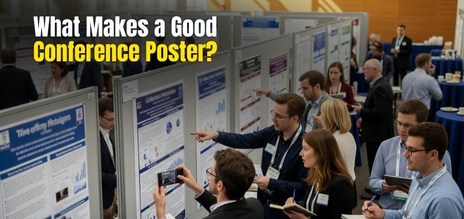
A conference poster is a way to share your ideas with others. It should be simple, clear, and easy to follow. People should understand your main message at a quick glance. A good poster also makes them want to stop and learn more.
So, what makes a good conference poster?
A strong poster has a big, clear title, short text, and colorful images. The layout should be simple, with space and bullet points to keep it clean. Most importantly, the main idea should stand out in an interesting way.
In the rest of this article, you’ll find easy tips to make your poster look great and grab attention.
What Makes a Good Conference Poster?
A good poster doesn’t just decorate the space; it tells a clear story, shares research in minutes, and opens up conversations that can lead to new ideas or collaborations. So, it should be simple, clear, and easy to follow. The poster needs to share the main point fast. A good design makes people stop and look closely at your work. Here are what makes a good conference poster:
Clarity and Readability
- A big title draws attention from far away. It helps people know your poster’s main idea quickly.
- Simple fonts keep text clean and easy to read. Strong contrast between words and background supports clear viewing.
- Short text makes ideas easier to follow. Large blocks of writing often confuse and turn readers away.
- Clear spacing makes reading smoother for everyone. Words remain visible from close and far without causing extra strain.
Engaging Layout and Structure
- A column layout guides the eye smoothly. Readers can move step by step without skipping important points.
- White space gives the eyes rest. It avoids messy design and makes each section look separate and neat.
- Headings act as quick markers. They help readers know where to start and what to expect next.
- Bullet points keep things short and sharp. They prevent heavy text and show details in a lighter style.
Visual Appeal
- Bright colors and neat images attract attention fast. They make the poster stand out in busy conference halls.
- Pictures should explain the idea. Extra images that don’t fit the message may confuse or distract the reader.
- Color harmony matters for clarity. Using soft matching shades keeps the poster calm and pleasant to the eye.
- A strong central image pulls people in. It invites them to explore more of the poster’s story.
Clear Message and Narrative

- Plan key points before design. This makes sure the poster follows one clear story without going off track.
- Show the main idea clearly. Even quick readers should understand your message by glancing at the poster.
- Arrange sections in a natural order. This helps people move smoothly from one idea to the next.
- At events like upcoming conferences in Canada, a clear story helps connect research with different kinds of audiences.
Interactivity and Creativity
- Simple creativity keeps posters memorable. Fancy design should never hide the message or confuse readers with clutter.
- Adding QR codes gives more value. Curious people can scan and access extra details beyond the poster itself.
- Small props make posters unique. They create moments that help visitors remember your research longer after leaving.
- Fresh ideas attract attention. New touches keep viewers engaged, while clear writing ensures the message is never lost.
What’s the Purpose of the Conference Poster?
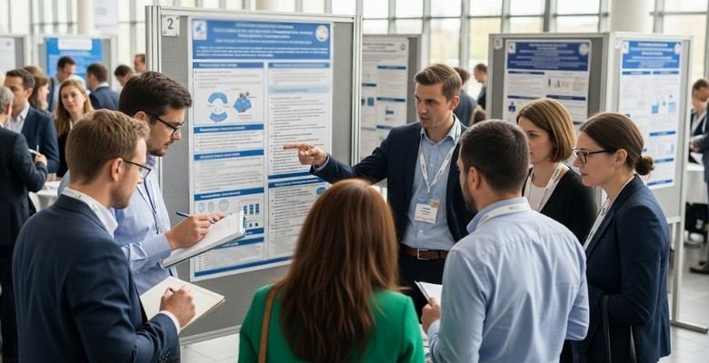
Step into any conference hall and the first things likely to grab your attention are the posters. They stand tall with colorful designs, short words, and simple layouts that draw the eye right away. A strong poster doesn’t just hang on a board; it invites people to pause, read, and engage. Here are some of the main purposes a conference poster serves for both presenters and their audience:
Share Information
The main purpose of a conference poster is to share information in a simple and quick way. It gives the key points of research without making people read long pages of text. This way, someone can understand the core message in just a few minutes. The poster acts like a visual story that shares knowledge clearly with everyone.
Attract Attention
A poster is designed to stand out among many others in the room. Bright colors, bold titles, and neat images catch the eye right away. Once a person stops to look, the short and clear text keeps them engaged. It makes them want to know more about the research behind it.
Encourage Discussion
The poster is not just about showing facts; it also invites people to ask questions. Viewers often stop by to talk and share their thoughts about what they read. This creates space for friendly discussions that can lead to fresh ideas. These small talks can even grow into helpful academic or professional connections.
Build Connections
Conferences are not only about sharing research but also about meeting people with similar interests. Posters help researchers connect with others who find the topic interesting. These connections can lead to future collaborations or even new projects. A simple poster can be the start of strong professional relationships.
Increase Visibility
For researchers, visibility is very important. A poster lets their work be seen by people they might not meet otherwise. Even if someone doesn’t talk with the presenter, they still remember the name and the main findings. This helps the researcher gain recognition and respect in their field.
Provide a Record
Posters are not only useful during the event but can also be displayed later. Some are put up in classrooms, labs, or offices to remind people of the work. This makes the research last beyond the short time of the conference. It stays visible and keeps sharing information long after the event ends.
Invite Feedback
A poster is a chance to learn from others as well. Viewers may give suggestions, ask questions, or point out ideas the researcher had not considered. This feedback can improve the work and make it stronger. It also gives the researcher confidence to move forward with a better understanding.
How to Write a Single Sentence Poster Hook?
A strong hook pulls readers in before they blink. It hints at your topic and creates quick curiosity. It also sets up the story your poster will tell without giving everything away. Let’s go through the key steps that will help you create a poster hook that’s short, memorable, and powerful.
Step 1: Know Your Audience
Picture the people who will read your poster and think about their needs, questions, and time. Choose words they already use in class, labs, or everyday talk. Focus on what matters to them right now, not someday. Aim for a promise that feels useful, clear, and honest.
Step 2: Choose a Hook Style
Pick a style that fits your topic and goal for the session. Ask a sharp question, drop a surprising fact, or make a bold claim. Keep the mood consistent with your findings and your field. Avoid jokes that distract or slang that confuses mixed groups.
Step 3: Use Your Angle
Decide on the single idea you want readers to remember after ten seconds. Link the hook to your main result and why it matters today, then weave in your conference poster presentation naturally for context. Cut side points that weaken focus or cause doubt. Stick to one clear benefit the reader can spot fast.
Step 4: Add Specifics
Numbers, names, or time frames make the line feel real and trustworthy. Replace vague words with concrete details that anyone can picture. Show scale with a percent, a count, or a short comparison. Let the hook hint at impact without spilling every detail.
Step 5: Keep It Short
Limit the hook to one crisp sentence that fits on one line. Use simple verbs, short words, and clean structure. Remove filler like “very,” “really,” or “in order to.” Trim anything that slows reading or muddies meaning.
Step 6: Match the Tone
Set a tone that reflects your study and your poster’s design. If your topic is serious, keep a steady, respectful voice. If it’s exploratory, sound curious and energetic. Make sure the line feels natural when you read it aloud.
Step 7: Test and Tweak
Read the hook aloud and time how fast someone understands the point. Ask a friend to tell you what they heard in their own words. If they guess wrong, adjust the claim, detail, or verb choice. Keep refining until the message lands instantly.
Step 8: Place It Right
Put the hook near the title area where eyes land first. Give it space so it breathes and stands out. Avoid small fonts or busy art that steals attention. Align it with the flow so readers glide into your sections.

Best Fonts, Sizes, and Color Contrast to Use
Choosing the right fonts, sizes, and color contrast makes a poster clear and easy to read. Good choices help your message stand out, guide the reader’s eye smoothly, and keep the design clean, simple, and visually engaging throughout. For conference posters, the best fonts, sizes, and color contrast guidelines are as follows:
Fonts
- Use sans-serif fonts like Arial, Verdana, or Helvetica for better readability from a distance.
- Avoid decorative or overly stylized fonts, which can be difficult to read.
- Limit yourself to 1-2 font types for a clean, professional look.
Font Sizes
- Title: 85 to 100 pt — the largest text, readable from at least 3 meters.
- Author names: Around 56 pt.
- Headings/Subheadings: 36 to 60 pt — clearly distinguishable from body text.
- Body text: 24 to 36 pt — legible at 1 to 2 meters distance.
- Captions/References: Around 18 to 30 pt.
- Avoid using too many font sizes: stick to 3-4 sizes maximum for consistency and clarity.
Color Contrast
- Use high contrast between text and background for readability. For example, black or dark blue text on a white or light background.
- Avoid color combinations that strain the eyes, such as red-green or low-contrast pastels.
- Use bold text or color blocks to emphasize important sections, but sparingly to avoid clutter.
- Ensure visuals and text complement each other in color, avoiding clashing hues.
Tips for Presenting and Answering Questions at a Poster Session
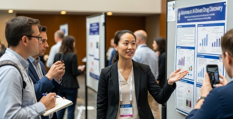
Walking into a poster session can feel exciting and a little overwhelming at the same time. The room is full of people, colorful posters, and curious faces eager to learn something new. Every small detail, from the way you stand to the way you speak, makes a difference. Sharing your work here is about more than research—it’s about making real connections. Here are some practical tips on this.
Warm Welcome
Start by smiling and standing slightly to the side of your poster so people can see it clearly. Eye contact shows you are open to conversations and helps others feel more comfortable approaching you. A friendly greeting like “Hi, would you like to hear more?” can break the ice. Little things like posture and a positive mood make the session feel easier.
Quick Summary
Prepare a short explanation of your research that you can say in one or two minutes. This is sometimes called an elevator pitch, and it helps others understand your main idea quickly. Ask if they would like a longer explanation or just the basics. A flexible approach keeps everyone engaged and interested.
Use Visuals
When you talk, point to different parts of your poster to guide your audience. Using your hands while explaining makes it easier for people to follow along. This makes your poster feel more interactive and keeps the viewers’ attention. Keep your body language open and relaxed while presenting.
Show Energy
Energy matters when you’re presenting, even if the session has been long. Stay excited about your work because your enthusiasm can inspire interest in others. People connect better when they feel your passion for the subject. A genuine smile and lively voice can make your research memorable.
Adjust for Audience
Not everyone will know your topic at the same level. Some people might be experts, while others may just be curious. Change your explanation depending on who is listening so they understand easily. This way, everyone walks away with something useful.
Share Details
Make sure to leave your contact information on your poster or handouts. If someone wants to ask more questions later, they can reach out to you. This also helps keep conversations going after the event ends. Networking can sometimes lead to new opportunities.
Listen First
When someone asks you a question, give them your full attention. Do not rush to answer before they finish speaking. If you don’t understand, it’s fine to ask them to repeat or explain. Listening carefully shows respect and helps you respond better.
Be Honest
If you don’t know the answer to a question, it’s okay to say so. You can tell the person you will look into it or suggest where they might find more details. Honesty builds trust and shows confidence in your work. Pretending to know everything can make things uncomfortable.
Keep It Short
Answer questions with short and clear replies. If the person shows more interest, you can then add extra detail. Long explanations often lose attention, so begin simple and expand only if needed. Being direct makes your message easier to follow.
Encourage Talk
Encourage further discussion by asking them if they’d like more information or examples. You can even mention how designing eye-catching posters adds value to the way ideas are shared. This helps create a two-way conversation rather than just you talking. Conversations often lead to new insights for both sides.
FAQs About What Makes a Good Conference Poster
A conference poster helps you share your research quickly and visually with others. It needs to grab attention, explain your ideas clearly, and invite conversations. Here are some frequently asked questions to help you design a strong poster.
How Important is Font Choice on a Poster?
The right font makes your poster readable from a distance. Avoid fancy or decorative styles that are hard to read. Stick with simple fonts like Arial or Calibri in large sizes, ensuring clarity for both short glances and detailed reading.
Why Should White Space Be Used?
White space prevents the poster from feeling overcrowded and messy. It separates different sections, making the information flow easier to follow. Viewers appreciate clean layouts because they can focus on the important points without getting lost in visual clutter.
Should Posters Include QR Codes?
QR codes are a useful addition to modern posters. They allow viewers to access extra resources or data instantly. This small feature extends engagement beyond the session and gives interested readers more time to explore your research thoroughly.
How Many Images Are Enough?
Images help tell your story, but too many can overwhelm the viewer. Three to five strong visuals usually work best. Each image should have a purpose, whether to clarify results, highlight data, or create a clear visual connection.
Is Color Psychology Useful for Posters?
Color choices can influence how people react to your poster. Calming shades make reading easier, while bold colors highlight key sections. Balanced palettes make the design pleasant to view while guiding attention to the most important research details.
Do Posters Need a Takeaway Section?
A takeaway section is very helpful because it sums up the main message clearly. Attendees can read it quickly and remember the key point later. This section should highlight results or findings in simple terms without unnecessary detail.
Can Humor Work in a Poster?
Humor can make your poster memorable if used carefully and relevantly. Light jokes or playful visuals can catch attention. However, the humor must fit the topic and setting, ensuring it adds to understanding rather than causing distraction.
Should References Be Included on Posters?
Yes, short references should be included if they support your research claims. Keep them minimal and concise, not long lists. Place them at the bottom or in smaller text so they don’t distract from your main message and visuals.
How Do Titles Affect Poster Success?
Titles are often the first thing viewers notice. A clear and catchy title draws them closer and sets expectations. Good titles summarize the research focus in just a few words while still sparking curiosity about the content.
Are Interactive Elements Worth Adding?
Interactive elements like small props, QR links, or flip panels can make your poster stand out. They invite people to explore deeper while keeping them engaged. Use them only if they add real value to understanding your research findings.
Bottom Lines
A good conference poster helps people understand your ideas quickly. It should look clear, simple, and easy to read. Use big titles, short text, and helpful images to catch attention. Think about what makes a good conference poster when planning your design and message.
Keep your layout neat, and use colors that are easy on the eyes. Make sure people can follow your main point without getting lost. A strong poster also makes others ask questions and want to talk with you. When done right, your poster will stand out and be remembered by everyone who sees it.

