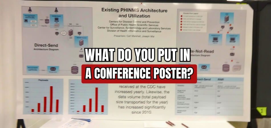
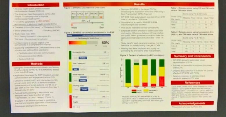
Presenting a poster at a conference has become a powerful way to share your research and connect with your peers. With so many attendees and presentations, a well-designed poster can make a lasting impression. This often leaves people wondering: What do you put in a conference poster?
A great conference poster includes essential sections: a title, background, objectives, methods, results, and discussion points. These elements, combined thoughtfully, help you communicate your study’s purpose, findings, and implications. Every section serves to make your message clear, memorable, and impactful.
If you’re curious about creating an engaging poster or simply want to improve yours, keep reading. This article covers everything you need to make a conference poster that stands out and communicates your research effectively.
Why Does Content Matter in a Conference Poster?
A conference poster isn’t just about design; the content plays an equally important role. While visuals attract attention, clear and well-structured content keeps the audience engaged. A good poster delivers key information in a way that is easy to understand. Without meaningful content, even the most creative design can fail to communicate effectively.
Well-organized content helps make complex topics more accessible. Posters often summarize research findings, highlight industry trends, or present innovative ideas. Using simple language and structured sections allows viewers to absorb the details quickly. A balance of text and visuals ensures that key points are easily noticeable, making the poster more impactful for attendees.
Concise yet informative content makes a poster stand out in a crowded event space. Avoiding large text blocks and using bullet points or short paragraphs improves readability. Titles, subtitles, and keywords should be strategically placed for clarity. When information flows naturally, it encourages attendees to stop, read, and engage in discussions.
Different conferences have unique expectations for poster presentations. In international events, organizers focus on making research and ideas accessible to a diverse audience. Events like conferences in Canada, USA, UAE, and many other conferences in different country often emphasize clear and informative content to help attendees grasp ideas efficiently. Well-structured posters allow viewers to understand research or insights even with limited time. Making content accessible and engaging ensures that a poster effectively communicates its intended message.
What Do You Put in a Conference Poster?
Making an eye-catching conference poster facilitates the presentation of important research in an understandable manner. Every element should communicate your work’s purpose and findings. Here are essential sections to make your poster stand out.

Title and Author Information
Choose a simple, engaging title that reflects your research focus. List the names and positions of the authors below. Use a clear, legible font for the title, and make sure the font size is larger than the body text to capture attention. Position author names beneath the title, and ensure that each name links to the appropriate institution for quick reference.
Background and Objectives
Provide relevant context and explain why the study matters. Start by summarizing the field and mentioning any gaps your research addresses. Then, define the study’s main objectives, explaining briefly how your research will address them. A concise background builds reader interest, making them want to learn more about your approach and findings.
Research Questions or Hypotheses
If your research explores specific questions, list them clearly in this section. Alternatively, if you have hypotheses, briefly state each one, linking them to the broader study purpose. This helps attendees quickly understand the central focus of your work. Ensure that each question or hypothesis directly connects to the study’s objectives.
Methods and Materials
Describe the methodology briefly but precisely, highlighting how you collected data and conducted analysis. Include any notable tools, software, or materials that played a significant role.
By providing this summary, readers can quickly grasp your study’s design and methods without needing extensive detail. Be sure this section connects well with your objectives.
Results
Share key findings in an accessible, engaging way, helping viewers understand what your research revealed. Avoid dense text; instead, present the main results in a straightforward format. Organize findings by importance and try to keep explanations clear and short. This clarity allows your audience to easily remember and discuss your research afterwards.
Discussion
Explain the implications of your findings and how they fit within the existing literature. Address whether your results support or contradict your hypotheses and consider the broader field’s reactions. This section should encourage viewers to think critically about your study’s contributions. Strong discussions engage readers, prompting them to reflect on your findings.
Conclusion and Future Directions
Summarize the primary takeaway and discuss the next steps in research or practical applications. This closing section should highlight how your findings can inspire future studies or potential innovations in the field. Offer a forward-looking perspective that suggests broader implications for the field, ensuring readers leave with a sense of completion.
Acknowledgments and References
Give credit to any people or groups that provided funding, data collection, or other crucial assistance. Also, provide references to any major studies or sources that informed your research. Keeping this section concise ensures your main content stays focused while respecting contributors and offering further reading for interested viewers.
When designing a conference poster, always ensure your content is visually engaging and concise while fully communicating your study’s core insights. Remember, clarity and readability help attract attention and prompt valuable discussion among attendees.
Should You Add Images to Your Conference Poster?
Including images in a conference poster can improve your message and grab attention immediately. Visuals, when used thoughtfully, help simplify complex ideas, making it easier for your audience to understand and remember your information. The key lies in balancing visuals with clear, concise text.

Increasing Understanding of Visuals
Visuals can turn intricate ideas into digestible information that resonates. A well-chosen image provides immediate context, helping readers understand your topic quickly. By illustrating key points, visuals can support your text without overwhelming the audience. This balance makes it easier for people to engage with and retain information.
Making Visuals Stand Out with Purpose
Images should serve a clear purpose on your poster, bringing value beyond aesthetics. Every visual included needs to directly support or enhance your message. When transforming a picture into a conference poster, be sure it aligns with the main points you’re sharing, helping your audience see the connection between visuals and content.
Balancing Visuals with Text
The ideal conference poster finds the right balance between text and images. Overloading with visuals can lead to distraction, while too much text can overwhelm viewers. By thoughtfully placing visuals alongside concise information, you create an organized layout that keeps your audience focused on the core ideas of your presentation.
Choosing Quality over Quantity
Good quality photos have a stronger effect than many irrelevant images. Sharp, high-resolution images ensure clarity and professionalism, attracting viewers. It’s wise to select only a few meaningful visuals that enhance your message. This approach ensures your poster looks polished and maintains its appeal without feeling cluttered.
Using Color to Increase Impact
The colors in your visuals can greatly influence how people perceive your poster. Complementary colors make images pop, drawing viewers’ attention to specific areas of your presentation. Color also helps organize information visually, guiding the eye naturally and making your poster easy to follow from start to finish.
Adding images to a conference poster can create a more engaging experience for viewers if done with purpose and balance. Keep your audience and your message in mind as you select and place visuals, ensuring they complement your overall theme effectively.
Tips for Making Your Poster Visually Engaging
Creating a visually engaging poster can set your work apart, making it more memorable and impactful. Visual appeal encourages viewers to stop, explore, and fully grasp your message. Here are some tips to elevate the visual quality of your poster.
- Use White Space Effectively: Strategic white space can make your poster appear organized and less cluttered. It helps direct focus to important areas and creates a visually appealing balance.
- Opt for Consistent Font Styles: Maintaining consistent fonts throughout your poster enhances readability and keeps the design cohesive. Pick one or two fonts for titles and body text to create harmony.
- Align Elements Carefully: Precise alignment of text and visuals makes your poster look polished and professional. Proper alignment also helps guide the reader’s eyes smoothly from section to section.
- Group Related Information Together: Organize content logically by grouping similar topics, making it easier for viewers to follow your flow. Thoughtful grouping enhances clarity and helps reinforce your main points effectively.
- Use Visual Hierarchy for Emphasis: Establish a visual hierarchy by emphasizing key information with slightly larger text, bold fonts, or prominent placement. This strategy draws viewers’ attention to essential elements first.
- Select Colors that Complement Each Other: Harmonious color schemes enhance readability and make your poster visually pleasant. Choose a palette that matches your theme and uses contrast sparingly to highlight important areas.
- Incorporate Symbols or Icons: Small icons can enhance understanding and break up large sections of text. Icons add an extra visual element, making complex points easier to digest and remember.
Applying these tips thoughtfully can make your poster visually engaging and accessible. Creating a professional, attractive layout allows your key messages to stand out and leaves a lasting impression on your audience. Prioritize clarity and appeal to make an impactful presentation.
How to Capture Attention With a Strong Conclusion?
Concluding with impact is essential for making your poster memorable. This final section can inspire, clarify, and strengthen the value of your research. Below are ways to prepare a strong conclusion that captures attention.

Summarize Key Findings Clearly
For an engaging conclusion, highlight the core findings in a brief and precise manner. State how these findings contribute to the field, avoiding complex terms that might dilute the message. By keeping your language straightforward, you help viewers leave with a solid grasp of your research’s main contributions, which adds impact to your poster.
Focus Broader Impact and Relevance
To make your conclusion impactful, relate the findings to the broader field. Demonstrate why your research matters and how it might influence future studies or real-world applications. This approach elevates the conclusion, showing attendees that your research is valuable and relevant, creating a memorable impression on them.
Suggest Future Research Directions
A strong ending often inspires further thought or action, so point out possible avenues for future research. By offering fresh ideas for exploration, you help viewers see how your study fits into a larger context. This foresight signals confidence in your work and encourages deeper engagement with your conclusions.
Reinforce Your Main Takeaway
Summarize the main finding from your research and provide a brief reminder of it. This short recap brings clarity to the conclusion, making your key points easy to remember. With a strong summary, attendees gain a clearer understanding of your poster’s significance and can communicate it easily to others.
Include a Call to Action or Reflection
End with an invitation for further discussion or personal reflection, which creates a lasting connection. When presenting a poster at a conference, encourage viewers to consider your research’s applications or implications in their work. This subtle call to action motivates engagement and opens opportunities for future collaboration.
A well prepared conclusion strengthens the impact of your poster, leaving attendees with a clear, memorable understanding of your research. The final message should be clear and motivating, turning interest into lasting impact.
FAQs About What Do You Put in a Conference Poster?
Creating a successful conference poster involves careful planning and organization to present your research most effectively. Below are some frequently asked questions to help clarify what makes an engaging, informative, and memorable conference poster.
How Can I Make My Poster Stand Out?
To make your poster stand out, focus on a clear and compelling visual layout. Use contrasting colors, consistent font sizes, and a balance of images and text. Highlight important information with strategic placement, ensuring key points catch the eye immediately and create a lasting impression.
What Level of Detail Should I Include?
Include enough detail to communicate your research effectively, but avoid overwhelming viewers. Focus on summarizing key points, methods, and results concisely, leaving out excessive background or complex explanations. The goal is to provide enough information for understanding while encouraging further discussion.
How Do I Structure My Poster for Readability?
Structure your poster with clear sections, such as title, introduction, methods, and results, so viewers can easily follow your research journey. Use headings and subheadings for each section, and place content in a logical flow from left to right or top to bottom to enhance readability.
Should I Include References and Citations?
Yes, including references is essential for credibility and gives viewers additional resources for further reading. Use a dedicated section at the bottom of the poster for key references. Keep citations concise and include only major studies or influential sources directly relevant to your research.
How Do I Ensure My Poster Is Visually Appealing?
To keep your poster visually appealing, prioritize simplicity and clarity. Avoid overcrowding with too much text or unnecessary graphics. Use high-quality images and legible fonts, and add white space strategically to keep it organized. This approach helps create a clean, attractive layout that’s easy on the eyes.
Closing Remarks
The key to successfully communicating your research to a wider audience is designing an impactful conference poster. A well-structured poster can spark conversations, attract interest, and lead to valuable connections during the event. Thoughtful design choices can significantly enhance the visibility of your work.
So, what do you put in a conference poster? Include a clear title, author information, background context, research objectives, methodology, results, and conclusions. Additionally, make sure to use visuals that complement your content and engage viewers, ensuring that your poster conveys your message effectively.
As you begin on preparing your poster, remember to keep your content concise, choose visuals wisely, and maintain a logical flow. Pay attention to design elements that enhance readability, and don’t hesitate to seek feedback from peers. Best wishes for creating an engaging conference poster that leaves a lasting impression!


