In the academic and corporate events, presenting research or projects has become more prevalent than ever. But before you rush to get your findings printed, knowing the ideal dimensions for display is essential. So, what is the typical poster size for a conference?
The standard choice many professionals gravitate towards is the 48″ x 60″ size. This dimension ensures your content is visible and legible from a distance and aligns with the standard provisions of many event organizers.
Grasping this essential detail can distinguish between a presentation that seamlessly fits in or awkwardly stands out. Let’s explore the ideal size and shape for conference posters.
Conference Posters – What Does it Signify?
Conference posters serve as visual representations of research or projects. They provide insights at a glance, condensing vast data into accessible formats. Posters are invaluable tools in academic and professional circles. They communicate complex ideas succinctly, allowing viewers to grasp critical points swiftly. In settings where time is limited, they’re particularly potent.

Beyond mere data presentation, these visual aids encourage interaction. Presenters engage with curious onlookers, answering questions and expanding on highlighted topics, especially when going to events with international participants. Such interactions often lead to fruitful collaborations or fresh perspectives.
Crafting a compelling poster demands creativity and clarity. The design should captivate while the content informs, balancing aesthetics and information. A well-executed poster can elevate one’s research, leaving a lasting impression on its audience.
Different Types of Conference Posters
Conference posters come in varied styles, each tailored to different presentation needs. The diversity ensures effective communication, catering to distinct content and audience preferences.
Research-based Posters
These delve deep into academic studies or professional research. Detailed methodologies, results, and interpretations are showcased. They’re common in scholarly conferences, emphasizing evidence-based findings.
Infographic-style Posters
A blend of visuals and concise text, these are aesthetically engaging. They transform data into digestible graphics, ensuring quick comprehension. Perfect for audiences that favor visual over verbose content.
Case Study Posters
Highlighting real-world examples, these posters narrate stories. They detail challenges, solutions, and outcomes from specific scenarios. Ideal for illustrating practical applications of theories or strategies.
Interactive Posters
 Incorporating QR codes or digital touchpoints, they bridge the physical-digital divide. Viewers access supplementary information or media through smartphones or tablets. They’re futuristic, adding layers to the presentation experience.
Conference posters can boost the impact of presentations if they are designed correctly. Consider the content, audience, and venue when selecting the poster style, ensuring it resonates and engages effectively.
Typical Poster Size for a Conference
Selecting the right poster size for a conference is crucial. It determines visibility, engagement, and alignment with venue specifications.

Easel signs, typically measuring 18″ x 24″, are compact and great for small-scale displays. The 36″ x 48″ size is apt for presentations demanding more detail. But the 48″ x 60″ dimension remains a standard choice for many conferences, providing ample space without being overwhelming.
If employing a design service, early communication is pivotal. Establishing a clear dialogue ensures your design aspirations align with the practicalities of printing. This collaborative approach guarantees a poster that’s both informative and visually captivating.
Creating an impactful poster is a smooth endeavor. Dedicate ample time to design, content collation, and final touches. Forethought ensures clarity and precision, and a poster effectively communicates its intended message.
What is the Purpose of the Conference Poster?
In academic and corporate environments, preparing a well-designed conference poster is more than just creating a decorative display. It embodies purpose, functioning as an information, validation, and engagement conduit.
Engaging Visual Representation
Conference posters are specifically designed to captivate the attention of attendees. Through a combination of strategic design and pertinent content, they offer a visual distillation of months or even years of research. This synthesis of information ensures that viewers are immediately drawn in, setting the stage for deeper exploration and understanding.
Facilitating Quick Comprehension
Given the hustle and bustle of conferences, attendees are often pressed for time. Posters act as a beacon, providing a high-level overview of the core research points. Distilling complex data and findings into easily digestible chunks enables attendees to grasp the essence of a study or project swiftly.
Promoting Interaction and Networking
Beyond mere information dissemination, posters are catalysts for dialogue. They provide a platform for presenters to interact one-on-one with interested parties. These conversations often pave the way for networking, collaborations, and future academic or business partnerships.
Validating Research or Ideas
A well-crafted poster stands as a testament to the rigor and validity of one’s work. By cohesively laying out methodologies, findings, and conclusions, they offer peers an opportunity to assess and validate the presented research. This peer recognition can lead to further research opportunities, collaborations, or publishing prospects.
Serving as a Reference Point
Posters act as a static reference amid a flurry of presentations and discussions. Attendees can revisit them to refresh their memories or clarify specific points. Thus, a memorable poster can linger in viewers’ minds long after the conference concludes, ensuring the research continues to resonate.
Crafting an effective conference poster is both an art and a science. It’s about striking the right balance between visual appeal and informative depth. When executed well, a poster becomes a fulcrum around which meaningful interactions, validations, and insights revolve.
Tips for Making a Unique Poster for a Conference
Crafting a standout conference poster requires a blend of design understanding and content clarity. Here are tips to ensure your poster shines amidst a sea of presentations:
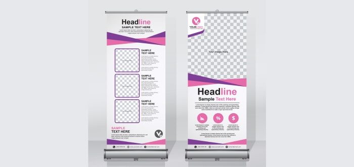
- Harmonized Color Palette: Choose colors that resonate with your topic. A harmonized palette draws attention and enhances legibility, making content pop.
- Hierarchical Design: Prioritize information using size and position. This ensures viewers are guided through your content, understanding key points first.
- High-Quality Graphics: Incorporate sharp, relevant images or graphs. Quality visuals not only beautify, but also reinforce and simplify complex data.
- Consistent Typography: Maintain uniformity in font types and sizes. A consistent typographical approach ensures readability and a polished appearance.
- Engaging Headline: Your title should intrigue and inform simultaneously. An attractive headline pulls viewers in, sparking their interest in the details.
- Whitespace Usage: Avoid overcrowding by leveraging whitespace. This design element offers viewers visual breathing room, enhancing comprehension.
- Interactive Elements: Consider QR codes or digital touchpoints. These foster more profound engagement, allowing attendees to explore supplementary content.
- Proofread Diligently: Errors can detract from credibility. Thorough proofreading ensures your message remains undiluted and professional.
A well-designed poster is both a beacon and a testament to your research’s significance. By incorporating these tips, you’re poised to create a memorable visual masterpiece that resonates and informs.
End Notes
Conference presentations require more than just compelling content; the medium is equally important. As we’ve explored, the typical poster size for a conference, notably the favored 48″ x 60″, offers an ideal canvas for academics and professionals alike.
This dimension can captivate and inform simultaneously when paired with an engaging design and straightforward content. Whether it’s a research deep dive, a visually driven infographic, or an interactive piece, the poster’s purpose is to communicate, validate, and engage.
Crafting a standout display demands meticulous attention to design, size, and content. Ultimately, understanding the nuances of conference posters ensures that your research isn’t just seen, it’s remembered.

