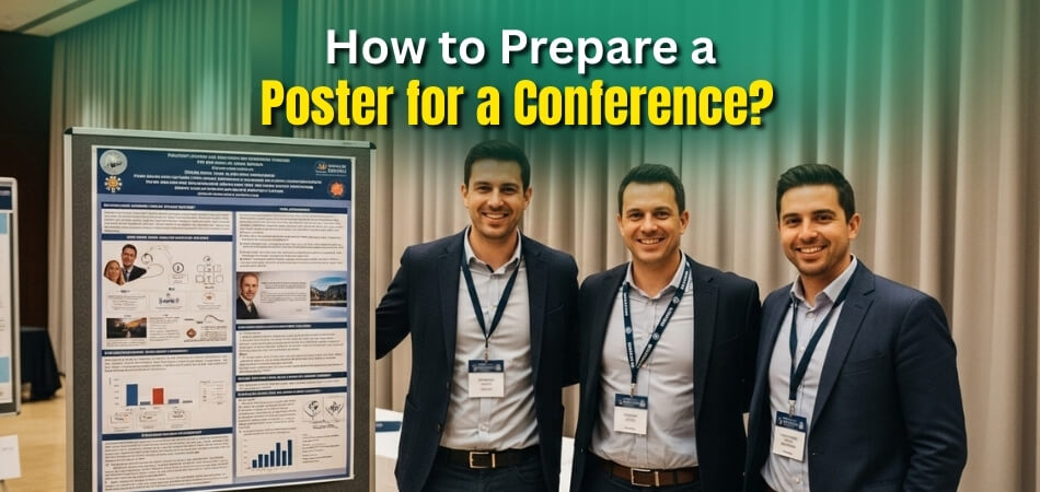
Preparing a poster for a conference is an exciting opportunity to showcase your work, but it can also feel challenging. A poster isn’t just about design — it’s a chance to share your ideas, spark conversations, and build connections. So, how to prepare a poster for a conference?
The key lies in clarity and planning. A strong poster highlights your main points, uses visuals effectively, and communicates your message in a way that’s easy to grasp. Whether it’s for academic research, industry insights, or creative projects, the goal is to make your audience stop, read, and engage.
This guide will take you step by step through the process of poster preparation. From understanding conference guidelines and choosing a compelling topic to designing, printing, and presenting confidently, you’ll learn practical strategies to make your poster stand out.
How to Prepare a Poster for a Conference? Step-by-step Process
A good conference poster tells your story quickly, visually, and in a way that invites people to stop and talk. Unlike a long paper or formal lecture, posters work best when they’re focused and approachable. Here’s a natural step-by-step guide to help you prepare one with confidence.
Step 1: Review the Conference Instructions
Start by checking the poster guidelines provided by the organizers, as requirements often differ from country to country. For example, a conference in Canada may have specific size formats or submission deadlines that differ from events elsewhere. Understanding these details early prevents redesigns and ensures your poster meets expectations.
Step 2: Define Your Core Message
Ask yourself: what is the single most important idea I want people to remember? That idea should guide every design choice. A focused message makes your poster easier to read and gives visitors a clear reason to stop and engage with your work.
Step 3: Structure the Story Clearly
Organize your content like a mini-paper but in simplified form: background, problem, methods, results, and conclusion. Use short sentences, section headings, and bullet points. People should be able to scan your poster in a minute and understand the flow without needing you to explain every part.
Step 4: Keep Design Clean and Readable
Good design isn’t about flashy graphics — it’s about clarity. Use large titles, legible fonts, and consistent spacing. Stick to two or three colors that contrast well. White space is your friend; it makes your poster less overwhelming and directs the reader’s attention to key points.
Step 5: Use Strong Visuals
Charts, diagrams, and images are the heart of a poster. They should explain their data faster than words could. Choose visuals that are simple, well-labeled, and directly support your message. A single clear graph often has more impact than a page full of text.
Step 6: Write With Brevity
Your audience won’t stand in front of your poster to read paragraphs. Keep text short, direct, and free of jargon. Summarize complex ideas in plain language and highlight only the essentials. The goal is to spark interest, not to publish your entire research on one sheet.
Step 7: Prepare Your Pitch
A poster isn’t just a static display; you’re part of the presentation. Prepare a short 2–3 minute explanation of your poster. Practice until you can deliver it smoothly to both experts and non-experts. This verbal pitch turns a quick glance into a meaningful conversation.
Step 8: Plan Printing and Transport
Printing logistics can trip up even seasoned presenters. Decide early whether you’ll print on paper or fabric. Fabric folds into luggage, while paper usually requires a poster tube. Double-check deadlines at your local print shop and always keep a digital backup in case reprints are needed.
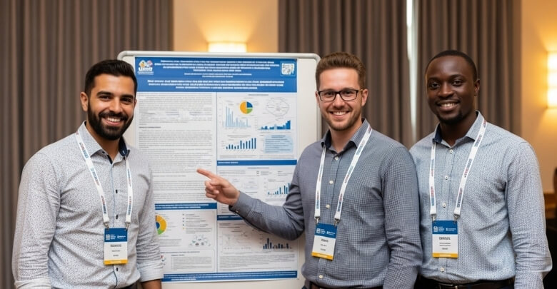
Step 9: Engage During the Session
On the day, stand by your poster, smile, and welcome people. Hand out summary sheets or share a QR code with your contact info. Ask visitors about their work too; poster sessions are as much about networking as they are about presenting your research.
Conference Poster Requirements and Guidelines
Before starting your poster design, the first step is to understand the specific rules provided by the conference organizers. These requirements affect everything from layout to printing. Ignoring them can lead to last-minute stress, wasted money, or even your poster being rejected. Here’s what to check carefully in advance.
Poster Dimensions and Orientation

Conference organizers usually provide clear instructions about the poster size, such as A0 or 36×48 inches, and whether it should be portrait or landscape. These details are not flexible. The wrong size can cause printing issues or prevent your poster from fitting the display boards correctly, undermining your effort.
Font Sizes and Readability Rules
Many conferences ask you to follow minimum font sizes for titles, subheadings, and body text. This ensures that your poster is readable from several feet away. Sticking to these standards not only helps your audience but also keeps your design consistent with other posters in the session.
File Formats and Submission Deadlines
Some events require digital uploads of your poster before the conference begins. They usually request PDF or JPEG formats. If your event includes online participation, treating this step as part of your overall preparation for a virtual conference ensures your poster is ready for both physical display and digital viewing.
Printing Responsibilities
Not all conferences offer on-site printing. In many cases, presenters must handle printing themselves. That means researching reliable printing shops, confirming delivery times, and budgeting accordingly. Waiting until the last week is risky. By planning early, you’ll avoid costly mistakes and ensure your poster is ready well before travel.
Mounting Materials
Display methods vary from one venue to another. Some provide pins, clips, or Velcro strips for mounting, while others expect you to bring your own. If you don’t prepare, you might scramble to borrow materials on the spot. Double-checking this detail avoids unnecessary stress during setup.
Display Duration
Your poster may be up for only a scheduled session or for the entire conference. Knowing this in advance helps you manage expectations and plan your availability. If it’s a short session, you’ll need to be present the entire time to interact with attendees and answer questions effectively.
How to Choose a Compelling Topic for Your Poster?
Selecting the right topic is one of the most important steps in preparing your conference poster. A clear and relevant focus not only attracts attention but also makes it easier to design, explain, and defend your work. Here are key considerations to guide your choice.

Align With the Conference Theme
Most conferences revolve around a specific theme or focus area, and aligning your poster topic with that theme makes it more appealing. Review the conference description, call for abstracts, or track listings to find the best fit. When attendees see your work contributing directly to the main conversation, they’re more likely to stop and engage with you.
Keep the Scope Narrow and Focused
One of the most common mistakes is trying to cover too much. A poster is not a full research paper, so avoid cramming in every detail. Instead, pick one core message or result you want people to remember. A narrow, focused scope makes your poster easier to read and your takeaway clearer.
Consider Audience Interests
Think carefully about who will be attending your session. Is it mostly academics, professionals, or students? Knowing your audience helps you choose a topic that resonates. A strong poster is not just about what you want to present, but also about what your audience will find useful, interesting, or inspiring.
Highlight Originality or Innovation
With dozens or even hundreds of posters in one hall, standing out matters. Choose a topic that highlights something new — a unique finding, a novel approach, or an innovative perspective. Even if your project is small, framing it as a fresh contribution gives people a reason to stop at your poster.
Show Practical Application
While theory is valuable, attendees often connect more with topics that show real-world relevance. A poster that demonstrates how your findings solve a problem or can be applied in practice attracts attention. Think about industry applications, community benefits, or professional impact — practical takeaways leave a stronger impression.
Reflect Your Strengths
It’s always easier to present a topic you know inside out. Select something you’re confident in explaining and ready to defend under questioning. Picking a subject aligned with your strengths makes you sound more natural and credible, helping you connect better with your audience and answer questions effectively.
Build on Current Trends
Choosing a topic linked to current debates or hot issues in your field can make your poster more attractive. Attendees often want to learn about emerging trends and future directions. By connecting your work to ongoing conversations, you make your poster timely, relevant, and more likely to spark discussions.
Ensure You Have Enough Data
A compelling poster should balance focus with substance. Make sure your chosen topic is backed by enough data, evidence, or case studies to support your claims. Avoid topics that feel incomplete, as this leaves gaps in your presentation. Solid data helps build trust and invites deeper conversations.
Sample Poster Layout Structure:
Designing your poster with a clear structure keeps it organized and easy to follow. A well-thought-out poster layout for Conference presentations not only guides the audience’s eyes but also makes your research easier to understand. Here’s a simple framework you can adapt for most conferences:
- Title & Author Information
Large, bold title at the top with your name, affiliation, and contact details. - Introduction / Background
Brief context and the research question or problem you’re addressing. - Methods / Approach
A short explanation of how you conducted your research or project. - Results / Key Findings
Clear visuals such as graphs, charts, or tables showing the main outcomes. - Discussion / Conclusion
Key takeaways, significance of your findings, and possible next steps. - Acknowledgments / References
Space to credit collaborators, funding sources, or important citations. - Contact Information / QR Code
Provide an email, website, or QR code linking to further resources.
How to Keep Your Poster Text Simple and Effective?
Conference attendees rarely have time to read long paragraphs, so the text on your poster must be simple, clear, and easy to absorb. Overly detailed writing can push people away, while concise and effective text invites them in. Here are eight ways to keep your poster text impactful.
Use Plain and Direct Language
Your poster should be accessible to both specialists and non-specialists. Avoid technical jargon that only a few will understand. Instead, write short, direct statements that capture your message. A good rule is: if someone from another field can understand your main point, your text is clear enough.
Favor Bullet Points Over Long Paragraphs
Large text blocks make posters intimidating. Bullet points help break down information into bite-sized ideas, making it easier for readers to scan. Each point should focus on a single idea or fact. This format not only improves readability but also keeps your design visually balanced and inviting.
Limit Each Section to Essentials
Every section of your poster should provide only the most important details. Summarize your background, methods, and results in a way that highlights key insights without overwhelming the reader. Remember, your visuals will do much of the talking. Keep text short and let images and graphs support the story.
Emphasize Key Takeaways
Your main findings or conclusions should never get lost in the text. Use bolding, larger fonts, or subtle color highlights to draw attention to them. By making your takeaways stand out, even a quick passerby will leave with the essential message you want to communicate.
Write for Skimmability
Posters are not meant to be read word-for-word. Use simple headings, subheadings, and short phrases that guide the eye. Avoid long explanations and write in a way that allows someone to understand your core message within a minute. Skimmable text respects your audience’s limited attention span.
Balance Text With Visuals
Posters are a visual medium, so don’t let text dominate. Whenever possible, replace explanations with charts, graphs, or diagrams that summarize data. Short captions and labels should explain visuals without repetition. The balance between visuals and concise text creates a poster that is both attractive and informative.
Keep Consistency Across Sections
Use the same style, tone, and formatting for all your text. Stick to one or two fonts, consistent sizes for headings, and uniform spacing. Consistency makes your poster look polished and professional. Inconsistent text styles, on the other hand, make it harder to read and look unrefined.
Proofread for Clarity and Accuracy
Errors in spelling, grammar, or formatting reduce credibility. Always proofread your poster multiple times and ask a colleague to review it as well. Reading text aloud is also helpful for catching awkward phrasing. Polished text shows attention to detail and builds confidence in the quality of your work.
Preparing for Presentation and Interaction
Your poster is only half the story — the way you present it matters just as much. Attendees often remember the conversations they had with presenters more than the text on the poster. Being prepared to explain, answer questions, and connect with others makes your session far more effective.
Develop a Short Verbal Summary
Prepare a clear, two to three-minute overview of your poster. It should cover the problem, your approach, main findings, and why they matter. Keep it conversational, not like reading a script. A confident, concise summary helps draw in attendees and invites them to ask follow-up questions.
Prepare Different Versions of Your Pitch
Not everyone has the same amount of time. Some people will stop for just 30 seconds, while others may stay longer. Have a brief elevator pitch, a mid-length explanation, and a detailed version ready. This flexibility ensures you can adapt quickly to your audience’s needs.

Anticipate Likely Questions
Think about what questions people might ask regarding your work. These could be about your methods, results, or implications. Preparing thoughtful responses ahead of time makes you look confident and well-prepared. It also prevents you from being caught off guard during important conversations.
Engage With Body Language
Posters attract more people when the presenter looks approachable. Stand near your poster, smile, and make eye contact. Avoid crossing your arms or looking distracted. Positive body language signals openness and makes attendees feel welcome to stop, look, and talk with you about your work.
Provide Handouts or Digital Links
Offer attendees something to take away. This could be a one-page handout, your business card, or a QR code linking to your full paper, slides, or project website. Providing extra material ensures your work is remembered even after the session ends.
Encourage Two-Way Conversations
Don’t just talk at people; ask questions about their work as well. Conferences are about building relationships, not only presenting. Engaging in two-way discussions creates stronger connections, makes interactions more memorable, and often leads to collaboration opportunities after the event.
Practice With a Colleague
Rehearse your presentation with a peer before the conference. They can give you feedback on clarity, pacing, and body language. Practicing aloud helps you feel more confident and ensures you’re not struggling to find words during the actual session. Preparation reduces nerves and builds presence.
Follow Up After the Event
The interaction doesn’t end at the poster. Collect contact information, connect on LinkedIn, or send a follow-up email thanking someone for their interest. Keeping in touch turns a brief conference exchange into a professional relationship that can support your career long after the event.
Tips for Printing and Transporting Your Conference Poster
Printing and transporting your poster may seem like the final step, but it’s often where small mistakes create unnecessary stress. From choosing materials to carrying your poster safely, every detail matters. With careful planning, you can ensure your poster arrives looking professional and ready to present.
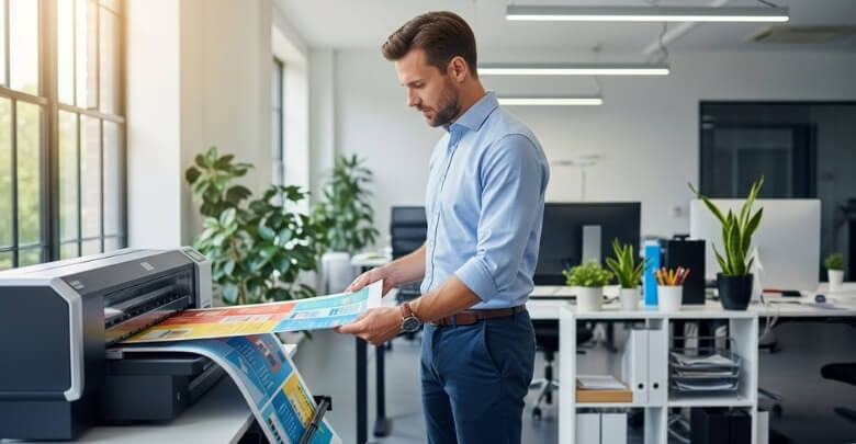
Choose the Right Printing Material
Posters are usually printed on paper or fabric. The paper gives crisp visuals but needs a poster tube, while the fabric folds into luggage easily and is travel-friendly. Consider your journey, costs, and display needs before deciding, since the material choice can make presenting far less stressful.
Confirm Poster Dimensions With the Printer
Always check your poster size against both conference requirements and printer settings. A mismatch can ruin formatting or leave your poster unusable. Printers sometimes resize automatically, which may distort visuals. Clear instructions prevent errors and ensure your poster fits perfectly on the display board.
Proof Before the Final Print
Ask for a digital proof or print a reduced version before committing to the final run. This allows you to spot typos, alignment problems, or unexpected color changes. Taking this step saves you from last-minute disappointment and ensures your poster looks exactly as intended.
Print Early to Avoid Delays
Don’t leave printing until the week of your conference. Printing shops often experience backlogs during academic seasons. Printing at least a week in advance gives you time to correct errors and reduces the pressure of last-minute surprises, letting you focus more on presenting confidently.
Use a Poster Tube or Carrying Case
If your poster is printed on paper, protect it with a durable poster tube. Some tubes have shoulder straps for easy carrying. For fabric, a flat case or your luggage works fine. Protecting your poster properly prevents damage and ensures a professional appearance on arrival.
Pack a Backup Copy
Problems like damaged posters or lost luggage can happen. Printing a smaller backup version or carrying a high-resolution digital copy is a smart move. If something goes wrong, you’ll still have material to present and can engage attendees without missing your chance to share your work.
Check Transport Restrictions
Airlines often count poster tubes as extra carry-ons, and size limits vary. Check restrictions in advance to avoid awkward surprises at the airport. Knowing whether your poster fits in overhead compartments or luggage ensures smoother travel and helps prevent issues during check-in.
Arrive Early to Mount Your Poster
On presentation day, show up ahead of schedule to find your assigned space and mount your poster securely. Bring extra pins, clips, or Velcro in case supplies run short. Arriving early ensures your poster is displayed neatly and gives you confidence before attendees arrive.
Frequently Asked Questions
Presenting a poster at a conference is exciting but can also feel overwhelming, especially if it’s your first time. To help you feel more prepared, here are answers to some of the most common questions about creating, printing, and presenting a poster effectively at conferences.
How Early Should I Start Designing My Poster?
It’s best to start planning at least four to six weeks before the conference. This gives you enough time to refine your content, review the layout, and handle printing without stress. Starting early also allows space for feedback and unexpected adjustments.
What Size Should My Conference Poster Be?
Most conferences specify poster dimensions in their guidelines, often A0 (33×47 inches) or similar. Always follow the exact size required to ensure your poster fits the display boards. Confirming size early avoids last-minute resizing problems and ensures your poster looks professional.
Can I Use Templates for My Poster?
Yes, many universities and organizations provide poster templates in PowerPoint or design software. Templates save time and ensure a professional structure. However, don’t rely on them blindly — adjust the design to match your content and follow conference-specific requirements for fonts, sizes, and logos.
Should I Print on Paper or Fabric?
Paper prints provide sharp visuals and vibrant colors, but they require carrying a tube. Fabric posters fold into luggage, making them easier to transport, though the colors may appear slightly softer. Your choice depends on travel needs, costs, and the display setting at the conference.
How Much Text Should My Poster Include?
Keep text to the essentials. Use short bullet points, simple headings, and concise summaries instead of long paragraphs. Aim for no more than 800–1,000 words in total, supported by visuals. A good rule: attendees should understand your poster’s main point in under two minutes.
How Do I Prepare for Questions During My Session?
Anticipate the most common questions about your methods, results, and implications. Prepare clear, concise answers and practice with colleagues beforehand. Having responses ready shows confidence and helps you engage more naturally with attendees. It also turns questions into opportunities to highlight the value of your work.
Do I Need to Stay by My Poster the Entire Time?
Yes, during your assigned session, you should remain by your poster to engage with visitors, answer questions, and network. Attendees often want to talk directly with the presenter. Being present ensures your hard work gets noticed and maximizes the impact of your poster.
What Should I Bring on Presentation Day?
Bring your poster, mounting supplies (pins, Velcro, clips), and backups like a digital copy or smaller print. Handouts, business cards, or a QR code linking to your work are also useful. These extras make it easy for attendees to remember and follow up with you afterward.
Conclusive Words
Creating a strong poster isn’t just about design — it’s about communicating your work clearly and engaging with others in a professional setting. The process may feel overwhelming at first, but breaking it into steps makes it manageable and rewarding.
If you’ve ever wondered how to prepare a poster for a conference, the answer lies in careful planning, clear text, balanced visuals, and being ready to present with confidence. From choosing the right topic to handling printing and transport, every detail contributes to the final impression you leave.
Ultimately, a well-prepared poster helps you share your ideas, connect with peers, and make the most of your conference experience. Take these tips forward and approach your next poster session with confidence and clarity.

