Conference posters are everywhere at big events, catching eyes with their bold colors and clear layouts. These posters show off ideas in a way that’s quick to read and easy to understand. If you have ever walked through a row of displays, you might already be thinking about how to make your own poster stand out—and you may have the thought in your mind: how to poster layout for conference?
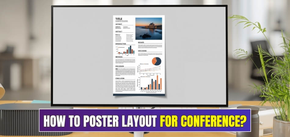
To create a strong conference poster layout, organize your content with a clear title at the top, sections for introduction, methods, results, and conclusion. Keep the design balanced with space between sections, stick to a simple color theme, and always check the event’s size and layout rules. This helps your message stay clear and your poster looks professional.
Do you want to know more about planning your own poster, or wonder what details matter the most? If you’re curious, keep reading this article, because you’ll find every important point you need to make a strong, eye-catching conference poster from start to finish.
How to Poster Layout for Conference?
Looking at all the posters at a conference can feel exciting and confusing. There are so many ways to share your message and catch someone’s eye. A smart layout helps people quickly understand what your poster is about. Read on to learn some easy steps for making your poster stand out.
Keep the Title Clear
Your poster needs a title that can catch attention from across the room. Use short and easy words so people know your topic right away. Big, bold letters at the top work best for drawing in viewers. People will want to stop and read more if the title is clear. For those planning to join any upcoming conferences in Canada or any other country, a great title helps a lot.
Organize Your Sections
Readers find posters easier to understand when the information flows in order. Try putting your introduction, methods, results, and conclusion in separate areas. Use short paragraphs or bullet points so no one gets lost. Clearly marked sections help people move from one idea to the next quickly. They’ll remember your main point if your layout is neat and organized.
Make Text Easy to Read
People should be able to read your poster from a few steps away. Use plain fonts like Arial or Calibri, and pick a font size that stands out. Black letters on a light background work best for clear reading. Don’t crowd the words—leave space between each line and section. Everyone will appreciate a poster that’s simple, clean, and easy on their eyes.
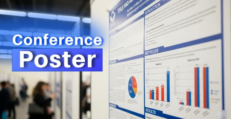
Use Helpful Visuals
Good visuals help your audience understand your work much faster. Charts, images, or diagrams placed near matching text are always a good idea. Each visual should have a short caption to explain what it means. Try to keep all your pictures clear and large enough for people to see. Never let your visuals cover your message or hide important parts of your poster.
Balance the Layout
A poster that feels balanced is much more comfortable for people to read. Spread your sections and visuals evenly across the space you have. Keeping columns straight and margins the same on each side looks best. When everything fits neatly, your information is easy to follow. Try not to let one area feel crowded while another part feels empty.
Stick to a Theme
Matching colors and styles can make your poster look professional and clean. Soft colors like blue, green, or grey help people focus on your words. Try not to use too many colors or decorations, as that can distract your viewers. Pick one or two main colors and use them in your charts, lines, and headings. A simple theme always leaves a better impression.
Follow the Rules

Checking the event’s poster rules before starting can save you lots of trouble later. Some conferences want posters in a tall style, others like them wide. There may be rules about how much you can write or what images are allowed. Reading the guidelines early helps you avoid mistakes and saves time. Your hard work will be noticed if you follow all the requirements.
A good poster makes your ideas easy for others to see and remember. You can use these steps to make a poster that really stands out. Don’t forget to keep your design clean and your message clear every time. Your poster might be the one that everyone remembers after the event.
What Are the Standard Dimensions for Academic Conference Posters?
Choosing the right size for your conference poster is super important. It helps your content look neat, easy to read, and professional. Here are the most common poster dimensions you should know before printing or uploading.
Standard Poster Sizes (Printed):
- 48″ × 36″ (122 × 91 cm): Most popular size for research and engineering posters. Lots of space for title, graphs, and key points.
- 36″ × 24″ (91 × 61 cm): A smaller option if your content is short and simple.
- 42″ × 30″ (107 × 76 cm): Another accepted size at many academic events. A good middle ground.
- 42″ × 56″ or 42″ × 72″: Larger sizes used at some venues. Good for more detailed content.
Other Format Options:
- Tri-fold board (48″ × 36″ overall): Comes with three panels. Often seen at school fairs or smaller events.
- Custom sizes: Some labs or poster centers allow widths up to 90″, often starting from 42″ tall.
Digital Poster Sizes (for virtual conferences):
- 1920 × 1080 px (HD, 16:9): Fits most screens and is commonly used online.
- 3840 × 2160 px (4K): Higher quality for sharp details.
- 1600 × 1200 px (4:3): An older format still used by some platforms.
Always check the poster size rules given by the event organizers before you start. Printing the wrong size can cause problems at the venue. If it’s an online event, use the digital size that fits the platform best. Picking the right size helps your poster stand out and keeps things looking professional.
How to Align Your Poster Content With Conference Submission Standards?
Designing a poster isn’t just about adding pictures and colors. Conferences often have clear rules you need to follow. If your content doesn’t match those rules, your poster might be rejected. Keep reading to learn how to meet the right standards easily.

Follow Size Rules
Most conferences clearly mention what size your poster should be. You must check the size, layout direction, and printing format early. Choosing the wrong size can cause display problems on the event day. Make sure everything fits inside the allowed space neatly. Also, avoid cluttered sections by giving each part its own room. If you stay inside the size rules, your poster will be accepted easily.
Keep Things Clear
Readers usually don’t stop to read every single word. That’s why clear, short text works better than large paragraphs. Use bullet points, graphs, and headings to break down the message. Make sure your main idea stands out at a glance. Too much detail or complex words can confuse the viewer quickly. A simple layout helps your audience understand your point without any trouble.
Use Proper Fonts
People won’t read your poster if the text is too small. Pick basic fonts like Arial or Times New Roman to keep it clean. Your title should be large enough to see from a distance. The rest of the content must be readable from a close spot. Don’t mix too many font styles, as that makes it messy. When the text looks simple and clean, people will read more.
Stick to the Theme
Conferences are planned around a specific subject or research focus. You need to match your poster with the main topic closely. Adding off-topic information can confuse readers and lower your chances. When planning your layout, make sure the content aligns with academic expectations, especially if it may be included in official materials. This also connects to the importance of conference proceedings, where well-structured posters can leave a lasting academic impression.
Check Submission Details
Conference organizers usually provide a list of final submission instructions. These can include file format, size limits, print deadlines, or upload steps. Missing any of these small details might result in a rejected poster. Always go through everything carefully before the deadline hits. Save extra time to check and correct anything that seems off. A careful review can save you from last-minute problems or disapproval.
Always follow the rules to make your poster look more professional. A strong layout shows your work in the best possible way. Clear sections and the right fonts make reading much easier. If everything fits the rules, your chances of success are much better.
How to Choose Fonts and Colors for a Readable Poster Layout?
Making your poster easy to read is just as important as what you put on it. Fonts and colors might seem small, but they play a big role in how people see your work. If you want your poster to stand out for the right reasons, getting these parts right is a must. Let’s break it down step by step.
Pick Simple Fonts
Stick with fonts that are clear and easy to read from a distance. Fonts like Arial, Calibri, or Helvetica work well because they have clean lines. Avoid fancy or curly fonts that might look cool but are hard to read. Use bold styles for headings and regular for the rest. Keep font styles the same across your poster to make it look neat and consistent.
Set the Right Size
Font size matters more than most people think. Headings should be big enough to grab attention, usually around 72 pt or more. Subheadings can be a bit smaller, while regular text should be at least 24 pt. If it’s too small, people won’t stop to read it. Make sure everything is readable, even if someone is standing a few feet away.

Use Light Backgrounds
Choose background colors that won’t make your text hard to see. Light backgrounds like white, cream, or pale blue are usually best. They make dark text pop and keep everything easy on the eyes. Try not to use bright or flashy backgrounds—they can be distracting. Always test how the colors look together before printing your poster.
Choose High Contrast
The text and background should have a strong contrast so your words don’t blend in. Black text on a white background is the most readable, but dark blue or deep gray also works. Don’t use colors that are too close in shade, like red on orange. When the contrast is right, your poster is easier to read from anywhere in the room.
Stay Consistent
Using the same font type, size, and colors across your poster helps it look more put-together. Changing styles too often can confuse people or make your poster look messy. Keep a pattern: same font for all headings, same size for all body text, and the same background throughout. This keeps everything clean and easy to follow.
Fonts and colors may seem like small details, but they decide whether someone reads your poster or walks past it. Clear fonts and smart color choices make your work look neat and easy to understand. Keep things simple, and test everything before the final print. A well-designed layout always makes a better impression.
Where Should You Place Your Research Title and Author Info?
Knowing where to put your title and author information is important to help people find them quickly. Their placement guides viewers’ eyes naturally and makes your poster look tidy and well-organized. Let’s look at some simple tips about the best spots to place these key details.
- Title at Top Center: Place your research title across the top center of your poster. This is the first place people look when they approach.
- Author Info Below Title: Position the author names just below the title, aligned with it, so people can easily see who did the work.
- Institution Near Authors: Put the institution or organization names right below or next to the author names, keeping them close together.
- Leave Margin Space: Keep some blank space around the title and author area at the top to make them stand out and avoid clutter.
- Avoid Side or Bottom: Don’t place the title or author info on the sides or bottom because viewers might miss these important details.
- Center Alignment Works Best: Center-aligning these details at the top helps balance the layout and draws immediate attention.
- Contact Details Placement: If you add contact info, place it near the author info, but keep it smaller and less bold than the title.
Placing your title and author info clearly at the top center of the poster helps viewers spot them right away. A neat and balanced layout guides eyes smoothly, making your research easy to find and understand. Good placement gives your poster a professional touch.
What Sections Should Every Conference Poster Include?
Posters are a simple way to share your research or ideas at conferences. Each section you include helps others follow your work from start to finish. Good structure can make a big difference. Take a look at what every poster should have below.
Title and Authors
Your poster’s title and your or your team’s names should be at the top. This makes it easy for people to know who created the work and what topic you are talking about right away. Short, simple titles catch attention fast. Listing your school or organization under your name is also helpful. Make this part easy to see, because it is the first thing everyone notices.
Introduction
The purpose of your research or project should be clear to your audience. Keep your introduction short and to the point, but make sure it gives enough background. Give a little detail so people can see why your topic matters. If someone is new to your subject, the introduction makes them interested in learning more. Always make this section clear and simple to read.
Methods
People like to know how you did your research or built your project. In this section, explain the steps you took or the materials you used. Clear lists or short sentences work best here, especially if there are many parts. If you’re creating a poster for an engineering conference, describing methods and processes is really important. This section helps others understand exactly how you reached your results.
Results
Sharing your results helps people see what you discovered from your work. Tables, graphs, or pictures are great for making your results easy to understand. Be sure to keep explanations short, focusing on the most important findings. Do not add too much detail here—save that for a longer report. People are interested in your big discoveries and what they mean for your topic.
Conclusion
Summarize what you learned or proved with your research at the end. This section should be clear and not too long. Mention what your findings mean and if they could help others. It is also a good spot to suggest what could be done next or if there are new questions to answer. Your conclusion leaves people with a final thought about your work.
A well-organized poster makes your work easy to follow for everyone. Each section plays its own role and helps people understand your ideas. Remember to keep it neat, simple, and interesting. Try using these sections in your next poster!
Commonly Asked Questions
Even after planning your poster layout, a few common questions can come up. These answers cover extra tips that weren’t explained earlier but are still important for a great poster. If you’re getting ready for a conference, these quick answers can help you feel more prepared. Take a look and get the help you need below.
How Much White Space Should a Poster Have?
White space is the empty area between sections or around text and images. You should leave enough space so that your poster doesn’t look crowded. White space makes your content easier to read and more comfortable to look at. Try not to fill every corner—clean and open space keeps things neat.
Can I Use QR Codes on a Poster?
Yes, adding a QR code can be a smart idea. It lets people scan and visit your website, report, or video. Just make sure the code is large enough to scan easily. Put it in the bottom corner where it doesn’t distract from your main content.
What File Type Should I Use When Printing a Poster?
The best file type for printing is usually a PDF or a high-quality PNG. These file types keep the text sharp and the images clear. Before saving your file, check the printer’s settings or the event’s printing rules. A poor file type might make your poster look blurry when printed.
Should I Add Contact Information on My Poster?
Including contact details is a great idea if someone wants to reach you later. You can add your email or a link to your profile at the bottom. Keep the font small but easy to read. It’s a simple way to let people ask questions after the event.
How Many Visuals Are Too Many for One Poster?
You should only add visuals that help explain your topic. If you use too many, your poster might feel messy and hard to follow. Try using two or three strong visuals, like graphs or photos. Each one should clearly support what your text is saying.
Where Can I Print My Poster for a Conference?
Most schools, colleges, or local print shops offer poster printing. Some online services also let you upload your file and deliver the poster. Always print it a few days early to avoid delays. Make sure to check the size and paper quality before printing.
Can I Use Bright Colors to Make My Poster Pop?
Bright colors can help your poster stand out, but don’t use too many. One or two bright shades are fine, as long as your text is still easy to read. Too many bold colors can be distracting and hurt your layout. Soft background colors work better with dark text.
Is It Okay to Use a Template for My Poster?
Yes, using a template can save time and help you stay organized. Many websites and schools offer free poster templates in PowerPoint or PDF. Just make sure the template matches your content and layout needs. Change the colors and text to fit your topic clearly.
Can I Include a Short Video on My Digital Poster?
If your conference allows digital posters, you can include a short video. Keep it under one minute and make sure it plays without needing extra tools. Use the video to explain your results or show your work in action. Just place it where it won’t distract from the main points.
How Can I Practice Presenting My Poster?
Stand near your poster and explain each section like you’re telling a story. Use short and simple words, and don’t read directly from the text. Try practicing with a friend to see if they understand your points. This helps you feel more confident when talking to others at the event.
Last Words
Creating a clear and eye-catching poster makes sharing your research easier and more effective. When you organize your sections, choose the right sizes, and use simple fonts and colors, your message becomes easy to follow. So, how to poster layout for conference? By keeping things clean, balanced, and readable.
Remember to leave enough space, use clear headings, and check the event’s rules before printing. Don’t overcrowd your poster with too much text or too many images. Keep your message simple and focused, and your poster will catch attention for all the right reasons. Best of luck with your presentation!

