Posters at engineering conferences grab attention with their clean visuals, sharp ideas, and simple layouts. These posters aren’t just displays; they help explain real projects in a way that’s easy to follow. You might be thinking about how to make poster for engineering conference?
Create an engineering poster by focusing on one clear idea. Use a simple layout with big titles and helpful images. Keep your text short, use clean colors, and check the poster size. A well-organized poster helps people understand your work quickly.
If this topic feels important to you, you’re not alone. Many people want their posters to look good and explain their ideas clearly. This article covers everything you need to know from layout to visuals, so keep reading to get all the important tips.
How to Make Poster for Engineering Conference?
Designing a poster for an engineering conference isn’t just about adding text and images. It’s about sharing your idea in a way that’s easy to follow and visually appealing. Want to get it just right? Let’s break it down step by step.
Pick a Clear Topic
Start by choosing one main idea to focus on. Whether it’s a design, a solution, or an experimental result, keep it simple. Don’t try to explain everything in one go. A poster works best when it highlights just one concept clearly. This helps people understand your message quickly and keeps your poster from feeling crowded or confusing as they walk by.
Choose the Right Layout
Sketch out how your poster should look before making it. Use a three or four-block title at the top, visuals in the middle, and text beside or below them. This setup guides the viewer’s eyes in a smooth direction. If you’re planning for upcoming conferences in Canada or any other country, it’s a good idea to check their layout rules in advance so you don’t miss any important details.
Use Simple Words
Make sure your poster uses words that anyone can understand. Don’t use complex terms or long explanations. Instead, go for short sentences, clear headings, and even bullet points when needed. Think about what someone would see if they only had 10 seconds to read your work. Keep it direct and make your main message easy to catch right away.
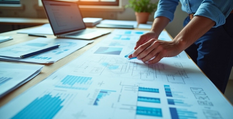
Add Useful Images
A few clear pictures can make your poster stand out more than long paragraphs. If you’ve built or tested something, show it. Use labels or arrows to explain each image so it adds meaning. Avoid adding too many visuals—just pick the ones that support your idea the most. Make sure they’re not blurry, and print them in high quality so they look sharp on the board.
Pick Bold Titles
Your title should grab attention from across the room. Use a clean font that’s easy to read, and make it big enough to stand out. Break your content into smaller sections with clear, bold headers. This helps viewers know where to start and where to look next. It also makes your poster feel more organized and easier to follow.
Keep It Colorful
Colors can make your poster look great, but don’t overdo it. Stick to two or three colors that go well together. Use one color for your main headings and another for your background or highlights. Always check that the text stands out clearly from the background. A good color balance makes your poster more attractive and easier to read at the same time.
Include Your Info
Don’t forget to add your name and contact details. Place them in a small box at the bottom or top corner. If your work is part of a group or supported by a school or company, include their logo too. This makes it easier for others to remember who made the poster and how to get in touch if they want to learn more.
Add a Short Summary
Your poster should conclude with two or three lines summarizing your entire project. This is helpful for people who only have time to skim through. Your summary should be simple and focus only on the most important points. No need to repeat all the details—just highlight the idea and what makes it useful or interesting.
Check the Size
Before printing your final poster, always make sure it meets the size rules given by the event. A common size is 48×36 inches in landscape layout, but it can change depending on the place. If your poster is too big or too small, it might not fit the board. Checking early helps avoid last-minute problems on the event day.
Making a good poster is all about keeping things clear and simple. You don’t need fancy words or too many pictures—just focus on one strong idea. A clean layout and easy text can make a big difference. Take your time, and your poster will speak for itself.
What Size Should an Engineering Conference Poster Be?

Making a poster for an engineering conference isn’t just about what you say; it’s also about how it looks. Size plays a big role in grabbing attention. A good poster should be easy to read from a short distance. Before you start designing, it’s smart to learn which sizes are commonly used and why they matter.
- Most Popular Size: 48×36 inches is used the most in engineering events because it fits nicely on standard boards and gives enough space for clear visuals.
- Smaller Option: 36×24 inches works well when there’s not much room or when your content is short and easy to explain without too many visuals.
- Alternative Size: 42×30 inches is another size you might see, especially when posters are placed on taller stands or narrow wall spaces.
- Big Format Choices: Some special events or research labs suggest sizes like 42×56 or 41×41 inches, which are less common but still used in select cases.
- International Size (A0): A0 (84×119 cm) is often used in global or European conferences. It’s large enough for charts, images, and readable text.
- Portrait or Landscape: Most posters are landscape unless the event asks for a portrait. Landscape fits more graphs and helps people read from left to right.
- Virtual Poster Sizes: If your event is online, common screen-friendly formats include 1920×1080 pixels or 3840×2160 pixels for sharper, wider displays.
The right poster size helps people focus on your work without feeling overwhelmed. It also shows you’ve prepared well and followed the event rules. Bigger isn’t always better—what matters is how clearly everything is shown. Pick the format that fits your topic and space best.
What Fonts and Colors Work Best for Engineering Posters?
Choosing the right fonts and colors can make a big difference when you’re designing an engineering poster. These choices affect how easy your poster is to read and how professional it looks. Want to get it just right? Keep reading for simple tips.

Font Style Basics
Stick with clean, simple fonts that are easy to read from a distance. Sans-serif fonts like Arial, Calibri, or Helvetica work great because they don’t have extra strokes on the letters. Avoid using scripts or fancy fonts that can be hard to understand. You can mix one or two fonts at most—one for the title and one for the body. That helps things stay neat and not confusing.
Font Size Tips
Your title should stand out, so make it big—around 72 points or more. Subheadings can be around 36 to 48 points, while your main text should be about 24 to 30 points. These sizes make sure people can read your poster even from a short distance. If the text is too small, people will skip it. Always test it out by stepping back.
Smart Color Choices
Pick colors that go well together without hurting the eyes. Light backgrounds with dark text (like white and black) are safe and clear. You can also use navy blue, dark green, or gray for a calmer look. Avoid super bright backgrounds like neon yellow or pink. They might look fun, but they can make text hard to read. Always aim for contrast.
Highlighting with Color
Use color to draw attention, but don’t overdo it. You can add color to headings, boxes, or important keywords. Choose just two or three colors and use them the same way across your poster. This helps everything feel balanced. If everything is too colorful, it becomes messy and confusing. A bit of color in the right spots can really help your message stand out.
Keeping Things Balanced
Don’t crowd the poster with too much text or too many colors. Leave space between sections so your content can breathe. Use the same font style and colors all the way through to keep things neat. If something feels out of place, it probably is. Step back, look at the full layout, and adjust as needed to keep everything easy to follow.
That’s the simple breakdown to help you choose the best fonts and colors for your engineering poster. These small design choices can make your work clear, sharp, and easy to understand. Always test your poster from a distance to see if everything stands out well. A clean design with smart color use can leave a strong impression on anyone who sees it.
Should You Include Graphs and Technical Diagrams in Your Poster?
Adding graphs and technical diagrams to your poster can make your ideas easier to understand. People often understand information faster when they see it in a visual format. A simple chart, graph, or image can quickly show trends, results, or designs that take longer to explain in words. Just make sure the visuals match your topic and support your message clearly.
Use technical drawings or schematics when you need to show how something works or fits together. These diagrams are useful for explaining machines, systems, or design parts that are hard to describe in plain text. Keep the drawings clear, labeled, and not too crowded. Always check that the size is readable and nothing looks confusing or too small.
Too many visuals can make your poster look messy and hard to follow. Try not to place too many graphs or diagrams close together. Leave space around each image so it’s easy on the eyes. Only include visuals that add real value to your explanation. A clean layout makes your poster look more professional and easier to read.
What Types of Visuals Work Best for Engineering Conference Posters?
Posters aren’t just for showing off your work; they help explain your idea quickly and clearly. In places like tech expos or engineering conferences, the visuals you choose can either pull people in or push them away. Let’s break down what works best.
CAD Renderings
These are helpful when your project involves machines or physical parts. CAD images show depth, shapes, and how everything fits together. They give people a real sense of what your design might look like in real life. Use a clean angle, no cluttered backgrounds, and label important parts. This type of visual makes a strong impression, especially when your work is technical and needs precise shape and size.
Technical Diagrams
Many conferences aim to provide people with a quick and clear idea they can grasp within seconds. A technical diagram is perfect when you need to explain systems, steps, or how parts connect. Use arrows, blocks, or callouts to show what goes where. That’s why paying attention to poster layout for conference settings is just as important as choosing the right visuals. A well-organized layout ensures your audience can follow your work without confusion.
Blueprints
If your idea involves tools, buildings, or physical spaces, blueprints are essential. They help viewers understand the measurements and how different sections fit together. Make sure the lines are sharp and the labels are easy to read. Keep extra text to the side so the blueprint stays clean. Use bold or colored lines for important areas so they stand out from the rest.
Flowcharts
Ideas that go through steps or choices work well with flowcharts. These charts break everything into boxes and arrows, making it easy to see what happens first and what comes next. Try not to add too many branches. Stick to your main path and keep each part short. This helps anyone scanning your poster quickly understand your full process without needing to ask questions.
Schematics
You’re best off using schematics if you’re working on electronics. They turn complex circuit details into a simple drawing with symbols. Use clear lines and make sure each part is labeled. Don’t try to show the full system—just highlight the area that fits your poster’s main idea. People will understand your concept faster when the drawing points directly to what matters most.
The right visuals make your poster easier to understand and more interesting to look at. Keep it clean, use the type of image that fits your project best, and let your work speak for itself.
How to Present Complex Engineering Concepts Simply in a Poster?
Posters work best when they break down hard ideas into simple visuals and easy-to-read points. If something looks confusing, people might skip it altogether. That’s why layout, word choice, and design all matter a lot. Want to know how to make your poster simple but effective? Keep reading these quick tips below.
Use Simple Words
It’s better to avoid long or confusing words when you’re explaining technical ideas. Replace hard terms with basic ones that still carry the right meaning. If a term must be used, add a quick definition beside it. Think of how you’d explain your topic to someone new. This makes your poster more welcoming and easier to understand for everyone passing by.
Keep Text Short
Posters aren’t made for long reading. Keep your sentences short and to the point. Use short paragraphs, and don’t crowd the space with blocks of text. It helps if you highlight keywords or bold important terms. One helpful reference is how researchers make a successful scientific poster, focusing on clarity, hierarchy, and minimal text. Applying similar techniques can make your engineering poster more engaging and easier to understand.
Use Icons and Visuals
People understand things faster when they see pictures. Icons, arrows, and charts can do a lot of the explaining for you. Instead of describing a process in ten lines, a simple diagram could show it better. Just make sure the images clearly match the idea. Keep everything labeled so no one gets confused while looking at it.
Add Bullet Points
Large blocks of text make people lose interest fast. Bullet points help you break your content into smaller chunks that are easy to scan. Try using one idea per bullet, and keep each one between 8 to 12 words. This keeps the flow clean and also makes it easier for your readers to remember the main takeaways.

Show One Idea
Posters get too crowded when too many ideas are placed together. Choose your main idea and stick to it. If you try to explain everything at once, people might not understand anything. Focus on one concept and build everything around it—your title, visuals, and key points. This keeps your message clear and avoids confusion.
Keeping things simple takes a bit of planning, but it always pays off. A clear and neat poster helps people understand your idea quickly. Avoid overloading it with too much text or too many visuals. Stick to one main message, and let your work speak confidently on its own.
What Are Common Mistakes in Engineering Poster Design?
Making a poster for an engineering event takes more than just adding facts and numbers. Design choices matter a lot, especially if you want people to stop and read your work. A few simple mistakes can ruin a great idea.
- Overcrowded Layout: Trying to fit too much in one space makes it hard for people to know where to look or what to read first.
- Tiny Font Sizes: If the text is too small, people will walk past without even trying to read what you’ve written.
- Unclear Titles: A vague or confusing title won’t grab attention. People need to know what your topic is about right away.
- Too Much Jargon: Using too many hard technical words can confuse people. Simple, clear words make your ideas more understandable.
- Poor Color Choices: Colors that clash or make text hard to see will turn readers away. High contrast always helps with readability.
- No Visual Balance: A poster that feels lopsided or crowded on one side makes it uncomfortable to look at for long.
- Missing Key Sections: Leaving out basics like an introduction or results makes the poster feel incomplete and less engaging.
Avoiding these mistakes helps your poster look clear, smart, and easy to follow. When everything fits well, people are more likely to stop, read, and remember your work.
Tips for Adding Technical References Without Cluttering the Layout
Adding technical references to your posters shows that you base your work on facts. But if you don’t place them well, they can make your layout messy. Want to include references neatly without taking up too much space? Let’s break it down.
Keep It Small
Place your references in a smaller font size, usually at the bottom of the poster. This way, they won’t steal attention from your main points. Just make sure the text is still easy to read. Around 12 to 16 points is usually fine for this part. Keeping them in one area helps your layout stay clean.
Use Number Tags
Instead of writing full reference details in the middle of your content, just use small numbers like [1] or (1). These act like quiet signals. Then, match these numbers with full details in the bottom section. This trick saves space and keeps everything neat and tidy.
Choose a Clear Font
Use a simple, clean font like Arial or Calibri for your references. Avoid cursive or artistic fonts—they look cool but are hard to read in small sizes. Sticking with the same font style throughout your poster also helps everything feel more organized and easier on the eyes.
Limit the Count
Only include the most important sources. A long list makes your poster look too busy. Pick around 3 to 5 solid references that really support your work. If you have more, consider showing them in a handout or link. Less is better when space is limited.
Set a Clean Section
Make a small boxed area or draw a soft line to separate the references. This creates a space just for citations without distracting from the rest of your visuals. People can find your sources easily, and your layout stays focused on the main message.
Using smart design for references keeps your poster clean and professional. A clear layout helps your main points stay in focus without being pushed aside. Readers should find your sources easily, not search around for them. With a neat setup, your work looks more polished and easier to follow.
Commonly Asked Questions
Once you’ve learned the basics of poster design, it’s normal to still have a few more questions in mind. Whether you’re confused about what tools to use or unsure about printing, these extra tips can help. Below are some frequently asked questions that cover important things many people forget. Go through each one to make sure you’re fully ready for your next engineering conference.
How Do I Choose the Right Software to Make My Poster?
You can use programs like PowerPoint, Canva, or Adobe Illustrator. PowerPoint is easy to use and great for beginners. Canva offers ready-made templates that you can customize. Adobe Illustrator is best for more advanced designs, but it may take more time to learn.
What File Format Should I Use to Print the Poster?
Most printing centers ask for PDF files. Saving your poster as a PDF keeps your layout and fonts safe. It also prevents any changes when it’s opened on another computer. Always double-check the print shop’s rules before saving.
Where Should I Print My Poster?
You can print your poster at a local print shop or a university printing service. Make sure they offer large-format printing. Call ahead to ask about the paper size they support. It’s a good idea to visit in person and review a sample before printing.
How Can I Check If My Poster Is Easy to Read?
Step back a few feet and read your poster from a distance. If you can read the title and main points easily, it’s good. Ask a friend to look at it and share what they understand. This helps you know what to fix before final printing.
Can I Use Animation or Videos in My Poster?
For in-person posters, videos, or animations don’t work. But if your conference is online, you can include short video links or GIFs. Just make sure they’re not too long or distracting. Use them only if they help explain something better.
What Should I Do If My Poster Gets Damaged Before the Event?
Try to keep a backup PDF file with you. If your printed poster gets damaged, you can print another one quickly. Also, keep your poster in a cardboard tube or folder to protect it during travel. It’s always better to be prepared for last-minute issues.
How Do I Transport a Large Poster Safely?
Use a poster tube with caps to carry it. These tubes protect the poster from getting bent or torn. Some tubes even have straps, so you can carry them on your shoulder. Always roll your poster gently and keep the printed side facing out.
Should I Make a Digital Version of My Poster?
Yes, it’s a smart idea to create a digital copy. Many conferences now ask for both printed and online versions. You can email it, share it by link, or show it during a virtual session. A digital copy also helps if someone asks for your work later.
Is It Okay to Add a QR Code to My Poster?
Yes, QR codes are useful for sharing extra info. You can link it to your report, video, or website. Place it in a corner so it doesn’t block your main message. Make sure it’s big enough to scan easily.
What Should I Wear When Presenting My Poster?
Wear something clean and professional. You don’t need a suit, but look neat and tidy. Choose clothes that make you feel comfortable and confident. This helps you focus on speaking and answering questions.
Final Words
Creating an effective poster means making smart choices with words, layout, and visuals. If you’ve been wondering how to make poster for engineering conference, the answer is simple: focus on one idea, keep things neat, and use clear visuals and text that are easy to read from a short distance.
Before you print your final poster, double-check the size, colors, and fonts. Don’t forget to add your name and a short summary at the end. Keep it simple, avoid overloading with info, and most importantly, believe in your work. Good luck with your conference poster!

