Posters at electrical engineering conferences are more than just paper with diagrams they show off ideas, results, and smart systems in a quick and clear way. If you’ve been thinking about how to share your project visually, you might already be wondering how to make poster for an electrical engineering conference?
Make an electrical engineering poster by choosing one clear idea. Use a neat layout, short text, and clean visuals. Add circuit diagrams or test results with labels. Pick simple fonts, soft colors, and double-check your size and spelling before printing.
Curious to learn how to organize everything and make it look neat? Keep reading—you’ll find every useful step, from the first layout sketch to printing tips, all in one place right here in this article.
How to Make Poster for an Electrical Engineering Conference?
Creating posters helps share big ideas through simple visuals. If you’re preparing for an engineering event, designing your own poster is a great place to start. Scroll down and follow each step carefully to create yours.
Step One: Know Your Topic
Start by picking one clear idea. Think about the most important thing you want others to learn from your poster. This could be a working model, a new solution, or a small test. Avoid including too many things at once. A focused idea is easier to explain and much easier for others to understand when they walk by your poster at an event.
Step Two: Sketch Your Layout
Once your topic is set, sketch your poster on paper. Use a simple layout with three or four columns. Place the title on top, images or diagrams in the middle, and text sections below or beside them. A left-to-right order usually works well. This draft helps you decide where everything should go before using design tools. Keep things neat and avoid filling every space.
Step Three: Set the Poster Size
Before starting digital work, check what size is allowed at the event. A popular size is 48×36 inches, landscape format. Use clear margins on all sides. If the event is online, find out the required screen size. These details are often listed on the conference’s website or instructions page. Staying within the correct size makes your poster look professional and ready for display.
Step Four: Write Clear Text
Now, write your content using short and simple sentences. Break information into small chunks using bullet points when needed. Avoid using difficult words or long blocks of text. Make your content easy to read quickly. Use bold for section titles. This is especially helpful when presenting at big events like some of the upcoming conferences in Canada or any other country, where people only have a few moments to glance at your work.
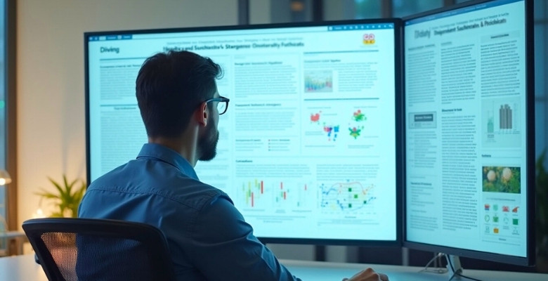
Step Five: Add Good Visuals
Use images, graphs, or circuit diagrams to show your idea. Choose visuals that match your topic and help people understand better. Every picture should have a short label or explanation. If you include a photo of your project, make sure it’s clear and bright. Try not to fill your poster with too many images. Just pick the most useful ones that explain your work well.
Step Six: Choose Simple Fonts
Pick clean and readable fonts like Arial or Calibri. Your title should be big and bold. Section headings should be a bit smaller. Body text should be large enough to read from 3 to 5 feet away. Don’t use more than two font styles across your whole poster. Also, avoid script or fancy fonts—they might look cool, but are hard to read on posters.
Step Seven: Select Colors That Work
Go for 2 or 3 matching colors. A white or light background with black or dark text works best. Use bright colors only to highlight important parts like titles or graphs. Stay away from very bright colors like neon green or red. They may hurt the eyes or make the poster look unprofessional. Stick with colors that are clean, calm, and easy to read.
Step Eight: Add Your Details
Include your name, school or organization, and email address. Place this info near the title or in a corner at the bottom. If your school has a logo, add it in one corner of the poster. These small things show that your poster is complete and made with care. If you worked with others, make sure to include all names and give credit properly.
Step Nine: Final Check
Before printing or uploading your poster, go through it carefully. Check for spelling mistakes, missing labels, or unclear images. It’s also smart to show your poster to someone else for feedback. They might spot something you missed. Once you’re happy with everything, save your file in high quality (PDF is best), and follow the instructions given by the conference for submission.
Making a poster may seem tricky at first, but once you follow each step, it becomes much easier. Keep your ideas simple, your layout clean, and your message clear. Focus on what really matters and skip anything extra. A well-made poster can speak for you even when you’re not standing next to it.
What Size and Dimensions Are Ideal for Electrical Engineering Posters?

During engineering conferences, posters help you show off your work in a clear and visual way. Especially in electrical engineering topics, it is important that everything fits neatly and is easy to follow. A good poster size helps you stand out without looking messy or crowded. Keep reading to make sure your poster catches eyes.
- The most common poster size at engineering events is 48×36 inches, which gives enough space to include text, charts, and diagrams without feeling cramped.
- Some venues might ask for 36×24-inch posters, which are smaller and better for limited display spaces or smaller research presentations at technical events.
- Always read the event’s poster guidelines carefully, as some conferences give specific size requirements depending on the board space or layout of the venue.
- Choose a landscape orientation if you want a wide layout to spread out sections clearly, or use portrait if space is tall and narrow.
- If you’re not sure, ask the event organizer early. They usually provide a poster template or tell you what size most participants will use.
- Use a digital design tool that lets you set custom dimensions, so your poster matches the size exactly and nothing gets cut when printed.
- Leave at least a half-inch margin on all sides, so no content gets trimmed off during printing or mounting on the poster board.
Choosing the right size might seem like a small thing, but it plays a big role in how your poster is seen. A clear layout can help people understand your work faster. It also makes sure you don’t run into printing or setup problems. So, take the time to plan your size before you design.
How to Structure Technical Content in Your Conference Poster?
Posters aren’t just pieces of paper filled with text—they’re visual tools that help explain your technical ideas quickly. A good structure can turn complex information into something clear and easy to follow. Let’s look at how to do it right.
Keep Your Message Clear
Start by deciding what your main message is. Instead of writing long blocks of text, try to explain your methods and results in simple chunks. Break your project into parts like background, method, result, and conclusion so people can follow step by step. Add short titles above each section to guide their eyes. This basic structure works well for any topic, especially for making a poster for a computer engineering conference, where technical flow and precision really matter.
Use Space Wisely
You don’t need to fill every inch of the poster. Empty space, also called white space, helps keep the poster from looking messy. It makes everything easier to read. Try using columns to keep a clean layout. Keep important parts in the middle or top section. When posters feel less crowded, viewers can quickly find the sections that matter most without feeling lost or confused.
Add Simple Visuals
Some parts of your work may be better shown with visuals than words. Diagrams, flowcharts, and tables can help explain your idea faster than a paragraph. Always make sure your visuals are large enough to read from a short distance. Don’t overcrowd them with labels. Use arrows or bold boxes to highlight key steps or actions if needed. This helps the viewer focus on what really matters in your work.
Make Equations Easy
Equations can be tricky if they look too complex. Don’t include every equation from your paper; choose only the ones that really support your results. Use bigger font sizes for any formulas you include. Try to explain the meaning of each part in a short sentence right below. You’re not trying to teach someone math; you’re trying to help them understand what the equation proves in your research.
Show What Matters
Let your key results stand out. Highlight them using bold text, colored boxes, or bigger fonts. Don’t just list all the results—show the one or two that matter most. Add a sentence or two explaining what makes them important. This makes it easier for viewers to get the main idea without reading everything, and keeps the focus on the strongest part of your work.
A well-structured poster doesn’t just share facts—it helps people understand them faster. Keep your layout clean and your message simple. Make sure your visuals and text work together, not against each other. With the right structure, your poster can stand out and make a strong impact.
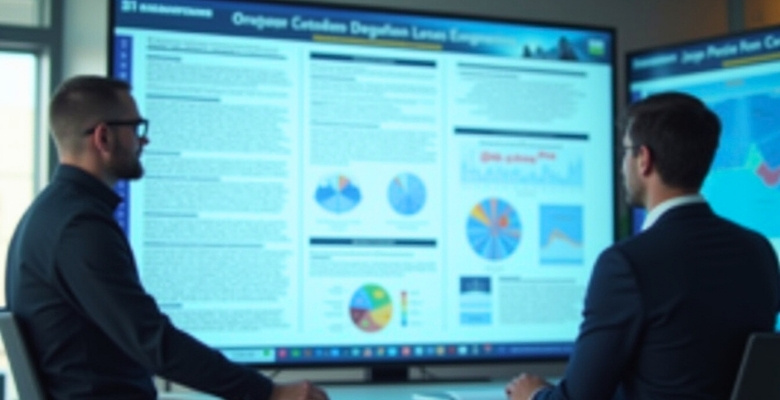
Which Graphs and Circuit Diagrams Work Best in Electrical Posters?
Posters in electrical engineering often use visuals to explain how systems work or how data behaves. Diagrams and graphs can tell a lot without using too many words. To make your poster stronger, explore the tips below.
Circuit Block Diagrams
These diagrams are great for showing the overall layout of a system. Each block stands for a function, like a power supply or an output. Use arrows to show how signals move between blocks. Keep the shapes simple and avoid adding too much detail. When done right, a viewer should understand the system’s flow just by looking at it. Always label each block so it’s easy to follow.
Signal Flow Graphs
Signal flow graphs help show how signals change or pass through a system. Use straight arrows and clear labels for each signal path. These graphs are helpful when you’re working with amplifiers, filters, or controllers. Try to limit the number of branches in one section. That way, people won’t get confused while looking at it. Use different arrow styles to mark signal strength or direction.
Simple Circuit Diagrams
These are best for showing actual wiring and parts like resistors, capacitors, or transistors. Use clean lines and standard symbols to avoid confusion. Make sure all connections are clear and not overlapping too much. Put each section, like power or output, in its own area. A neat diagram makes it easier to understand how your circuit works from start to finish.
Data Line Graphs
Line graphs are perfect for showing how voltage, current, or signal changes over time. Use different colors if you’re comparing more than one line. Label both the horizontal and vertical axes properly. Keep the background plain so the data stands out. Try not to crowd the graph with too much info—pick only the results that really show something important or interesting.
Process Flowcharts
Flowcharts are great for showing steps in a testing process or how a circuit operates over time. Use rectangles for steps, diamonds for decisions, and arrows for flow. Keep the shapes aligned and the layout simple. Don’t use too many steps in one chart. It should feel like reading a short story with a clear beginning and end. This makes your logic easy to follow.
Visuals make posters easier to understand when used correctly. Clean design, simple symbols, and a clear message will help your work stand out. Just remember, less clutter leads to more clarity. Keep it smart and simple.
How to Add References and Data Sources Neatly to an Engineering Poster?
Adding references to an engineering poster might not feel exciting, but it’s an important step. Viewers should know where your data came from and how reliable it is. A clean layout and correct citation format make a big difference. Want to learn how to do it without cluttering your design? Let’s break it down.
Placement Matters
Most posters look neater when references are placed at the bottom right or bottom center. This keeps them out of the way but is still easy to find. Use a smaller font size than the main text, but keep it readable. Make sure spacing is even, and don’t let lines run too close together. Viewers usually glance at this area last, so it’s the perfect spot to list your sources without pulling attention from your main content.
Use IEEE Style
When citing technical references, the IEEE format is often expected in engineering posters. It uses bracketed numbers like [1], [2], and a full list at the bottom. This keeps the content tidy and less distracting. Inside the poster content, just use the number. At the bottom, add full details like author, title, and year. Be consistent, and double-check spellings and formatting before printing. If your event provides a citation format, always follow it exactly.
Keep It Short
You don’t need to list everything, just the most important sources that support your data or tools. Around three to five references are usually enough for a poster. Skip unnecessary URLs or very long titles that might make the list messy. Try using shorter paper names or abbreviations where allowed. Focus on the ones that clearly connect to your graphs, results, or main points. It’s about showing your work is backed by real research, not filling space.
Use Clear Labels
Instead of calling the section “References,” you can label it “Data Sources & References” or “Citations.” This tells readers it includes both where your data came from and the studies you mentioned. Always match the label with what’s actually shown. If you used graphs from a study or copied values from a table, list that study here. Adding a clear label builds trust and makes the content feel more organized.
Why It Matters
Citations aren’t just for rules—they also help with how your work is seen. At many conferences, posters are reviewed for accuracy and detail. Clear references boost the credibility of your poster and help viewers trace your data sources. Well-cited posters are often considered for inclusion in conference proceedings, which play a role in academic research evaluation. That’s why understanding the importance of conference proceedings in research evaluation can influence how you present citations in your work.
Adding references the right way can make your poster feel more complete and professional. It also shows that you care about doing things correctly. Don’t skip this part—it really helps build trust. Small details like this can make a big difference.
How to Summarize Complex Electrical Concepts for a Mixed Audience?
Explaining electrical concepts to a wide audience can feel tricky, especially when some people know the topic and others don’t. But with a few simple steps, you can make things clearer for everyone. Let’s go through them below.
Use Everyday Words
Avoid words that only experts understand. Instead of saying “impedance,” say “opposition to flow.” Try to explain it like you would to a friend. Break long sentences into shorter ones and keep your message simple. When you use easy words, more people stay interested. The goal is to help everyone understand, not to sound too technical or complex.
Give Real Examples
Try linking the idea to something people already know. For example, comparing an electric circuit to water flowing through pipes can make the concept easier. People remember simple things they’ve seen before. This method helps connect hard terms with real-life situations. Even the most technical point becomes clearer when you match it with an everyday object or event.
Focus on the Why
Before going into how something works, talk about why it matters. If people understand the purpose, they’ll pay more attention to the details. Explaining the reason behind a topic builds interest. Whether it’s saving power or improving devices, make that part clear. Once the “why” is clear, the rest becomes easier for most people to follow.
Add Visual Help
A simple diagram or chart can do more than a paragraph of text. Use basic shapes, arrows, or icons to explain flow or process. People often understand faster when they can see the idea instead of just reading it. Make sure the visuals are not too crowded. Clear, simple designs work best to support your explanation.
Repeat Key Points
Don’t be afraid to say the same thing in a different way. Repeating the important part helps people remember it better. After each section, give a quick summary using easy words. This helps everyone stay on the same page. You can also ask a simple question like, “So what does this mean?” and then give the short answer.
Good explanations help everyone feel included, no matter how much they know. With simple words, clear reasons, and helpful visuals, even tough topics can feel easy to understand. Keep it clear, and you’ll connect with more people.

Mistakes to Avoid in Electrical Engineering Poster Design
Designing a poster for an electrical engineering event means more than just adding text and pictures. You need to think about space, layout, and what people will notice first. One mistake can make your work hard to understand. So, let’s go through what you should avoid.
- Too Much Text: Filling your poster with long paragraphs makes it hard to read. Use short lines, simple words, and clear bullet points instead.
- Small Fonts: If the text is too tiny, no one will read it. Stick to font sizes that can be read from a short distance.
- Crowded Layout: Jamming everything into one space makes it confusing. Leave white space around each section so it feels open and easy to follow.
- Weak Titles: Using boring or unclear titles won’t grab attention. Make sure your headings tell people what your sections are about right away.
- Missing Visuals: Posters without charts or images feel flat. Adding diagrams, graphs, or circuit designs helps people understand your idea faster.
- Poor Color Choice: Using bright or clashing colors can hurt the eyes. Choose soft background shades and dark text for better contrast.
- No Clear Flow: If your poster sections are out of order, people get lost. Arrange it from left to right or top to bottom smoothly.
Avoiding these common mistakes can make your poster stand out in a good way. A clear, clean design helps people enjoy reading your work. Even small improvements in layout or colors can bring big results. Keep it neat and focused.
How to Choose the Right Software for Designing Engineering Posters?
Designing a poster is fun when you have the right tools to use. Good software helps you make everything look neat and easy to read. Some tools are simple while others have more features to explore. If you’re confused about what to choose, here’s some help below.
Think About Features
Every poster tool comes with its own set of helpful tools and buttons. You’ll want software that can add images, change fonts, and move things easily. Some also let you use pre-made poster layouts to save time. These tools help you build your poster faster and keep everything in the right place. If the features match your poster needs, then it’s a smart pick to go with.
Check Ease of Use
Tools that are hard to use slow everything down. Simple layouts and clear menus make it easier to learn quickly. You don’t need anything with too many steps or hidden settings. Try clicking around to see if things make sense without help. The less time you spend learning, the more time you can spend building your poster properly without stress.
Look at Export Options
Once your poster is done, you’ll need to save and print it well. Not every tool lets you choose high-quality formats or print sizes easily. Make sure you can export to PDF and change the resolution too. If not, your poster might look blurry when printed. Choosing software with strong export tools helps your poster stay clear and the right size every time.
Compare Free Tools
You don’t always need expensive tools to make a good poster today. There are many free options like Canva or Google Slides to explore. These can help with layouts, text boxes, and simple designs easily. If your poster doesn’t need fancy parts, free tools work just fine. Trying a few of them helps you find the one that’s easiest for you.
Match with Your Style
Different people like different ways to design things on a screen. Some like using boxes and grids, while others prefer more freedom to move things. Try to find a tool that feels natural and fun to use. It should help you make a layout that matches what you imagine. When the tool fits your style, your poster becomes easier to design step by step.
Choosing the right software can make your work faster and easier. Try a few tools and see which one feels best to use. Always check if you can export it in the right format. A good poster starts with a good tool that fits your needs.
Tips for Printing Your Electrical Engineering Poster Professionally
Printing a poster might sound simple, but there are a few things you really need to get right. Small mistakes in the file can ruin how your poster looks when printed. Want to make sure everything turns out perfect? Keep reading for key tips.
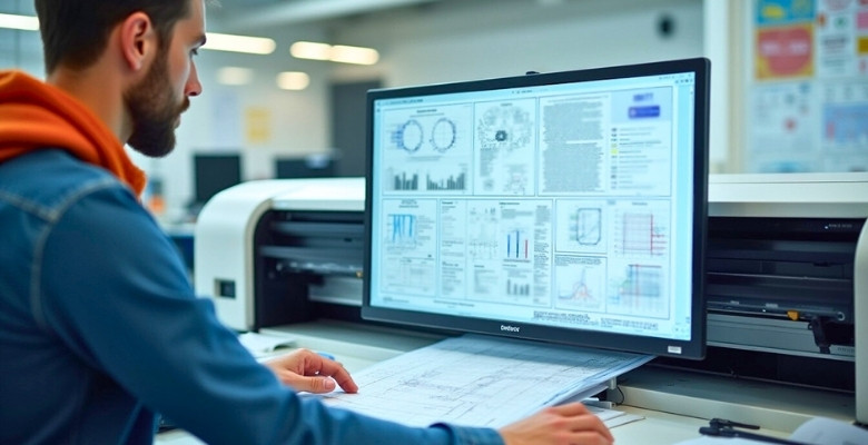
File Resolution
Your poster should be high resolution so that nothing looks blurry when printed. A good rule is to keep the resolution at 300 DPI (dots per inch). This setting helps make the text and images look sharp and clear. Low-resolution files might look fine on a screen but will turn out fuzzy on paper. Always check this setting before saving or sending your file.
Correct File Format
Save your poster in a format that keeps everything safe and ready to print. The most common and reliable option is PDF. It locks your layout, fonts, and images in place. You can also use TIFF if the printer asks for it. Avoid using formats like JPEG or PNG unless specifically requested. Always double-check the printer’s preferred format before sending anything.
Color Mode Choice
Posters that are printed use different colors from the screens. Set your color mode to CMYK for printing instead of RGB, which is only for digital screens. CMYK helps colors show up correctly when printed on paper. If you forget this step, the printed poster might look dull or different from what you saw on your screen. You can change the mode in most design software.
Font and Image Check
Before sending your poster, go over all your text and pictures. Make sure fonts are easy to read and none of them are missing or replaced. For images, zoom in to check they aren’t pixelated or stretched. Also, make sure nothing important is too close to the edge—you don’t want it to get cut off during printing. A careful check now saves big problems later.
Final Print Review
Take one last look at your entire poster before pressing send. Read every section slowly to catch small errors. Check spelling, colors, spacing, and layout one more time. If possible, print a small version at home to see how it looks. This helps you catch any surprises. Once everything looks good, send it to the printer with confidence and clear instructions.
Printing your poster the right way makes a big difference in how others see your work. A clear file, sharp images, and the right colors all help your poster stand out. Double-check everything before sending it to print. A little care now saves trouble later.
Frequently Asked Questions
If you’re preparing a poster for an electrical engineering conference, this FAQ section offers practical guidance on common design and presentation issues. Whether you’re finalizing the layout or preparing it for print, these answers aim to clear up typical doubts and support a smoother process.
What Should I Do If I Don’t Have Project Results Yet?
Even if your project isn’t finished, you can still make a poster. Focus on the goal of your work, the tools you’re using, or the steps you’re planning. Explain what you expect to find or why your idea is useful. Just make sure to say clearly that the results are still in progress.
Can I Use Animation or Video in My Poster?
Animations or videos won’t work in printed posters. But if the event is online, some allow short video clips or animations. You can add a QR code that links to a video showing your project. Just make sure the video is short and easy to watch.
How Can I Explain a New Tool or Device in My Poster?
If you’re showing a new tool or device, keep the explanation simple. Use one clear diagram and add labels to show each part. Write a few short lines explaining how it works and what makes it different. Don’t make it sound too complex—just show the main use.
Should I Include Safety Steps in My Poster?
Yes, it’s a good idea if your project involves electricity or tools. Add a short section with 2 or 3 key safety tips. This shows you are careful and understand real-life working conditions. People will appreciate that you included this kind of information.
Can I Use QR Codes in a Printed Poster?
Yes, QR codes are great for posters. They help you share links to videos, reports, or your project’s website. Place the code at the bottom corner of your poster. Make sure the code works and leads to the right content.
What Should I Do If I Have Limited Time to Prepare?
If you’re short on time, focus on one strong idea. Use a simple layout and fewer sections. Skip fancy designs and keep the text short and clean. It’s better to finish a small, neat poster than to rush a big, messy one.
Can I Add Team Photos or Group Work Info?
Yes, you can include a team photo if you worked with others. Keep it small and place it in a corner. Add names and roles below the photo. This helps show that the work was done by a team and not just one person.
How Do I Highlight the Main Idea in My Poster?
Make your main idea bold or use a box around it. Place it near the top or center where people will see it first. Write it in one short sentence. You can also use a bigger font or a different color to make it stand out.
Is Word or PowerPoint Better for Making Posters?
PowerPoint is usually better for posters because it handles large visuals and layouts more easily. It lets you move images, text boxes, and shapes freely, which is helpful for designing posters. Word is more limited and often harder to control for layout-heavy designs. So, if you’re making a poster, PowerPoint is the simpler and more flexible option.
What If My Project Is Very Basic?
That’s okay! Even simple projects can make great posters. Focus on explaining your idea clearly. Talk about what you learned and how your work solves a problem. People like posters that are easy to understand.
How Can I Make My Poster Stand Out?
Use neat layouts, clear text, and just a few strong visuals. Pick calm colors that go well together. Make sure your poster is clean and not overloaded. When everything is easy to read and looks organized, it stands out naturally.
Conclusion
Creating a poster may seem hard at first, but once you plan your layout, use clear text, choose useful visuals, and follow size rules, the process becomes simple. By organizing your content well and picking the right design tools, your ideas will stand out. From topic selection to final printing, each step matters. So if you were wondering how to make poster for an electrical engineering conference, now you have a clear and easy answer to follow.
To wrap it up, always check your text, keep your visuals clean, and print carefully. A neat, well-made poster grabs attention even from far away. Trust your creativity, follow the tips you’ve learned, and keep things simple. Best of luck with your upcoming poster—you’ve got this!

