Posters for computer engineering conferences stand out when they are clear, focused, and well-organized. They’re not just about showing results—they help others understand your work at a quick glance. You might already be thinking about how to make a poster for computer engineering conference?
Make a computer engineering poster by focusing on one clear idea. Use a simple layout with sections like methods and results. Choose clean fonts, limited colors, and helpful visuals. Keep text short, highlight key points, and guide the reader smoothly.
If this topic is on your mind, you’re not alone. Many people want to create better posters but aren’t sure where to begin. This article shares everything you need to know in one place. You’ll find helpful tips, design ideas, and simple ways to make your work look great on a poster.
How to Make a Poster for Computer Engineering Conference?
Creating a poster for a computer engineering event isn’t just about design; it’s also about how clearly you can explain your idea. Every detail matters, from layout to how your message is shown. Let’s break it down step by step.
Pick the Main Point
Start by thinking about the one thing you want people to remember from your poster. This could be a new method, a performance result, or a system design. Keep your message simple and focused. Avoid putting too many different ideas in one poster. If you’re planning to present at one of the upcoming conferences in Canada, the USA, or any other country, having a clear message helps you connect better with an engineering-focused audience.
Sketch Your Layout
You don’t need fancy software to start. Just use paper to draw boxes where each section will go. Three to four columns in a landscape layout usually work best. Put the title and your name at the top, main visuals in the center, and follow a clear left-to-right order for the rest. This rough sketch makes it easier to organize later when you design digitally.
Decide Poster Size
Not all posters are the same size, so always check what the event needs. A common size is 48×36 inches. Landscape layout is preferred, as it gives a better visual flow. Be sure to leave enough space near the edges so no part of your content gets cut off when printing. Knowing this early avoids last-minute problems before submission or printing.
Pick Design Tools
There’s no rule saying you must use fancy programs. PowerPoint works just fine for many people. Canva is another easy option with ready-made templates. Choose fonts like Arial or Helvetica so everything stays readable. Make your title big, your headings medium, and your main text large enough to read from a distance. The simpler your tools, the faster you’ll move.
Choose Clear Colors
Too many colors make things confusing. Stick to two or three basic shades that match well together. Use dark text on a light background so your words pop. Add enough white space between sections so things don’t feel cramped. Clear design helps people understand your work without asking you a lot of questions. Clean space also draws attention to key parts.
Break into Sections
Divide your content into areas that make sense: introduction, methods, results, and conclusion. Place the title and your name at the top, and arrange the rest in a way that feels like a natural reading order. Add small headers above each part so viewers can follow along easily. Having fixed sections also keeps you from adding things that don’t really help.
Use Helpful Visuals
Posters rely heavily on visuals, especially for computer engineering. Diagrams, graphs, or sample outputs are much easier to read than long blocks of text. Make sure each image is large, high quality, and has a clear label. If you’re including code, keep it short or turn it into a flowchart. A strong visual can explain more than paragraphs of writing.
Keep Text Short
Your poster should not feel like a full research paper. Write just enough to explain your main points. Use bullet points where possible, and make sure each sentence is easy to read. Don’t overcrowd with words. Each section should only take up the space it needs. Short, clear text makes your poster more inviting and easier to scan quickly.
Check Flow and Readability
A good poster reads like a story, from start to finish, without confusion. Use arrows or numbering to guide the reader’s eyes. Keep your font sizes consistent, and use bold titles to make each part stand out. When everything feels smooth to read, people spend more time at your poster. A well-organized layout makes a big difference in how your work is seen.
Making an impact doesn’t require a complex poster. What matters most is how clearly your idea comes through. If the layout flows well and your message is simple, people will remember it. Keep things clean, easy to read, and focused on what truly matters.
How to Present Algorithms and Code Snippets Clearly in a Poster
Presenting algorithms and code on a poster can be tricky, especially when space is tight and you want others to understand your work at a glance. There are a few smart ways to keep things clean and simple. Keep reading to learn more tips that can help.
Use Pseudocode Wisely

Instead of adding full code, try writing pseudocode. It looks like real code but skips details like semicolons or exact syntax. This helps people focus on the idea behind the steps, not the language. Keep each step short and clear. Use basic logic like “if,” “then,” and “repeat” to explain how your algorithm works. It’s all about making it easy to follow without getting stuck in long code lines.
Add a Flowchart
Flowcharts are great for showing how your algorithm moves from one step to another. Use shapes like circles for start and stop, and arrows for directions. Boxes can show steps or checks. A good flowchart can make things clear without using many words. Don’t make it too crowded. Stick to the main steps so anyone can understand your logic just by following the arrows.
Show One Example
Pick a simple example and show how your algorithm solves it step by step. Use short words, and point out what changes at each step. For example, show how a number gets sorted or a word gets searched. If people see how your method works on something real, it helps them understand faster. This way, the code becomes more meaningful than just blocks of text.
Keep Text Short
Use small blocks of text instead of large ones. Don’t write long stories about your code; stick to the main points. Explain what your algorithm does in one or two lines. Use bullet points if it helps. Don’t forget to keep enough space between sections, so it doesn’t feel tight. The simpler your words are, the better people can understand what you mean.
Choose Readable Fonts
Make sure your code or diagrams use a font that’s clear and easy to read. Don’t go for fancy or thin fonts. Bold and simple fonts help people read fast without confusion. Also, keep the font size big enough so someone standing a few feet away can still read it. A clean layout with neat spacing makes everything look more friendly and easy to follow.
More people will stop to look at your poster if it is easy to understand. These small changes can make a big difference in how your ideas are seen and remembered.
How Poster Design Principles Apply Across Engineering Fields?
Every branch of engineering has its own style and tools, but when it comes to poster design, some things feel surprisingly connected. If you’re curious how these ideas carry over from one field to another, keep reading below.
Visual Balance
Good posters are easy to read because everything is placed thoughtfully. Titles are large, subheadings stand out, and important details don’t get lost. When all elements are spaced out properly, your content feels organized and less crowded. This kind of layout doesn’t just look nice—it helps people understand what they’re seeing without much effort. Once the balance is right, viewers can focus on your message instead of being distracted by too much on the screen.
Sectioned Information
Breaking your content into parts makes it easier to follow. Use boxes, bold labels, or lines to create clear areas for different topics like problem, method, and results. This helps your viewer move step by step through your poster. Whether you’re preparing for a software-based conference or a hardware-focused one, many layout basics remain consistent. For instance, approaches used in electrical engineering poster design, like sectioning technical data for clarity, can also improve how computer engineering research is presented.
Color and Contrast
Colors can grab attention, but only when used the right way. Stick to a few colors that match well, and make sure your text stands out against the background. Light text on a dark background—or dark text on a light one—keeps things easy to read. Avoid using too many colors or making your poster look too busy. Even a small change in contrast can make a big difference in how easily someone can read your poster.
Font Choice
The style and size of your text matter a lot. Pick clean fonts that are simple and clear. Use bigger font sizes for headings and smaller ones for details, but not so small that people have to squint. Avoid fancy fonts that might look cool but are hard to read from a distance. Keep everything readable from about a meter away—that’s a good test to check if your font is working well.
Supporting Graphics
Charts, diagrams, and icons can explain more than a big block of text. If you’ve got technical data, try showing it in a visual format like a line graph or a flowchart. Just make sure every image you add is there for a reason, not just to fill space. Label everything clearly, and place your graphics near the text that explains them, so people can quickly connect what they see with what they read.
Clear design helps your poster make a strong first impression. It guides the viewer’s eyes and makes your message easier to understand. When your layout is clean, your work feels more professional and thoughtful. Take your time to apply these ideas well.
Should You Include Real-World Applications of Your Research?
Yes, sharing real-world uses of your research helps people understand why your work matters. It shows that your ideas can solve real problems, not just stay on paper. If you include simple examples, like traffic systems or smart homes, it becomes easier for others to connect with your work.
When you explain how your research fits into fields like AI, robotics, or cybersecurity, it adds more value to your poster. These topics are part of daily life now. Mentioning them in a short, clear way can make your work stand out and feel more useful.
You don’t need to go deep into technical details. A simple line like “This method can improve face recognition in security systems” can do the job. It’s not about making it complex; it’s about helping others quickly see how your idea works in real life.
Real-world examples also make your poster more memorable. People are more likely to stop and read when they see how something relates to things they already know. Adding this kind of detail shows that you’re thinking beyond theory and looking at actual impact.
Where to Place Author Information and University Logos?
Posters are more than just text and images—they also show who worked on the project and where they’re from. That’s why name and logo placement need a bit of planning. A messy layout can make things look unprofessional or confusing. Want to know how to place everything neatly and clearly? Keep reading for some easy tips.
- Top Center Name Block: Place your name in the top center under the title so it’s clear who the poster belongs to at first glance.
- Email Placement: Include your email address near your name, but keep it smaller so it doesn’t take up too much space on the poster.
- University Name: Mention the university just under your name or email, using a smaller font than the title but bigger than the body text.
- Multiple Authors: If others helped with the work, list their names under yours in the same style and order as the title heading.
- Logo Position: Keep the university logo in the top-left or top-right corner so it stands out without getting in the way of the main content.
- Logo Size: Keep the logo small and neat, just enough to be seen, but not so large that it pulls attention away from your title or topic.
- Spacing Matters: Leave enough space between names, logos, and contact info so each part is easy to read without crowding other details.
It’s not just easier to read a neat poster, but it also shows you pay attention to details. When names and logos are placed well, your poster feels complete. Even small things like spacing can make a big difference. Take time getting it right, and your work will stand out.
Fonts, Colors, and Layout Tips for Clarity and Impact
A good-looking poster is more than just colors and text; it’s about how well the design helps people understand your idea. Small design choices can make big differences. Let’s explore some easy tips that keep things clear and simple.
Font Selection
Always go for fonts that are easy to read from a short distance. Avoid curly or decorative fonts because they slow readers down. Stick with basic styles like Arial, Calibri, or Helvetica. Make the title big, the subheadings a bit smaller, and the body text at least 24 points. If you’re preparing to make a poster for academic conference work, picking clean fonts keeps your content clear and professional-looking without feeling heavy or crowded.
Color Balance
Too many colors can confuse people. Choose two or three that go well together and stick with them across the whole poster. Use dark text on a light background to make reading easier. Try not to place bright colors next to each other they can be hard on the eyes. Also, avoid background images that interfere with the text. Simple and high-contrast colors work best for long viewing.
Layout Flow
Every section of your poster should feel like part of the same story. Place your title at the top, followed by the introduction, then results, and conclusion in a left-to-right flow. Make sure each part fits in its own space without touching the edges. Group related ideas together so the layout feels natural. This makes it easy for someone to follow your work without needing help.
Spacing Tricks
Crowded posters look messy, even if the content is good. Use space between sections to give the viewer’s eyes a break. Make sure text doesn’t go too close to images. Add margins around the edges so nothing gets cut off. Use line spacing that makes reading smooth, not too tight or too loose. Clean spacing helps highlight key ideas and keeps things from looking packed.

Readability Tips
Big titles help grab attention, but don’t forget the small text as well. Keep your writing short and to the point. Use bullet points when possible to make information easier to scan. Choose high-resolution images that don’t blur when printed. Avoid putting too much in one area. Good posters are easy to scan quickly, with a clear message that sticks even after someone walks away.
Good design isn’t about showing off—it’s about helping people understand your work easily. When your poster is simple, clean, and organized, it makes a stronger impression and gets more attention. Keep it focused and easy on the eyes.
What Type of Graphics Are Best for Demonstrating Computational Models?
Computational models can be tricky to understand just by reading text. That’s why using the right kind of graphics can make your work stand out. Let’s explore some visual tricks that explain complex ideas in a much simpler way.
- Flowcharts: These are great for showing how a system moves from one step to another using boxes and arrows that connect everything clearly.
- State Diagrams: Explains changes in system behavior by showing different states and how one leads to another with clear transitions.
- Simulation Snapshots: Using visuals from actual simulations helps people see how your model works in action without needing a full explanation.
- Block Diagrams: These break your model into smaller parts, showing what each section does and how they’re connected in a simple layout.
- Code Snippet Visuals: Showing short pieces of code along with arrows or labels helps explain how your logic flows without needing full scripts.
- Tables with Comparisons: A chart that compares inputs, outputs, or system behaviors side-by-side makes things easier to understand at a quick glance.
- Graphs or Charts: Your results will be more convincing and clear if you use simple graphs with labels.
Even the most complex ideas feel easier to understand when you use the right visuals. Good graphics guide the viewer without needing long explanations. Try different types and see what fits your model best. Simple designs often leave the strongest impact.
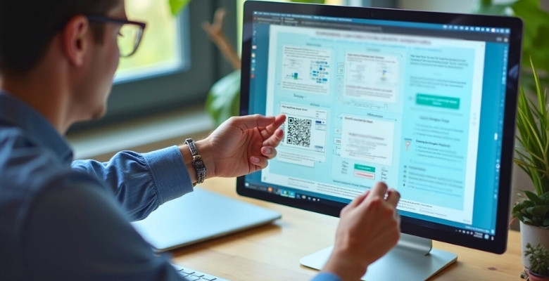
Should You Include QR Codes or Links to GitHub in Your Poster?
Sometimes, a poster doesn’t give enough space to show everything about your project. That’s when extra tools can help people learn more. You can still keep the design clean while sharing more details. Let’s explore how that works below.
Quick Access Tools
Adding a QR code is a smart way to help viewers reach extra content fast. It can lead to demo videos, full reports, or online presentations. Place it in a corner so it doesn’t block key info. The best spot is usually the bottom-right. Keep it simple—just one code is enough, so the poster doesn’t look messy or confusing.
GitHub Project Links
If your project includes code, sharing a GitHub link makes a lot of sense. It helps people check your actual files, scripts, or updates. Instead of pasting the long link on the poster, use a QR code or shorten it. This keeps your design neat and easier to follow while still letting others explore your work in detail later.
When to Use
Don’t just add links or codes for no reason. Use them only if they give more value or show something not visible on the poster. Demo videos, working apps, or detailed steps are great examples. If the extra content repeats what’s already on the poster, then it’s better to leave it out and keep things simple and clean.
How to Style
Make sure your QR code or link looks like part of the poster, not something random. Keep it the same color theme and place a short label like “View Demo” or “See Full Code.” That way, people know what they’re scanning. Use clear fonts and avoid shrinking them too much, so nothing feels lost or hard to find.
Making It Interactive
A poster that leads to more information can keep people interested even after they walk away. Adding links or QR codes gives them a chance to dig deeper in their own time. This can be really helpful during interactive sessions where many people want to learn more but can’t ask questions right away. It adds more value without needing more space.
Extra tools like QR codes or GitHub links make your poster more helpful and interesting. They let you share more while keeping your layout clean. Just remember to use them only when they add something useful. A simple touch can make your work stand out.
FAQs About How to Make a Poster for Computer Engineering Conference?
Creating a poster for a computer engineering conference often brings up a lot of small but important questions. Whether it’s about printing, deadlines, or what tools to use, having answers ready can save time and avoid confusion. Here are some helpful FAQs that cover things you might not have thought about yet.
What File Format Should I Use for Printing?
It’s best to save your poster as a PDF file before printing. This format keeps your design, fonts, and layout exactly how you made them. Avoid using Word or PowerPoint files directly for printing. PDFs are more trusted by most printing shops and give better results.
How Early Should I Start Designing My Poster?
Starting early gives you more time to make changes and fix mistakes. Try to begin designing at least two weeks before the deadline. This way, you won’t feel rushed, and you’ll have time for feedback. Printing also takes time, so finishing early helps avoid last-minute stress.
Can I Add a Video or Animation to My Poster?
Posters are usually printed on paper, so you can’t include real videos or moving animations. But you can add QR codes that link to videos online. This way, people can scan the code with their phones and watch your video later. It’s a smart way to share more without using extra space.
Is It Okay to Use Humor in My Poster?
A little humor can make your poster more fun and easier to remember. But don’t let jokes take over the main idea of your work. Keep it light and simple—avoid anything that might seem offensive or confusing. Just one small funny line or image is enough to add a nice touch.
Should I Include a Short Bio About Myself?
A short bio isn’t required, but it can help people know who you are. You can add 2–3 lines near your contact info, saying what your role is or what you worked on. Keep it brief and related to the project. It’s helpful if someone wants to contact you later.
What If I’m Not Good at Design?
You don’t need to be a designer to make a good poster. Use simple tools like PowerPoint or Canva and pick clean templates. Focus on keeping your message clear and your layout easy to follow. A neat and simple poster is always better than one that’s too busy or fancy.
Can I Print My Poster at Home?
If your poster is small, you might be able to print it at home. But for large conference posters, it’s better to use a professional print shop. They have bigger printers and better quality paper. Printing at home often means taping pages together, which doesn’t look great.
How Do I Transport My Poster Without Damaging It?
Use a poster tube to roll up your printed poster. This keeps it safe from folds, tears, or water. Don’t fold the poster—it’s hard to fix creases later. If you’re flying, carry the poster tube as hand luggage to avoid damage.
Can I Use Icons Instead of Full Images?
Yes, icons are great for saving space while still explaining ideas. Just make sure they are clear and easy to understand. Don’t use too many different styles—stick with one style across your whole poster. Label your icons if needed so people know what they mean.
What If I Don’t Get Much Attention at the Poster Session?
Don’t feel bad if not many people stop at first. Sometimes people come back later when it’s less crowded. You can also walk around and look at other posters, then return to yours. Stay near your poster and be ready to explain your work with a smile—it helps draw interest.
Bottom Line
Making a great poster starts with knowing what to show and how to show it. From layout and colors to visuals and font size, each part plays a small but important role. When everything is clear and clean, your message stands out better. By following all these simple design tips, you now know exactly how to make a poster for computer engineering conference.
To wrap it up, keep your design focused, avoid too much text, and use helpful visuals wherever possible. Don’t forget to check spacing, label your charts, and test how your poster looks from a distance. Small details matter a lot. Best of luck with your upcoming poster—hope it leaves a strong and lasting impression!

