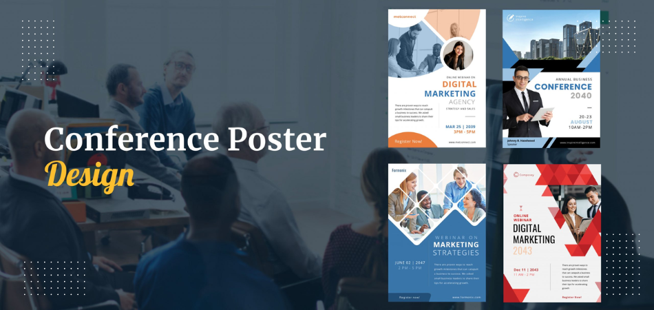
Are you attending a conference and presenting a poster? Do you want to make a strong impression and communicate your research findings effectively? Designing a conference poster can be daunting, but with the right approach and attention to detail, you can create a poster that stands out and effectively communicates your research.
Designing a conference poster requires a clear message, concise content, appealing visuals, and legible typography. Use color schemes, hierarchy, and white space strategically to create an engaging and informative poster.
This article provides a step-by-step guide to help you design an effective conference poster that effectively communicates your research and makes a strong impression on your audience.
Key Takeaways
- To effectively communicate research or projects to the intended audience, it is essential to recognize the poster’s purpose.
- Optimal layout and appropriate use of design elements are crucial for enhancing a research presentation’s visual appeal and effectiveness, including colour scheme, typography choices, visual hierarchy, and white space.
- Organizing the content of the visual presentation is essential to effectively convey research findings, including creating a visual hierarchy, breaking up information into sections with clear headings, using bullet points to highlight key information, and using images or graphs to represent data visually.
- Choosing the right paper and printing options is essential for the overall appearance of the poster, including digital printing suitable for small to medium quantities, while offset printing is ideal for large volumes.
Understand the Purpose of Your Poster
When planning for a conference, you should also consider designing conference posters. The primary objective of comprehending the purpose of a conference poster is to establish a clear and concise message that effectively communicates the research or project to the intended audience.
Determine the target audience and key messages that will resonate with them when planning for the upcoming conference. The target audience can vary from academic peers to professionals in the industry, and the key messages should align with their interests and needs.
The poster’s purpose will help determine the appropriate content, layout, and design elements to convey the intended message. An effective conference poster should be visually appealing and informative, with a concise message that is easy to comprehend. It should communicate the research or project in a manner that is engaging to the audience.
Choose the Right Layout and Design Elements
Optimal layout and appropriate use of design elements are crucial for enhancing a research presentation’s visual appeal and effectiveness. Here are some design elements to consider when designing a conference poster:
- Colour Scheme: Choose an eye-catching colour scheme that is not overwhelming. Use contrasting colours to highlight important information, and avoid using too many colours that may distract from the content. In that case, you should consider the dress code for the conference.
- Typography Choices: Use legible fonts that are easy to read from a distance. Avoid using too many different fonts, which may create confusion and make the poster appear cluttered.
- Visual Hierarchy: Use size, color, and font weight to create a visual hierarchy that directs the viewer’s attention to the most important information.
- White Space: Use white space effectively to create a clean, clean design that is easy to read. Avoid overcrowding the poster with too much information or images.
Organize Your Poster Effectively
To effectively convey your research findings, organizing the content of your visual presentation is essential. One effective way to do this is by creating a visual hierarchy. This means that the most important information should be given the most visual weight and placed in the most prominent position on the poster. The visual hierarchy can be achieved through color scheme, font selection, and data representation.

For example, a bold font for the title and subtitles and a lighter, smaller font for the body text can create a clear visual hierarchy. Additionally, contrasting colours for different sections or essential information can help draw the viewer’s attention to those areas.
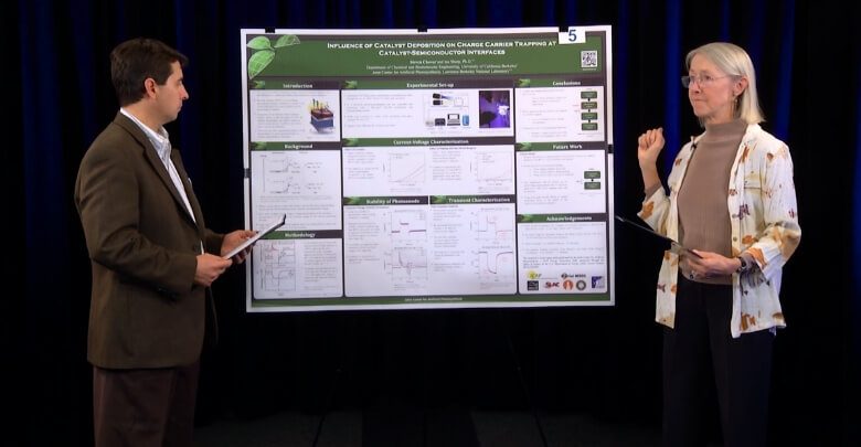
In addition to visual hierarchy, organize the content logically and coherently. This can be achieved by breaking up the information into sections with clear headings, using bullet points to highlight key information, and using images or graphs to represent data visually.
Do not overcrowd the poster with too much information, making it difficult for the viewer to understand the main points. By organizing your poster effectively, you can ensure that your research findings are presented clearly and concisely.
Prepare Your Poster for Printing
Preparing a poster for printing involves ensuring that it meets the technical specifications of the printing process, such as resolution, colour mode, and file format. Choosing the right paper is also essential for the overall appearance of the poster. Select a paper that can showcase the colours and details of the design. Glossy paper can provide a vibrant and eye-catching effect, while matte paper can give a more subtle and professional look.
When printing options, there are various choices available, such as digital printing or offset printing. Digital printing is suitable for small to medium quantities, while offset printing is ideal for large volumes. So, you should have a clear idea of what printing option to choose and where to print the conference paper.
Once the printing is complete, allow enough time for the ink to dry completely before handling the poster. By following these steps, you can ensure that your poster is printed correctly and looks professional.
Present Your Poster with Confidence
Presenting your research findings through a well-designed conference poster is only half the battle. The next step is to present your poster with confidence. Public speaking tips can help you prepare for the presentation, and body language cues can help you convey your message effectively.
Rehearse your presentation before the conference. Practice speaking in front of a mirror or with a colleague to get comfortable with your delivery. Additionally, research your audience and tailor your presentation to their interests.
During the presentation, maintain eye contact, use hand gestures to emphasize key points, and speak clearly and confidently. Remember to smile and project your voice, as this can help you connect with your audience and convey your enthusiasm for your research.
Following these public speaking tips and utilizing body language cues, you can confidently present your poster and make a lasting impression on your audience.
Wrapping Up
Several key factors must be considered when designing a conference poster to create a visually appealing and effective presentation. To determine the appropriate layout and design elements for your poster, you need to understand its purpose.
Choosing the right colour scheme, font styles, and images can also impact the overall effectiveness of your poster. Additionally, organizing the content clearly and concisely can help convey your message to the audience more effectively.
Preparing your poster for printing is vital in ensuring it looks professional and polished. This includes choosing the appropriate size and resolution for the poster and proofreading the content for any errors or typos.


