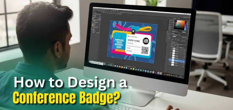
Conference badges are small but powerful parts of any event. They help people identify each other and create a sense of belonging. When done right, they make a lasting impression and add value to networking. Many event planners often wonder how to design a conference badge?
Design a conference badge by using clear fonts, event branding, and readable layouts. Include name, role, and company details. Add color codes, QR codes, and sponsor logos. Choose strong material and test print quality to keep badges durable, stylish, and comfortable to wear.
If you’re planning to create badges for your next event, this article covers everything you need to know. You’ll find clear steps, smart tips, and simple design ideas to make badges that look professional and work well.
How to Design a Conference Badge?
A well-designed conference badge helps people connect easily. It should share clear information while showing your event’s brand style. A good badge also makes registration and networking smooth for everyone. Let’s see how you can design one that looks good and works well too.
Choose the Badge Size
Start by picking a badge size that’s easy to see and wear. Standard sizes like 3×4 inches or 4×6 inches work best. They offer enough room for names, logos, and other key details. Make sure the badge is not too heavy or too small for comfort.
Include Key Information
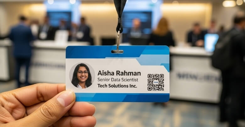
Every badge must have the attendee’s name, event name, and date. Use large and bold fonts so people can read them from a distance. You can also add the person’s role or company name below it. Keep the design simple so the main details stand out clearly.
Use Clear and Readable Fonts
Pick fonts that are easy to read at a glance. Avoid fancy styles that make names hard to understand. Sans-serif fonts like Arial or Helvetica look clean and professional. Test your font size to ensure it’s readable from a few feet away.
Add Event Branding
Use your event’s colors, logo, and theme on the badge. This helps people recognize your event instantly. Keep the design balanced so the branding doesn’t hide important text. You can take ideas from large events, especially for international events like upcoming conferences in Canada, the USA, or any other country, where professional design matters.
Color Code for Roles
You can use different colors to show who’s who at your event. For example, red for speakers, blue for staff, and green for guests. This makes it easier to spot people’s roles without reading small text. Keep your colors bright but not too flashy.
Add QR Codes
Adding a QR code can make your badge more useful. It can link to digital event guides, check-in pages, or schedules. Place it where it’s easy to scan but doesn’t cover text. Test the code on different devices to be sure it works smoothly.
Add Sponsor Logos
If your event has sponsors, you can give them space on the badge. Use small logos near the bottom so they don’t distract from the main design. This helps give your sponsors visibility while keeping your badge neat and professional-looking.
Pick Strong Badge Material
Choose a strong and lightweight material for your badge. Plastic or laminated paper works best for long events. Avoid thin paper as it can tear easily. Add a good-quality lanyard clip so people can wear it comfortably all day.
Make It Easy to Print
Before finalizing the design, test how it prints. Make sure the colors look right and the text stays sharp. Keep a print-safe margin so nothing important gets cut off. A simple layout helps printing go faster and reduces mistakes.
Keep Comfort in Mind
Badges should feel light and hang straight when worn. Check that the lanyard or clip doesn’t twist or cover text. People will wear them for hours, so comfort matters. A small detail like this helps make a good event impression.
Designing a conference badge is about more than looks. It’s about helping people connect and feel part of the event. A clear, simple design works best for any conference size. Start with the basics, test your design, and make it both stylish and useful.
What Are the Best Materials for Making Conference Badges?
Picking the right badge material helps your event look neat and stay organized. A good badge also makes it easier for guests to connect and feel included. Each material type offers a mix of style, cost, and comfort. The list below explains what works best for different events, so you can choose wisely.
Paper Or Cardstock
This choice is simple, low-cost, and easy to print on-site. It works well for short events where speed and budget matter. Paper badges can bend or tear and are not good for outdoor use. They suit single-day events or indoor meetings. Some event planners use paper inserts in plastic holders to add strength.
Plastic (PVC, PET, rPET, Biodegradable)
Plastic badges feel stronger, last longer, and resist water. They are a smart pick for events that run several days. The drawback is the higher cost and the fact that some plastics are not recyclable. When choosing between paper, plastic, or fabric materials, it helps to look at a few examples of badge types used in professional conferences to see which option fits your event style and budget. Using recycled or biodegradable plastic is a better choice for the environment.
Fabric Materials
These badges are soft, flexible, and feel nice to wear all day. They do not crack or bend like plastic or paper. However, they can stain easily and might not print fine details well. They are best for casual, fun, or creative events. Fabric badges can also be reused, making them a good long-term option.
Eco-Friendly Or Biodegradable Options
Badges made from recycled or natural materials help reduce waste. Some are made from seed paper, which you can plant later. Others use recycled paper or biodegradable plastic. They cost a bit more but show care for the planet. Many organizers pick these for “green” or sustainable events where eco goals matter.
The best badge material depends on your event’s setup and purpose. Paper suits short and simple events. Plastic works better for longer ones that need a strong badge. Fabric adds comfort and style. Eco options show that your event values the environment. Choose what fits your budget, theme, and guest comfort best.
How Do You Choose the Right Size and Shape for a Conference Badge?
Choosing the right badge size helps people read names and details easily. It also makes your event look neat and well-planned. You don’t want a badge that feels too heavy or too tiny. Let’s look at some simple ways to pick the best size and shape for your event badge.
Standard Badge Sizes
A common badge size used in many conferences is 3.75 by 5 inches. This size gives enough space for names, titles, and logos. Smaller badges around 4 by 3 inches are great for short info. Larger badges like 5.5 by 3.5 inches work well if you need more space or want your text seen from far away.
Popular Badge Shapes
Most badges are rectangles because they’re simple and fit all layouts. Rounded corners make them look softer and more polished. Some events try circles or ovals, but those can limit space for words. When selecting the badge size, think about how much space you’ll need for essential details to include on a conference badge, such as names, titles, and company logos.
Readability and Text Clarity
The name on a badge should be easy to read from a few feet away. Use large, clear fonts with enough spacing between letters. Avoid putting text too close to the edges. Keep margins wide so nothing gets cut off when printing. Simple fonts make your badge look clean and professional.
Comfort and Design Balance
A badge that’s too big can bother the person wearing it. One that’s too small might not be noticed at all. Pick a medium size that feels light and easy to wear all day. Test how it hangs with a lanyard before final printing to make sure it stays straight and readable.
Orientation and Layout
Many events use vertical or portrait-style badges. They look neat and fit well on lanyards. Horizontal or landscape badges can work better if your logo or design is wide. Choose what fits your layout best while keeping text clear and centered for easy reading.
The right badge size makes your event look more polished and organized. Always think about comfort, space, and readability before printing. Try a few sample sizes to see which feels and looks best. A clear and well-sized badge helps every guest feel seen and welcomed.
What Colors and Fonts Work Best for Conference Badges?
Conference badges are not just name tags. They help people recognize each other and start conversations easily. A well-designed badge should be clear and easy to read, even from a few feet away. Picking the right colors and fonts makes a big difference. Let’s look at what works best and why it matters.
Best Font Choices
Simple and clean fonts make badges easier to read from a distance. Use sans-serif styles like Arial, Helvetica, Open Sans, or Roboto. These fonts keep letters clear, even when printed small. Avoid using script or decorative styles since they can look blurry or hard to read on glossy paper.
How to Use Font Weight and Size
Thicker fonts help names stand out clearly on the badge. Use bold or heavy weights for the main name text. Keep it large enough to read easily—around 24–28 points works well. For smaller details like the company name or role, 16–18 points is enough to stay readable without cluttering the design.
Choosing Color Combinations
Clear contrast is key for easy reading. Use dark text on a light background or light text on a dark background. Avoid neon or extra bright colors since they can bleed and make text harder to see. Stick to high-contrast pairs like black and white or navy and light gray for better visibility.
Matching Event Branding
Your badge colors should match your event’s brand theme. Pick one or two brand colors and pair them with a neutral tone. Always test your color contrast before printing to make sure text stays sharp. This keeps the design professional while staying true to the event’s look.
Using Colors for Attendee Types
You can use color bands or small marks to show attendee roles. For example, blue for staff, gold for VIP, or red for press. Keep these color marks simple so they don’t take attention away from the name. This helps people recognize roles at a glance without making the badge look busy.
Good badge design is about balance and clarity. Fonts should be simple, bold, and readable. Colors should contrast well and fit your brand theme. Adding small color cues for roles helps without distracting. When done right, your badges will look great and help people connect easily.
How Can You Add Branding to Your Conference Badge Design?
Adding branding to your conference badge makes your event look more professional and connected. The key is to include logos, colors, and style without making the badge hard to read. Here’s how you can design it smartly and neatly.
- Event Logo Placement: Place the main event logo at the top or in a corner so it looks balanced. Avoid making it too large, as that can draw attention away from the attendee’s name and other important information.
- Logo Transparency: Use a lighter or transparent version of the logo behind text if needed. Always check that the text stays clear and easy to read with enough contrast against the background.
- Sponsor Logo Area: Keep sponsor logos smaller and place them at the bottom or back of the badge. This keeps the front clean while still giving sponsors the attention they deserve in a neat way.
- Use Event Colors: Match the badge design with the event’s theme or color scheme. Use those colors in borders, header bars, or small shapes to create a uniform and professional appearance.
- Keep Space Balanced: Leave enough space between logos, names, and other text. This makes the badge easier to read and prevents the design from looking messy or too full.
- Simplify Logo Design: When resizing logos, use a simpler version with fewer details or a single color. This helps the logo stay clear and sharp, even when printed on smaller badges.
- Balance Style with Function: Make sure the name, role, and company are easy to read from a short distance. The design should look attractive while still keeping the badge practical and useful.
A well-branded badge looks good and serves its purpose. By balancing colors, logos, and text clearly, your event badges will stand out, stay readable, and leave a lasting impression on everyone attending.
FAQs About How to Design a Conference Badge?
Designing a conference badge can raise many small but important questions. These details help make your event badges useful, clear, and nice to wear. The right design choices can save time and make guests feel welcome. Below are some common questions and answers to help you make great badges for any event.
What Is the Best Way to Arrange Information on a Badge?
Start by placing the attendee’s name at the center or top area. It should be the largest text so people can read it easily. Below that, add smaller details like company name or role. Keep your layout simple and organized so the main information stands out at first glance.
How Can You Make a Badge Look Professional Without Spending Much?
You can make a clean design using simple colors and neat fonts. Avoid too many decorations or images that make it look messy. Use a white or light background to save ink and make text clear. Focus on clear layout and readable fonts instead of extra design elements.
Should You Add a Badge Holder or Lanyard Clip?
Yes, adding a holder or lanyard clip keeps the badge safe and visible. Plastic holders protect paper or thin badges from damage. Lanyard clips make it easy to wear the badge all day without discomfort. Choose a strong clip so it stays straight and doesn’t twist.
How Do You Make Badges for Different Types of Guests?
You can create small design changes for each guest type. For example, use icons, border colors, or small labels to show staff or speakers. This makes it easy to tell people apart without reading fine print. Keep the overall style the same so all badges look part of one event.
What Is the Best Printing Method for Conference Badges?
Digital printing works best for short runs and quick updates. It gives bright colors and clear text even for small batches. For large events, offset printing saves money and keeps quality high. Always test one sample first to check how colors and fonts appear after printing.
How Can You Make Badges Easy to Scan at Check-In?
You can print a QR code or barcode that links to attendee info. Make sure it’s placed away from folds or edges for easy scanning. Use black on white for better code reading by devices. Test the code with scanners before the event to avoid last-minute problems.
How Do You Prevent Fake or Copied Badges?
To avoid fakes, add small design elements like holographic foil or unique barcodes. You can also print hidden marks or serial numbers. For digital check-ins, link each QR code to a single user ID. These small steps help keep your event secure and professional.
How Can You Make Badges More Eco-friendly?
You can print badges on recycled or biodegradable paper and use fabric lanyards. Reusable badge holders also cut waste after the event. Avoid using plastic if possible or pick recyclable types. Eco-friendly badges show you care about both guests and the environment.
What Is the Right Way to Test a Badge Design Before Printing?
Print a sample copy on the same paper or material you’ll use. Check if all text is readable from a few feet away. Make sure the badge feels light and hangs straight when worn. Ask a few people to try it and share how it feels and looks.
How Do You Design Badges for International or Large Events?
Use simple and clear English or add two languages if needed. Make sure names and roles have enough space for longer words. Use symbols or icons where possible to make meaning clear. This helps everyone understand the badge easily, no matter where they’re from.
Conclusion
A well-thought-out badge design helps your event feel more friendly and organized. It brings together style, comfort, and clarity so people can easily read names, find others, and feel part of the event. The right colors, fonts, and materials make every detail count.
If you’re wondering how to design a conference badge? the answer is simple: keep it clear, comfortable, and creative. Use readable fonts, balanced colors, and strong materials. Add your event logo and color theme smartly to make your badge both stylish and practical for everyone.
Always test your design before printing and focus on comfort and readability. Make sure the badge feels light, looks neat, and shows your brand well. Use simple fonts, good contrast, and balanced spacing. Good luck creating badges that stand out and make every guest smile!

