Ever noticed how some posters grab your attention instantly while others simply fade into the background? That magic often comes down to getting the size right. Knowing how to choose a poster size helps you balance space, design, and visibility while ensuring your message stands out perfectly.
Choosing the right size depends on a few factors, where the poster will be displayed, how much content it includes, and how far your audience will stand. A smaller size may suit indoor walls, while larger ones work best for events or outdoor promotions. Purpose always defines proportion.
Understanding these basics ensures your design stays clear, readable, and visually appealing. Ready to make your poster look professional and impactful? Keep reading to explore practical tips on how to choose a poster size that fits your goals effortlessly.
How to Choose a Poster Size?
Choosing the right poster size plays a vital role in how your message is received. A well-sized poster attracts attention, fits its environment, and communicates clearly without overwhelming viewers. Whether for schools, exhibitions, or upcoming conferences, understanding how to balance size, space, and visibility will help you create an impactful display.

Viewing Distance
The viewing distance is the first factor to consider. The farther people stand, the larger your poster must be for text and visuals to stay legible. For smaller rooms or indoor halls, medium formats usually work best. Always ensure that your content remains easy to read and visually balanced from every angle.
Purpose and Usage
Every poster serves a different goal, and the intended use determines its ideal size. A marketing poster in a shopping mall will differ greatly from an academic one at a conference. Match your poster’s dimensions to its communication goal, location, and viewing context for maximum clarity and engagement.
Content Density
The amount of information you include affects your required space. Detailed posters with charts, infographics, or multiple visuals need larger dimensions to maintain readability. If your content is minimal or heavily visual, smaller formats will suffice. Aim for a clean, organized layout that prevents crowding and enhances comprehension.
Available Display Space
Check the physical space where your poster will be placed before finalizing the size. Oversized posters can look cluttered or out of place, while small ones may lose visibility. Always measure wall areas, display boards, or frames beforehand to ensure the poster fits naturally into its intended setting.
Printing and Material Considerations
Printing requirements often influence your final decision. Some printers have specific size limits or paper preferences. Glossy, matte, or fabric finishes also change how your poster appears. Reviewing material quality, aspect ratio, and available print dimensions helps maintain both aesthetic quality and durability in your final output.
Design and Orientation
Your design layout and orientation, portrait or landscape, should complement the message and visuals. Posters meant for data-heavy content often look better in portrait mode, while artistic or wide-scene posters shine in landscape. Keeping alignment, spacing, and focal points consistent ensures your design remains cohesive and professional.
Selecting the correct poster size means aligning purpose, design, and display conditions with visual balance and readability. A thoughtful approach ensures your poster communicates effectively, looks appealing, and makes a lasting impression wherever it’s displayed.
Common Poster Sizes You Should Know
Understanding standard poster sizes helps you plan your design effectively and avoid printing errors. From compact options for classrooms to large displays for public areas, each size serves a unique purpose. Let’s look at the most common categories used worldwide.
Poster Size Reference Chart
|
Category |
Size (Inches) | Size (Centimeters) | Common Use |
|
Small |
11 x 17 | 28 x 43 | Indoor notices, classroom posters |
|
Medium |
18 x 24 | 46 x 61 |
Retail ads, small events |
| Large | 24 x 36 | 61 x 91 |
Marketing, exhibitions, outdoor use |
| Extra-Large | 27 x 40 | 69 x 102 |
Movie posters, large displays |
| A-Series | A3 – A0 | 29.7 x 42 to 84.1 x 118.9 | International formats, academic and corporate use |
- Small Posters: Ideal for local displays, classrooms, or announcements on notice boards. They’re portable, budget-friendly, and easy to frame while keeping messages simple and focused for closer viewing.
- Medium Posters: Commonly used for events and promotions, this size offers a balance between visibility and space efficiency, making it perfect for indoor marketing and limited wall areas.
- Large Posters: Preferred for exhibitions and public spaces, large sizes create visual impact and can hold more detailed content like graphics or sponsor logos, making them effective for professional campaigns.
- Extra-Large Posters: Designed for maximum visibility, they are suitable for movie promotions, billboards, or major brand campaigns where attention-grabbing visuals are essential for long-distance viewing.
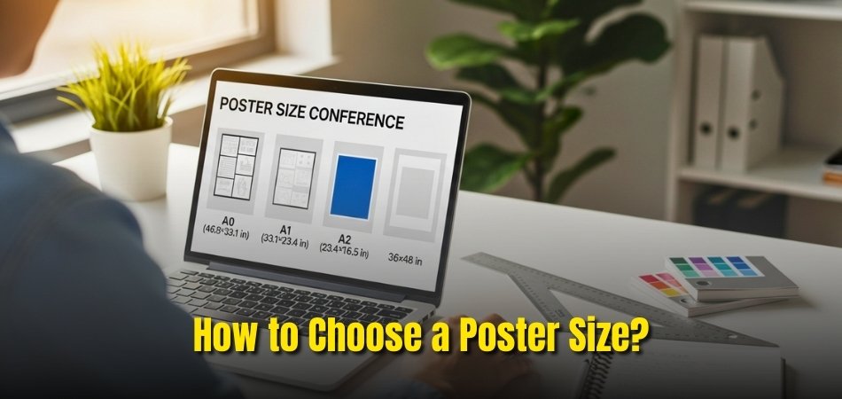
- A-Series Posters (A0–A3): These ISO-standard sizes are widely used globally. A3 suits educational or small professional needs, while A0 and A1 sizes dominate at conferences or scientific exhibitions.
Choosing the correct poster size ensures your content looks sharp and fits its display environment perfectly. With these dimensions in mind, you can confidently align your poster’s purpose, space, and audience expectations.
Small, Medium, or Large – Which Poster Size Fits Your Goal?
Choosing between small, medium, or large posters depends on your message, location, and audience size. Each format serves a different purpose, balancing visibility, cost, and design space. Let’s break down which option best aligns with your specific goal and communication needs.
Small Posters
Small posters are perfect for confined spaces like classrooms, offices, or bulletin boards. They work well for announcements, schedules, or internal promotions. Their compact format keeps printing affordable and quick, making them ideal for short-term or low-budget campaigns where clarity and simplicity are key.
Medium Posters
Medium sizes provide versatility for both personal and professional settings. They are frequently used for events, exhibitions, and retail promotions. When planning event materials, consider how conference poster cost varies depending on size, print type, and finish. This helps manage expenses while maintaining quality and visual impact.
Large Posters
Large posters make a bold statement for high-traffic or outdoor areas. They offer generous design space for visuals, brand logos, and key messages. Perfect for marketing campaigns, trade shows, or exhibitions, these posters attract attention from afar while maintaining readability and strong aesthetic appeal.
Selecting the right poster size depends on purpose and environment. Whether you aim to inform, promote, or inspire, align your design scale with visibility and budget. The right balance ensures your message connects powerfully with your audience every time.
Finding the Balance Between Space, Design, and Visibility
A successful poster design depends on how well you balance layout, spacing, and visibility. Every element should feel intentional, guiding the viewer’s eyes naturally through your content. Let’s look at how space and design choices influence readability, visual flow, and overall impact.
Managing White Space
White space gives your poster breathing room and prevents clutter. It separates sections, highlights important visuals, and makes text easier to read. Instead of filling every inch, allow margins to create structure and harmony. This minimal use of space keeps your design professional and inviting to the eye.
Visual Hierarchy and Alignment
The order in which information appears should follow a clear visual path. Use larger fonts for headlines, medium ones for subpoints, and smaller text for details. Aligning text and visuals consistently helps maintain balance and directs viewers’ attention toward key information without visual confusion.
Color Coordination
Color not only beautifies your poster but also controls focus and mood. Use bold tones for headings, softer shades for backgrounds, and contrast for visibility. A well-planned color palette enhances hierarchy, attracts attention from a distance, and strengthens brand identity across your entire layout.
Proportions and Readability
Design proportions should match the poster’s purpose and viewing distance. Keep content within safe zones so nothing gets cut during printing. Balance images and text evenly, ensuring large visuals don’t overpower key messages. Proper proportion maintains aesthetic flow while improving information clarity.
Finding the right design balance turns a basic poster into an effective visual story. When space, hierarchy, and color work together seamlessly, your message stands out clearly, leaving a lasting impression on every viewer.
Poster Size Tips for Events, Classrooms, and Marketing Displays
Poster design isn’t one-size-fits-all. The right layout and dimensions depend on where the poster will be displayed and who will see it. Here are some practical tips tailored for events, classrooms, and marketing environments to make your visuals stand out effectively.
- Events: Focus on readability and spacing. Use large fonts and strong contrast so your poster stays clear even from several feet away. Make sure the visual elements of conference posters, like images and typography, align with your brand and remain clear from a distance.
- Classrooms: Choose moderate sizes that fit well on bulletin boards or walls. Bright colors and simple designs grab students’ attention, while concise text and clear visuals make learning or communication more engaging.
- Marketing Displays: Maintain brand consistency across all materials. Pick sizes suitable for your display area, and use balanced proportions between visuals and text. Professional finishes and clear layouts help attract and retain customer attention effectively.
Tailoring your poster design for its environment ensures clarity and impact. Whether for education, marketing, or professional events, adapting your poster’s size and layout helps your message connect meaningfully with every audience.
Mistakes to Avoid When Selecting a Poster Size
Even the most creative design can fall flat if the size isn’t right. Many people make small but costly errors that affect visibility, clarity, and overall presentation. By recognizing and avoiding these mistakes, you can ensure your poster looks professional and communicates effectively.
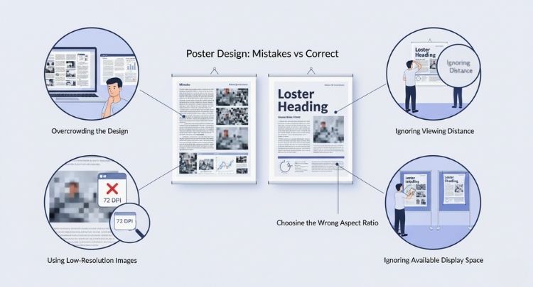
Overcrowding the Design
Filling every inch of space with text and visuals often makes posters confusing and unattractive. Crowded layouts reduce readability and visual appeal. Keep your design focused by using white space strategically. This approach highlights key elements, improves balance, and helps your main message stand out more clearly to your audience.
Ignoring Viewing Distance
A common oversight is forgetting how far viewers will stand from your poster. Text that looks fine on a computer screen might appear tiny from a few meters away. Always design with your audience’s perspective in mind, testing font sizes and layout readability from typical viewing distances before printing.
Using Low-Resolution Images
Low-resolution graphics make even the best designs appear unprofessional. Always ensure images are at least 300 DPI before printing. Enlarging small images leads to blurriness and pixelation, reducing credibility. High-quality visuals, on the other hand, maintain sharpness, color accuracy, and overall impact regardless of your poster’s size or location.
Choosing the Wrong Aspect Ratio
An incorrect aspect ratio can distort visuals and make text look stretched or cropped. Before finalizing your design, confirm your file’s proportions match your intended print dimensions. Keeping consistent ratios helps maintain layout harmony and ensures your design elements appear exactly as intended when displayed.
Ignoring Available Display Space
Not accounting for display space can cause size mismatches. Oversized posters may dominate small areas, while undersized ones can look insignificant. Measure the space beforehand and adjust accordingly. This ensures your poster fits naturally within its surroundings, maintaining both visual appeal and audience attention.
Paying attention to details like spacing, proportion, and image quality prevents common poster design problems. When you plan carefully and avoid these mistakes, your final piece will look polished, readable, and engaging across any viewing environment.
Poster Printing Essentials You Shouldn’t Ignore
Before sending your poster for printing, it’s important to understand the technical details that affect the final result. Proper preparation ensures sharp visuals, accurate colors, and professional quality. Let’s explore the key printing essentials that can make or break your poster’s appearance.
Maintain the Right Resolution
Always design your poster at a minimum of 300 DPI to avoid pixelation. Low-resolution files may appear fine on-screen but blur when printed. A higher resolution ensures crisp edges, detailed graphics, and professional image clarity that holds up even at large sizes or close viewing distances.
Choose Correct File Formats
Save your final design in print-ready formats like PDF or TIFF. These preserve colors, layers, and image quality far better than JPEGs. Embedding fonts and flattening layers before submission helps prevent printing errors and ensures that your layout remains consistent across different printers or devices.
Set Bleed and Safe Zones Properly
Include a bleed area of about 0.125 inches to prevent white edges after trimming. Keep vital text and graphics within the safe zone to avoid accidental cropping. Following these margins ensures your poster looks polished and accurately aligned once printed and cut to size.
Select the Right Paper Type
Paper thickness and texture have a major impact on how your poster feels and lasts. Glossy finishes enhance vibrant colors, while matte options reduce glare for readability. Thicker paper or cardstock adds durability, making your poster more resistant to wear in public display areas.
Explore Mounting and Lamination Options
Mounting provides structure, while lamination protects against moisture, dirt, and fading. Foam boards are excellent for events and exhibits, while adhesive backing suits temporary installations. Choosing suitable mounting and protective finishes enhances both presentation and longevity of your printed materials.
Quick Printing Checklist
Before printing, confirm resolution (300 DPI), file format (PDF/TIFF), bleed margins, and color settings (CMYK). Double-check text placement, image alignment, and printer specifications. A quick final review can prevent costly reprints and ensure your design appears just as intended in every detail.
Attention to these printing essentials ensures your poster maintains visual integrity and professional quality. With the right preparation, your final print will look polished, durable, and ready to make an impression wherever it’s displayed.
Visual Distance and Readability – Getting It Right
A well-designed poster is only effective if it can be read easily from the right distance. Font size, spacing, and layout all play vital roles in how information is perceived. Let’s look at how to optimize your design for clear visibility and professional readability.
Understanding Viewing Distance
The farther viewers stand, the larger your fonts and visuals should be. As a simple rule, use a minimum of 72-point text for audiences three meters away. Always test readability by printing a smaller version and reviewing it from different angles to ensure clarity and legibility.
Font Size and Weight Selection
Not all fonts perform equally across distances. Sans-serif typefaces like Arial or Helvetica work best for long-range readability. Use bold weights for headlines and medium weights for details. Maintain a strong contrast between text and background to make information stand out even in varied lighting conditions.
Layout and Text Spacing
A balanced layout improves reading flow and reduces eye strain. Avoid large text blocks and keep line spacing consistent for better visual rhythm. Place key elements such as headlines or charts at the top third of the poster to capture attention quickly from both near and far.
Color and Contrast Management
Colors greatly affect readability. High contrast between background and text ensures your message remains clear from any distance. For example, dark text on light backgrounds enhances legibility indoors, while light text on darker tones is more effective outdoors under bright light.
Designing for readability means thinking from your audience’s perspective. When font size, spacing, and color contrast align with viewing distance, your poster becomes both inviting and effective, ensuring every word and visual delivers its message effortlessly.
Custom Sizes: When Standard Dimensions Don’t Work
Sometimes, standard poster sizes simply can’t meet your creative or spatial needs. Whether for branding walls, art exhibits, or unique installations, custom sizing allows your design to stand out. Let’s explore when to use custom dimensions and how to approach them successfully.
When to Choose Custom Sizes
Custom sizes are ideal for spaces that require a distinct visual fit or brand statement. They’re often used in retail environments, gallery displays, or large event backdrops where standard proportions don’t suit the layout. Tailored dimensions ensure your poster complements its surroundings and aligns perfectly with your creative vision.
Tips for Requesting Custom Prints
Before ordering, consult your printer about material limitations and size constraints. Provide exact measurements, preferred orientation, and print resolution details. Confirm scaling options to maintain quality and proportion. A precise communication process helps you avoid design distortion and ensures your final piece looks exactly as intended.
Balancing Creativity and Practicality
While custom sizes offer freedom, practicality must guide your decisions. Ensure your design fits available display space and can be printed within equipment limits. Choosing a unique size should enhance, not complicate, your visual presentation or installation process. A well-balanced approach ensures both creativity and convenience.
Custom-sized posters allow you to move beyond traditional layouts and create visually memorable displays. Plan carefully, communicate with your printer, and think about how your poster will be viewed. Proper preparation ensures your custom design delivers both impact and precision.
Frequently Asked Questions
Choosing the perfect poster size and design can raise a few practical questions once you’ve gone through all the details. Here are some of the most common queries people ask before finalizing their printing decisions, answered in simple, clear, and helpful terms.
What Is The Best Poster Orientation To Use?
The best orientation depends on your design content and display space. Use portrait for text-heavy posters or vertical images, and landscape for wider visuals. Always choose the one that complements your layout and presentation goal.
How Can I Make My Poster More Eye-Catching?
Use bold headlines, high-contrast colors, and strong visuals that instantly attract attention. Keep your message short and focused. A clean design with balanced spacing helps your poster look appealing and easy to understand.
Can I Print Posters At Home?
Yes, you can print small posters at home using a high-quality color printer. However, for larger or professional posters, it’s better to use a printing service to ensure color accuracy and proper resolution.
What Type Of Paper Works Best For Posters?
Thicker, high-quality paper with a glossy or matte finish works best. Glossy paper enhances colors and brightness, while matte paper reduces glare. Your choice should depend on the display location and lighting conditions.
How Do I Protect Posters From Fading Over Time?
Use UV-resistant inks and consider laminating your poster for protection. Avoid placing it in direct sunlight for long periods. Proper framing or coating will help preserve color vibrancy and extend the poster’s life.
What File Type Should I Send To My Printer?
The most reliable formats are PDF and TIFF. They preserve resolution, color accuracy, and layout consistency. Before sending, embed fonts and double-check that your images are at least 300 DPI for print clarity.
Can I Design A Poster Without Professional Software?
Absolutely! Many free online tools like Canva or Adobe Express offer easy templates and drag-and-drop options. You don’t need expert skills—just creativity, clear text, and strong visuals to create a professional-looking design.
How Do I Choose Fonts That Enhance Readability?
Select simple, bold fonts like Arial, Helvetica, or Open Sans. Avoid using too many font styles in one design. Consistency in typeface and proper spacing help your poster look organized and easy to read.
Should I Include A QR Code On My Poster?
Yes, if you want to provide quick access to extra details like event registration or product information. Place the QR code where it’s visible but not distracting, and ensure it’s large enough to scan easily.
How Can I Reuse Or Repurpose Old Posters?
You can reuse posters for new campaigns by adding updated text overlays or reframing them for decoration. Alternatively, recycle the paper responsibly. Repurposing old posters helps reduce waste while keeping your visuals fresh and relevant.
Concluding Words
Selecting the right poster size is more than a design choice; it’s a communication strategy. When you understand proportions, viewing distance, and layout balance, you create visuals that deliver your message clearly and attractively.
Learning how to choose a poster size helps you make better design decisions that suit different environments. Whether it’s for classrooms, exhibitions, or marketing displays, matching size with purpose improves both visibility and engagement.
So, before printing, take a moment to plan. Measure your space, test readability, and visualize how your audience will see it. A well-sized poster speaks volumes without saying too much—it’s your design’s silent ambassador.


