A conference poster can be made using a variety of techniques, ranging from basic templates to expert design software. Each approach has its own unique features and flexibility. Now, you might be wondering, “Can I make a poster for conference on PowerPoint?” This is a common question for many.
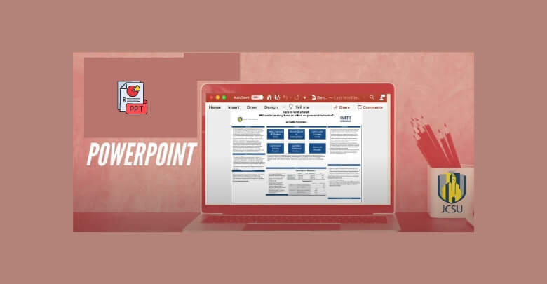
Yes, you can definitely create a poster for a conference using PowerPoint. This software is user-friendly and allows you to design visually appealing posters easily. You can set custom slide sizes, utilize built-in templates, and incorporate images, charts, and graphics. PowerPoint’s tools make it simple to arrange your content effectively, ensuring your message is clear and engaging.
Do you want to know more about how to make a PowerPoint poster that works? This article will provide you with all the essential information and tips to help you design an impressive poster that captures your attention and communicates your research effectively.
Why Choose PowerPoint for Conference Posters?
A well-known and easily accessible tool for making conference posters is PowerPoint. Its simplicity and range of features make it an excellent choice for both beginners and professionals. Many users are already comfortable with PowerPoint, which makes designing posters quicker and easier without needing extra software skills.
With PowerPoint, users have a variety of design options and customizable layouts. These features are perfect for engagingly organizing complex information. PowerPoint also offers helpful tools, like image alignment and text formatting, which give your conference poster a polished and professional look.
Whether preparing for upcoming conferences for researchers and professionals or showcasing findings to peers, PowerPoint makes poster creation manageable and efficient. Its built-in templates simplify the process, letting you focus on content rather than mastering new design programs.
Can I Make a Poster for Conference on PowerPoint?
The process of making a PowerPoint conference poster can be a rewarding experience. This platform provides flexible tools to help you design an engaging and informative visual display. Following the right steps ensures that your poster effectively communicates your message and captures attention. Here’s a guide to help you get started.
Step 1: Set Up Your Slide Size
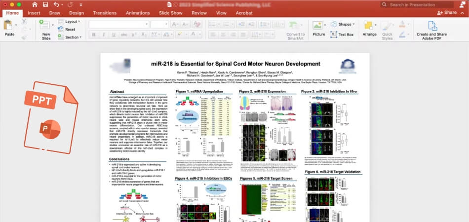
Before you begin designing, set the correct slide dimensions for your poster. Choose a size suitable for your conference’s requirements, typically 36×48 inches or A0. To adjust the slide size, navigate to the “Design” tab, select “Slide Size,” and choose “Custom Slide Size.” This action ensures your content fits perfectly within the specified dimensions.
Step 2: Choose a Simple Layout
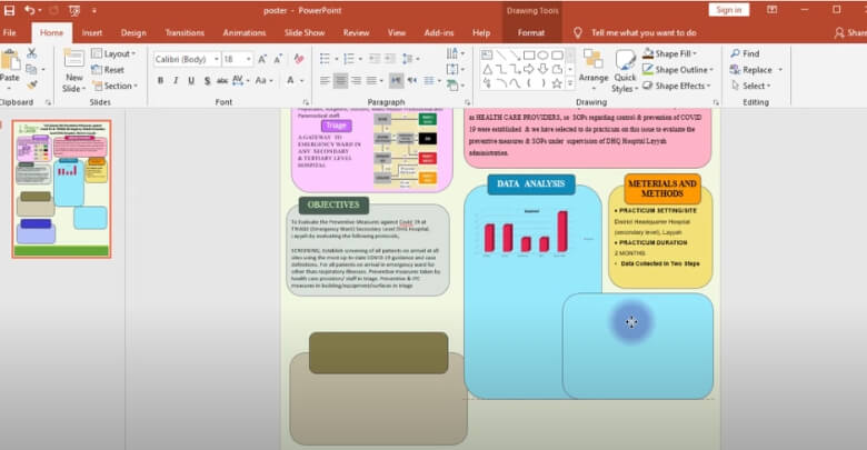
An effective poster layout simplifies your information and enhances readability. Use a grid structure to organize sections logically, such as the title, introduction, methods, results, and conclusion. Maintain enough white space between sections to avoid a mess. This method allows viewers to read through your poster easily, ensuring they absorb your message without feeling confused.
Step 3: Incorporate Eye-Catching Colors
Select a color scheme that attracts attention while ensuring readability. Use contrasting colors for text and background to enhance visibility. Stick to two or three primary colors to maintain a cohesive look. Colors must reflect the theme of your research and convey professionalism. A well-chosen color palette can engage viewers and enhance their overall experience.
Step 4: Use Clear Fonts
Choosing the right fonts contributes significantly to your poster’s clarity. Opt for sans-serif fonts, as they are easier to read from a distance. Make sure to use a larger font size for titles and headings and a smaller size for body text. Consistency in font choices will create a polished appearance. Limit the number of different fonts to maintain uniformity and avoid distractions.
Step 5: Add Compelling Graphics
Visual elements such as images, graphs, and charts can significantly enhance your poster. Include best quality visuals that clearly represent your data and findings.
Each graphic should have a clear caption or label to explain its relevance. The right visuals can convey complex information quickly, making them essential for capturing attention and enhancing understanding.
Step 6: Organize Your Content Logically
The organization of your content plays a crucial role in how effectively your poster communicates. Start with a clear title at the top, followed by sections like introduction, methods, results, and conclusion. Ensure that each section flows logically into the next. A well-organized layout guides viewers through your research, making it easier for them to follow your arguments.
Step 7: Edit and Proofread Thoroughly
Once you finish designing your poster, take the time to edit and proofread the content. Check for spelling, grammar, and formatting errors that could detract from your professionalism. Consider asking a colleague for feedback to catch any mistakes you might have missed. A polished poster reflects your attention to detail and enhances your credibility as a presenter.
Step 8: Save and Print Your Poster
After finalizing your poster, save it in the appropriate format for printing. Use high-resolution settings to ensure that all graphics remain clear and crisp. Choose a reliable print service familiar with poster printing to guarantee quality. Verify the print size matches your design specifications to avoid any last-minute surprises. Having a professionally printed poster can significantly improve your presentation.
Using PowerPoint to create a conference poster requires careful preparation and implementation. Following these steps ensures that your poster is visually appealing and effectively conveys your message to your audience.
What to Consider When Making a Poster for a Conference on PowerPoint?
Careful planning is necessary when making a PowerPoint poster for a conference to guarantee impact and clarity. A well-designed poster can capture an audience, clearly deliver research findings, and make a lasting impression. Below are key factors to consider when preparing your poster.
Define Your Poster’s Core Message
Pinpoint the main idea that you want your audience to take away. Every part of the poster should support this message, from visuals to text. Staying focused on your core message will help ensure the poster stays concise and doesn’t overwhelm viewers with too much information.
Prioritize Readability and Visual Flow
A clear layout with a logical flow is vital for a successful conference poster. Use readable fonts and appropriate font sizes, and ensure there’s enough spacing between sections. Dividing information into sections, and arranging visuals strategically, will help guide the audience’s eyes smoothly across the content.
Use Best Quality Images and Graphics
Quality visuals make a huge difference in a poster’s appeal and professionalism. Use high-resolution images and well-designed graphics to support your message effectively. Adding relevant visuals improves understanding and helps avoid a text-heavy poster, which can sometimes overwhelm viewers.
Pay Attention to Color and Contrast
Selecting the right colors enhances the visual appeal and readability of your poster. Choose colors that complement each other without clashing, and maintain enough contrast for easy reading. Colors can also help emphasize key information, directing attention to your most important data and findings.
Finalize Details for Conference Requirements
Before printing, double-check for any conference-specific requirements. Some conferences might have size guidelines, while others have restrictions on font styles or image sizes. If you’re requesting conference participation certificates, ensure that all poster elements are finalized and meet the standards provided by the event.
Following these guidelines will help you create a professional and engaging poster using PowerPoint. With attention to detail and clear messaging, your poster will stand out and communicate effectively at any conference event.
Common Mistakes to Avoid When Creating Posters in PowerPoint
Although making a poster in PowerPoint can go smoothly, there are a few typical mistakes to be aware of. Knowing these mistakes can save time and make sure your final design looks polished. Here are helpful tips to guide you.
- Overloading Text: Keep your content concise, as too much text can overwhelm viewers. Aim for essential points to ensure clarity and an easy reading experience.
- Ignoring Margins: To prevent crucial information from being missed during printing, keep text and images within the margins. A generous margin enhances the overall balance.
- Using Low-Resolution Images: Ensure all images are high-resolution, as blurry or pixelated visuals can detract from professionalism. Quality visuals create a more impactful impression.
- Skipping Alignment Checks: Regularly check that elements are aligned. Misaligned text or images can make your poster look messy, so use alignment tools to maintain balance.
- Relying on Too Many Fonts: Stick to one or two font types for a cleaner look. Too many fonts create visual chaos, which can distract viewers from your main message.
- Choosing Distracting Colors: Avoid overly bright or clashing colors, which can make text hard to read. Select a calm color scheme that enhances readability without drawing attention away from content.
- Forgetting to Save Frequently: Save your progress regularly to prevent accidental data loss. Saving frequently ensures that you won’t lose hours of hard work due to an unexpected issue.
By keeping these common missteps in mind, you can make the poster creation process smoother and produce a professional result. A thoughtful approach can lead to a more effective and visually appealing conference poster.
Tips for Optimizing Your Poster for Printing and Sharing
Designing a conference poster is only one aspect of creating an optimized one; other details that will improve print quality and digital sharing must also be taken into account. Following these key tips will help you produce a polished, professional poster that stands out.
Select the Appropriate File Format for Printing
Choosing the right file format ensures your poster’s elements remain sharp and intact. High-resolution PDF formats typically preserve the quality of images, text, and colors, making them ideal for professional printing. Most print services prefer PDFs for their compatibility and consistency.
Adjust Image Settings for Optimal Print Quality
When preparing your poster, make sure all images are high resolution, ideally 300 dpi or higher. This setting prevents pixelation, ensuring that visuals appear clear in the final print. High-resolution images significantly improve overall poster quality and maintain the integrity of your design.
Choose the Best Printing Paper for Quality Finish
Paper choice can impact the presentation quality of your poster. For high-resolution visuals, using glossy or satin finishes improves colors and details. When selecting the best paper for printing conference posters, go for one that provides durability and a professional appearance without glare.
Check Color Correction for Accurate Results
Ensuring color accuracy requires correcting your screen to match printer output. This step helps your chosen colors appear correctly in the final print, preventing unexpected color shifts. Calibration tools or working with a professional print service can make this process easier and more reliable.
Prepare a Compressed Digital Version for Easy Sharing
Optimizing your poster for digital sharing means creating a compressed file for quick downloads. Reducing file size while maintaining quality allows recipients to view your poster easily. Saving a web-optimized version enhances accessibility and ensures a faster loading experience when shared online.
With these optimization tips, your conference poster will be ready for both print and digital formats. A well-prepared poster enhances your presentation, leaving a lasting impression on both in-person and online audiences.
Frequently Asked Questions
Creating a conference poster in PowerPoint can be a simple yet impactful process, but questions often arise about optimizing design, handling print quality, and ensuring professionalism. Below are some frequently asked questions to help you make the most of PowerPoint for your conference poster.
How Do I Start Designing My Poster on PowerPoint?
To begin, set up your slide dimensions according to your conference’s requirements, typically in sizes like 36×48 inches. Go to the “Design” tab, select “Slide Size,” then “Custom Slide Size” to adjust. Setting the slide size from the start helps your content fit well and avoids resizing issues later.
What Are the Best Fonts to Use for Readability?
Choose sans-serif fonts like Arial, Calibri, or Helvetica for easy readability. For titles and headings, use larger font sizes, and for body text, a smaller but legible size. Limit your font types to one or two to maintain a clean, cohesive look and avoid visual clutter.
How Can I Make My Poster Visually Engaging?
To enhance engagement, incorporate visuals like high-quality images, charts, and graphs that support your main points. Use colors that contrast well but don’t overpower the text. Organize content in sections to guide viewers through your poster smoothly without overwhelming them with too much information.
Should I Use Templates or Design from Scratch?
PowerPoint templates can be a great starting point, especially if you’re new to poster design. Templates provide pre-set layouts, saving you time and simplifying organization. If you prefer a unique design, start from scratch, but ensure consistency in spacing, alignment, and font choices for a polished look.
How Do I Ensure Good Quality Printing Results?
To achieve clear print quality, export your final poster in high-resolution PDF format. Set your images at 300 dpi to prevent pixelation, and use high-resolution graphics throughout. Choose a professional print service that understands conference poster requirements to get the best results for your presentation.
Concluding Thoughts
Using PowerPoint to create a conference poster gives professionals and researchers alike a plethora of options. With its user-friendly interface and flexible features, PowerPoint simplifies the design process, allowing you to focus on presenting your key findings effectively. Engaging visuals and clear layouts make your poster stand out, capturing the attention of your audience.
So, can I make a poster for conference on PowerPoint? Yes! PowerPoint is a fantastic choice for designing posters that are both visually appealing and informative. It provides a variety of tools to customize your poster while ensuring that your message is clear and concise, making it accessible to everyone.
As you begin your poster-making adventure, remember to keep your content focused and visually engaging. Use the best quality images, maintain consistent formatting, and always proofread your work. Best of luck with your conference poster creation, and may your hard work lead to impactful discussions at your event!

