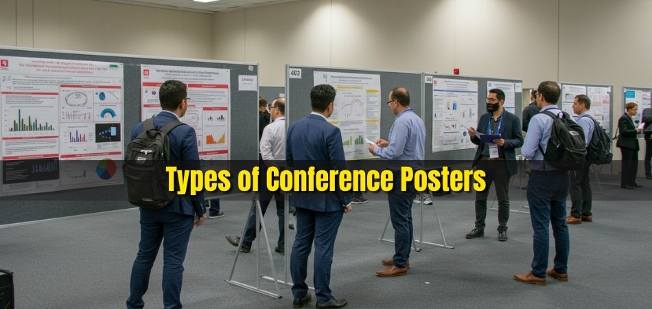
Scientific posters are often the first impression your research makes at a conference. A well-designed poster can draw attention, spark conversations, and make your findings memorable. It’s where creativity meets clarity, and presentation turns data into discovery.
The best examples of scientific posters combine strong visuals, organized structure, and concise storytelling. They simplify complex information using graphs, charts, and color balance that guide the viewer’s eyes naturally. Every element works together to deliver a clear message without overwhelming the audience.
Whether you’re presenting your first poster or improving your next one, knowing what works can make all the difference. Continue reading to explore real examples and expert tips that show how to create a poster that truly stands out.
Best Examples of Scientific Posters
A great scientific poster combines clarity, structure, and design that captures the viewer’s attention instantly. The best examples use visuals that simplify complex ideas and guide readers smoothly through each section. These posters not only share research but also tell a story. Let’s explore some remarkable examples and see what makes them effective for upcoming conferences in Canada, the USA, or elsewhere.
Research Posters With Strong Data Visualization
These posters turn complex statistics into simple, readable visuals. Graphs, pie charts, and bar models highlight key findings clearly without text overload. Each data element is color-coded and labeled for better comprehension, making it easier for attendees to grasp results within seconds during busy conference sessions.
Clinical Posters Using Clear Segmentation
A well-structured clinical poster separates each section like background, methodology, results, and conclusion with defined boxes or subtle dividers. This layout helps readers follow medical findings quickly. The segmented design ensures clarity, especially when data involves complex patient groups, trials, or diagnostic results. It’s ideal for healthcare-focused presentations.
Educational Posters With Visual Storytelling
Educational posters use illustrations, icons, and infographics to teach rather than just inform. The story flows visually, explaining concepts step by step. This approach works best for explaining procedures or experiments to students and non-specialists, making learning accessible while keeping the poster engaging and easy to follow.
Conference Posters with Impactful Color Hierarchy
Color hierarchy directs attention to important sections. Titles, subtitles, and graphs stand out through balanced color contrast. Consistent use of a color palette reinforces the research theme. Viewers can easily identify each part’s importance, making these posters both visually attractive and logically organized.
Environmental Posters Highlighting Sustainability
These posters focus on ecological or climate-related topics. Designers use green hues, minimalist layouts, and real-world photos to create an emotional connection. The goal is to inspire awareness and action while presenting measurable outcomes. They’re common in environmental science and policy-related conferences where visual storytelling supports meaningful data.
Technology Posters Emphasizing Innovation
Technology-focused posters often combine clean vector visuals with short case studies or prototypes. They may display circuit diagrams, app workflows, or AI models in a visually digestible format. Each section highlights innovation and research outcomes clearly, appealing to audiences at engineering or computer science conferences.
Social Science Posters with Narrative Flow
These posters prioritize human stories and community outcomes. They use quotes, charts, and clear comparisons to showcase behavioral or cultural data. Instead of dense text, the message flows like a narrative, helping audiences emotionally connect with the research findings during poster discussions and academic exhibits.
Scientific posters succeed when they balance creativity with accuracy. Each example above demonstrates how visuals, structure, and storytelling can make research memorable. Whether your topic is environmental, educational, or technical, focus on readability and flow.
Understanding Visual Hierarchy in Poster Presentations
A strong visual hierarchy helps your audience instantly understand where to look first and how to move across the content. It makes your poster organized, engaging, and easier to read. Every design decision matters, from font size to color balance. Let’s explore how layout and structure influence visual flow in different poster types.
Title Prominence and Placement

The title should be the most noticeable element on your poster. Larger font size, bold styling, and central alignment make it easy to locate. A clear, strong title helps audiences quickly identify the topic, especially in crowded conference halls where multiple posters compete for attention.
Section Order and Logical Flow
Organize your content in a top-to-bottom or left-to-right flow that feels natural to the reader. Each section should follow a clear order, leading the audience smoothly from background to results. Using visible section headers or numbered sections helps readers track information easily without confusion.
Size and Contrast for Readability
Bigger elements grab attention, while smaller ones guide detailed exploration. Using contrast between colors, font weights, and background shades ensures key information stands out. Important visuals, such as graphs or data highlights, should have a stronger contrast to emphasize their relevance and importance.
Using White Space Effectively
White space, or empty space, helps prevent clutter and gives each element room to breathe. It separates sections visually, making the poster less overwhelming. Balanced spacing around text and visuals improves comprehension and creates a cleaner, more professional look that draws viewers in naturally.
Layout Choices and Poster Types
Different types of conference poster layouts influence how your audience interprets data at first glance. Horizontal posters are ideal for wide visual storytelling, while vertical designs suit compact research summaries. Academic posters often prioritize data clarity, while corporate ones may emphasize visual branding and simplicity.
Color Coordination and Visual Flow
Color helps guide the viewer’s journey. Use bright or warm tones to draw attention to titles or key results, while cool or neutral shades can support background sections. A consistent palette not only enhances beauty but also directs focus to the areas that matter most.
Visual hierarchy is the foundation of poster readability. It determines what viewers notice first and how long they stay engaged. By combining balance, contrast, and layout planning, your design can communicate effectively.
How to Turn Complex Data into a Clear Poster Message?
Complex research data can easily overwhelm your audience if not presented clearly. Transforming dense information into simple visuals helps viewers understand your key findings quickly. With the right mix of charts, visuals, and concise text, you can make your message stand out. Let’s explore how to simplify data for better communication in posters.

Replace Large Tables With Visual Charts
Long tables filled with numbers can be hard to follow. Convert them into clean bar charts, pie charts, or line graphs that highlight trends instantly. For example, instead of a table showing five-year growth, a simple line chart makes the change visible at a glance, helping viewers grasp results effortlessly.
Use Infographics to Summarize Results
Infographics combine visuals and short text to make data storytelling more engaging. Icons, shapes, and arrows can show cause-and-effect relationships clearly. For instance, if your research tracks environmental impact, use layered icons and simple captions to summarize findings instead of paragraphs of explanation.
Create Before-and-After Visual Comparisons
A before-and-after layout helps audiences understand improvements or outcomes easily. For example, in a medical study showing reduced infection rates, one side can display the initial data while the other shows post-intervention results. This side-by-side method makes progress visually evident without needing complex descriptions.
Balance Text and Visuals Thoughtfully
While visuals attract attention, clear and concise text provides context. Limit each section to key points only. Too much text can overwhelm, while too many visuals may cause confusion. A balanced layout ensures information flows naturally and keeps viewers focused on the central research message.
Highlight Core Findings With Visual Cues
Use color, size, or bold markers to emphasize critical data points. Circling or enlarging specific figures can guide attention to what matters most. For example, highlight a 60% improvement result in a bold color so it immediately stands out during poster presentations or conference sessions.
Turning complex data into clear visuals builds stronger audience engagement. Each chart, icon, or comparison should serve a purpose, making information simple yet powerful. A well-designed poster tells your research story without long explanations.
Tips for Creating a Poster That Communicates Your Research Effectively
A research poster should communicate complex ideas in a way that feels simple, engaging, and easy to follow. The most effective designs make information instantly clear, even from a distance. A quick poster presentation for conference sessions works best when visuals convey the main message without lengthy explanations. Let’s explore practical strategies that help your poster speak clearly.
- Define your key message first: Identify the single most important takeaway from your research. Highlight it in the title or introduction so viewers understand your poster’s purpose within seconds of reading.
- Keep your text short and clear: Use concise sentences that summarize results effectively. Avoid technical jargon when possible and present findings in simple, reader-friendly terms that make comprehension effortless.
- Use bullet points instead of paragraphs: Bullet points make content easier to scan. They create visual rhythm and help viewers move smoothly from one idea to another without losing focus or interest.
- Maintain consistent color and font use: Stick to a simple color scheme and easy-to-read font. Consistency improves visual flow and reinforces professionalism, making your poster both appealing and credible.
- Balance visuals with key findings: Combine visuals with short explanations. Graphs, charts, and icons should strengthen your story while keeping the overall layout clean and balanced.
- Add a contact or QR code for engagement: Encourage interaction by including your contact details or a QR code linking to your research. This allows attendees to connect with you later for collaboration or feedback.
An effective poster captures attention, communicates quickly, and leaves a lasting impression. Every element should guide the viewer toward understanding your research with ease. Keep refining your layout until every section supports your story.
Common Mistakes to Avoid When Designing a Scientific Poster
Even powerful research can lose attention if the poster design confuses the viewer. Overcrowded text, uneven visuals, and unclear flow can make your message hard to follow. Avoiding these small design errors can significantly improve your poster’s impact. Let’s identify these common pitfalls so you can refine your presentation with confidence.
Overcrowding the Poster with Text
Filling every corner with information makes your poster difficult to read. Replace lengthy paragraphs with short phrases, visuals, or icons. Highlight key results only. A clean layout not only looks more appealing but also helps viewers understand your research faster.

Inconsistent Visuals and Formatting
Mixing multiple fonts, colors, or shapes can make the design look unpolished. Stick to a uniform color palette and consistent heading styles. Visual consistency builds trust and makes your poster appear cohesive, allowing your data to take the spotlight rather than the design itself.
Poor Font Size and Readability
Tiny fonts or overly stylized text strain the eyes. Choose readable font types and keep titles bold and clear. Make sure every word is visible from a moderate distance. Readability directly affects how long viewers stay engaged with your poster content.
Lack of Logical Flow
When content sections are placed without order, viewers struggle to connect your ideas. Follow a structured sequence, guiding them naturally from introduction to conclusion. A clear reading path enhances understanding and keeps your audience interested in your findings.
Ignoring Visual Balance
Too many visuals on one side or large blank spaces on the other create an imbalance. Distribute text and images evenly to maintain harmony. A visually balanced poster feels calm, organized, and professional, making it easier for viewers to absorb your main message.
Design errors often go unnoticed until they limit your poster’s effectiveness. Paying attention to balance, order, and clarity can transform your work from average to outstanding. Keep refining until every element feels aligned with purpose.
How to Review and Refine Your Poster Before Submission?
Before submitting your poster, taking time to review and refine it can make a big difference in how it’s received. Small adjustments in layout, color, and text often transform an average design into a professional one. Careful checking helps your work look polished and confident. Let’s go through the key steps to perfect your final version.

Check Spacing, Contrast, and Grammar
Ensure consistent spacing between elements and clear separation between sections. Proper contrast makes text easy to read and visuals more vibrant. Finally, review grammar and spelling carefully, as minor mistakes can reduce credibility and distract from your research message.
Print a Test Version
Always print a draft copy before the final submission. A printed version helps identify color issues, font sizing errors, and layout imbalances that may not appear on a screen. Reviewing the physical format also gives you a real sense of visibility and proportion.
Ask Peers for Feedback
Fresh eyes often catch what you miss. Share your draft with peers or mentors and invite constructive feedback. Ask whether your main points are clear, the visuals are balanced, and the flow feels natural. Honest input can reveal areas for quick improvement.
Test Readability from a Distance
Place your printed poster a few steps away and see if key titles and results remain visible. If someone unfamiliar with your topic can understand it easily, your layout and text size are well optimized. This simple test ensures clarity during presentation.
Practice Your Verbal Explanation
Rehearse how you will introduce and explain your poster during sessions. Being confident in your delivery helps reinforce the visual message. When both your design and explanation align, your presentation feels more professional and engaging to the audience.
Refining your poster is as crucial as designing it. Each small adjustment strengthens clarity, structure, and confidence. A polished layout supported by peer feedback ensures your work stands out for the right reasons. Start designing your next poster today and make your research stand out at your next conference.
Frequently Asked Questions
Before you design your next scientific poster, it’s natural to have a few questions about creativity, presentation, and effectiveness. Below are some helpful answers that cover practical tips researchers often wonder about after learning how to build a professional and visually appealing poster.
How Can I Make My Poster Look Unique From Others?
Use a consistent color scheme, creative visual flow, and clean typography to stand out. Avoid generic templates and add a few personal touches, such as icons or symbols that connect with your topic. Simple originality always leaves a strong impression.
What Is the Ideal Size for a Conference Poster?
Most conferences accept posters around 36×48 inches, but it’s best to check specific guidelines before printing. The size should balance readability and portability. Choose a layout that fits your content naturally without overcrowding or leaving too much empty space.
How Can I Make People Stop and Read My Poster?
Start with an engaging title that sparks curiosity. Include one eye-catching visual or key figure at the center. Once someone stops to look, clear sections and readable text will hold their attention and encourage further discussion.
Should I Include My Photo or QR Code on the Poster?
Adding your photo is optional, but a QR code is very useful. It allows visitors to access your paper, contact details, or additional data easily. This modern touch keeps engagement going long after the session ends.
How Early Should I Start Preparing My Poster?
Ideally, begin at least two to three weeks before the deadline. This gives you enough time to plan the layout, review data, and collect feedback from peers. Early preparation reduces stress and leads to a more polished result.
Can I Use Humor or Creative Titles in a Scientific Poster?
Yes, but only if it suits the tone of your research. Light creativity can make your poster memorable, as long as it doesn’t reduce professionalism. A clever but clear title helps attract more viewers to your work.
How Do I Handle Questions During the Poster Session?
Stay relaxed and friendly when people ask questions. Listen carefully, answer honestly, and admit when something needs more study. Engaging confidently helps build connections and shows you’re open to collaboration and feedback.
Concluding Lines
Designing a scientific poster is more than arranging text and visuals; it’s about communicating ideas clearly. These poster examples prove that simplicity, balance, and thoughtful design always lead to better engagement.
When each section connects smoothly and visuals highlight key results, your audience will understand your work faster. A clear layout not only shares your research but also reflects professionalism and confidence.
Great posters are remembered because they tell a story without saying too much. With focus, feedback, and creativity, your next poster can join the list of best examples of scientific posters admired at future conferences.

