Planning, imagination, and effective communication are necessary when making a conference poster. The process can seem difficult, especially if it’s your first time, as each detail contributes to effectively showcasing your research. This is where a question arises: How long does it take to make a conference poster?
On average, creating a well-organized conference poster takes about 7–8 days, factoring in research, design, and revisions. Key steps include preparing content, designing visuals, editing, and practicing the presentation. Each stage varies depending on complexity, but allowing adequate time ensures a professional result that conveys your message with clarity.
Curious to know more about the best practices, tips, and common mistakes to avoid when creating your conference poster? Read on! This article covers everything you need to know to design an impactful, professional poster that stands out at any conference.
Conference Poster: What Does It Mean?
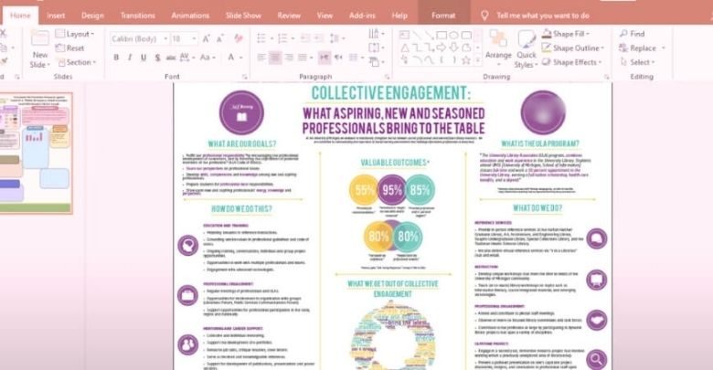
A conference poster is a visual aid for presenting research findings at academic conferences. It usually features a mix of text, images, and graphs. The design allows attendees to quickly understand the study’s goals, methods, and main results without needing a full-length paper.

To create a poster, you must plan carefully, use clear messaging, and be sure to place a lot of emphasis on the presentation. Researchers aim to keep it simple and appealing to capture interest. The layout often follows a structured format to ensure all important details are easily seen and understood. Each poster speaks volumes about the researcher’s work and aims.
When presenting a poster, researchers display their work at various academic gatherings. You can even find notable conferences to attend where researchers showcase posters on different topics. This allows professionals to exchange ideas and gain new insights.
What to Consider When Making a Conference Poster?
It takes a thoughtful fusion of design, content, and clarity to produce a conference poster that stands out. As a valuable tool in academic and professional arenas, a well-made poster can effectively communicate research insights, provoke discussion, and foster networking. Here’s what to consider to maximize your impact.
Define the Core Message Clearly
Focusing on a concise core message is crucial to providing clarity and ease of learning. Aim to present the essential insights that summarize your work’s value. This helps viewers quickly understand the main idea and retain key points, reinforcing the strength of your research without confusing them.
Design for Visual Appeal
An appealing design helps draw attention, increasing engagement with your poster. Using a balanced color scheme, readable fonts, and organized structure creates a natural flow. Placing visuals strategically guides viewers’ eyes and supports understanding. Minimal text combined with informative graphics ensures readability and invites viewers to explore your research findings more closely.
Ensure Accessibility and Readability
Maximizing accessibility improves your poster’s reach to a wider audience. Use large fonts, simple language, and brief statements to enhance readability from a distance. Including visual aids such as icons, headers, and bullet points improves organization and helps viewers quickly navigate the content. Easy-to-read posters attract more attention, even from non-experts in your field.
Encourage Interaction and Engagement
A poster should invite questions and conversation. Including prompts, diagrams, or interactive elements can create curiosity and encourage viewers to ask about your research.
Creating these moments not only engages the audience but also offers a unique chance for feedback and connection with professionals, providing insights that could refine or expand your work.
Align Content with Audience Needs
Adjusting content to match the interests and knowledge level of the audience ensures relevance and impact. Identifying the conference’s primary attendees helps adjust terminology, visuals, and depth. Adapting to the audience’s needs improves engagement and makes your research memorable, increasing its effectiveness and overall contribution to the conference.
To effectively communicate your work, an impactful conference poster strikes a balance between clarity, simplicity, and engagement. Focusing on these elements ensures you maximize the value of presenting a poster at a conference, creating a lasting impression on viewers.
How Long Does It Take to Make a Conference Poster?
It takes time, preparation, and a careful balancing act between visual appeal and clarity to create a conference poster. Many factors affect how long it takes to make a successful poster, and understanding these can streamline the process. Here’s a breakdown of what to consider:

Research and Content Preparation
Preparing content is one of the most time-consuming parts, often requiring 2-3 days. Collecting data, choosing essential points, and creating a logical flow is critical. Information organization also ensures a concise and visually appealing presentation, which can take some focused effort, especially for complex research topics.
Designing Layout and Structure
An effective layout increases readability and engagement, often taking 1-2 days to finalize. Arranging sections in an organized way helps guide viewers smoothly through the information. Choosing a structured layout with clear headers and concise text is key to a successful design.
Selecting Visuals and Graphics
Good visuals increase the appeal and understanding of your poster, often adding about 1 day to the process. Finding relevant graphics and creating simple, informative images enhances the overall presentation. Visuals should also align with your message, so dedicating time to this selection stage improves overall quality.
Editing for Clarity and Conciseness
To ensure accuracy and readability, editing calls for close attention to detail and takes an additional day. Revising each section to avoid lengthy or complex wording helps make the poster accessible. Grammar, spelling, and formatting are equally important, as polished content reflects professionalism and clarity.
Feedback and Revisions
Feedback offers fresh perspectives and helps refine the poster, often requiring 1-2 additional days. Sharing a draft with peers or mentors can reveal necessary changes and improve the content. Allowing time for feedback and revisions ensures your poster aligns with both research goals and audience expectations.
Printing and Quality Checks
Printing adds extra time, especially with quality checks that ensure your poster looks as intended. Taking 1 day for this process helps avoid unexpected issues like blurriness or incorrect colors. A final quality check also confirms that everything is readable and that images print clearly.
Practicing the Presentation
Design is only one aspect of preparation; a confident presentation enhances the poster’s worth. Taking 0.5 days to review talking points and rehearse delivery ensures you can explain your research clearly. Practicing also helps you anticipate questions, making interactions with conference attendees more engaging.
Balancing each stage carefully leads to a polished, impactful conference poster. Focusing on clarity, design, and preparation ensures your research stands out, effectively conveying its value and engaging viewers for a memorable conference experience.
Common Mistakes to Avoid When Making a Conference Poster
A successful conference poster requires more than just data and design. Avoiding common mistakes ensures your work stands out and communicates effectively. Here’s a guide on what to avoid for a professional, engaging poster.
Overloading with Text and Details
Including too much text can overwhelm viewers and distract them from your main points. Aim to highlight only the essential aspects of your research, focusing on key data and conclusions. A clear and concise approach helps viewers grasp the message quickly, enhancing their experience and encouraging engagement.
Avoiding Visual Appeal
An engaging design attracts attention and keeps viewers interested. Using balanced colors, legible fonts, and organized sections creates a professional appearance. Good visuals highlight important points and help viewers understand complex data better. This visual appeal is essential in catching attention in a crowded conference space.
Ignoring Readability and Flow
Readability is critical for effective communication, as cluttered or small text can drive viewers away. Using clear headings and logical sections guides viewers smoothly from one point to the next. By prioritizing readability, you make your poster approachable, allowing audiences to understand your work at a glance.
Forgetting Audience Needs
Considering your audience’s background ensures the content resonates and remains relevant. Use appropriate language and visuals that appeal to both specialists and general attendees. Recognizing the different dynamics between poster vs. oral presentations can also help you adjust your content to meet audience expectations effectively.
Skipping Proofreading and Final Checks
Spelling or grammatical errors can detract from the professionalism of your poster. Taking time to proofread ensures accuracy, leaving a positive impression on your audience. A final check of all visuals, text, and formatting helps prevent small mistakes that could affect the quality of your presentation.
By avoiding these typical errors, you can make sure that your conference poster is impactful, interesting, and clear. Focusing on readability, design, and relevance helps you effectively communicate research and stand out in a crowded space, making a lasting impression.
Tips for Designing Your Conference Poster Efficiently
Effective conference poster design combines time-saving strategies with well-thought-out planning to improve quality. By focusing on key strategies, you can create an impactful poster without unnecessary delays. Here are some tips to help you simplify the process:

- Use Pre-Designed Templates: Templates provide a ready-made structure, saving you from starting from scratch. They help maintain professional standards and let you concentrate on your content.
- Choose User-Friendly Design Tools: Selecting intuitive software speeds up the creation process. Easy-to-use tools reduce the learning curve and allow quick adjustments as needed.
- Prepare All Content in Advance: Having text and visuals ready beforehand simplifies assembly. It keeps the workflow smooth and prevents interruptions during design.
- Limit Fonts and Colors: Using a minimal number of fonts and colors reduces decisions. A simple design speeds up the process and keeps the poster looking clean.
- Utilize High-Quality Visuals: Selecting clear, high-resolution images early avoids issues later. Quality visuals enhance appearance and save time searching for replacements.
- Set Specific Deadlines: Establishing timelines for each task keeps you on track. Deadlines prevent procrastination and ensure timely completion of your poster.
- Review Work in Stages: Checking sections as you complete them catches errors early. It streamlines the final review and minimizes last-minute corrections.
By applying these efficiency tips, you can create a compelling conference poster with less stress and better results. Focusing on smart strategies helps you present your work confidently and make a strong impression at your event.
FAQs About How Long Does It Take to Make a Conference Poster?
There are many steps involved in making a conference poster, and each one takes time and careful consideration. For those new to the process or looking for guidance, we’ve compiled answers to some of the most common questions. From planning to final presentation, these FAQs provide key insights into creating an impactful conference poster efficiently.
What Supplies Are Essential for Making a Conference Poster?
Having the right supplies simplifies the poster-making process. Essential items include a computer with design software, good-quality images, and visual elements like graphs or charts. Consider purchasing quality paper or canvas for printing, along with backup storage for files. These essentials streamline production and help prevent any last-minute disruptions during the process.
How Do I Choose the Best Design Software?
Selecting user-friendly design software is crucial for ease and efficiency. Popular options include PowerPoint, Adobe Illustrator, and Canva, which cater to different skill levels. Each offers unique features designed specifically for graphics and layouts. Choose a tool based on your comfort level, project requirements, and desired complexity to ensure a smooth design experience.
How Many Visuals Should I Include in My Poster?
Aim to include 3-5 visuals, such as charts, graphs, or relevant images, to illustrate your research effectively. These visuals should complement the text and clarify complex information for the viewer. Creating a poster with too many visuals can confuse your message, so ensure each visual serves a clear purpose for optimal engagement.
How Do I Prepare for Poster Presentation?
To confidently communicate your research, you must practice your presentation. Rehearse a short summary that highlights key points while preparing for potential questions. Consider practicing in front of peers to gather feedback, which can help you refine your delivery. Being well-prepared increases your comfort level and enhances audience engagement during the presentation.
Can I Make a Poster in Less Than a Week?
While a week is ideal for a comprehensive poster, it is possible to create a simple version in 3-4 days with careful planning. Prioritizing essential tasks, such as content preparation and basic design, helps save time. However, avoid rushing through the process to ensure you maintain a good quality and professional presentation.
Bottom Lines
The process of creating a successful conference poster combines creativity with effective communication. By focusing on essential elements like clarity, design, and audience engagement, you can create a poster that highlights your research and attracts interest from peers and experts alike.
If you’re still wondering, how long does it take to make a conference poster? — the process typically spans about a week, considering stages like research, design, and final edits. Dedicating time to each step ensures your poster is polished, informative, and visually appealing for the conference audience.
As you prepare, remember to stay organized, prioritize key points, and practice your presentation for a confident delivery. Good luck with making a memorable poster that showcases your hard work and valuable insights effectively!


