Researchers, clinicians, and healthcare professionals gather at global conferences to share discoveries and advances. Often overlooked is the humble poster as a powerful way to communicate research findings. Here’s the scoop on “What Is the Standard Poster Size for a Medical Conference?”
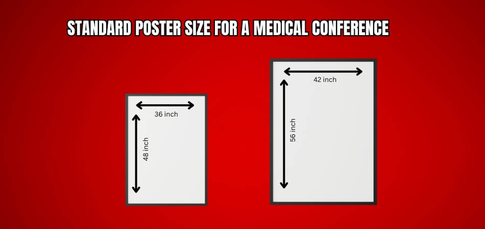
The standard poster size for a medical conference typically ranges from 36 by 48 inches to 42 by 56 inches. These dimensions ensure visibility and readability while allowing presenters to effectively showcase their research findings and engage with conference attendees.
This blog explores the significance of poster dimensions and offers tips to ensure your presentation captivates. Keep an eye out for conference insights!
What Is a Medical Conference?
The purpose of a medical conference is to bring together the latest advancements, research findings, and best practices in healthcare. The benefits of attending medical conferences include networking, sharing knowledge, and collaborating with other professionals.

Medical conferences have keynote presentations, panel discussions, workshops, and poster sessions. The topics covered at these events include new treatment modalities, emerging technologies, and healthcare policies. There are renowned speakers and meaningful discussions with peers.
Among world-class medical events, Canadian medical conferences are popular. International attendees planning to join the medical conferences in Canada 2024 can avail the opportunity to travel and network globally. These conferences are known for purposeful sessions and activities and help attendees grow their careers.
What Is the Standard Poster Size for a Medical Conference?
Your poster size is crucial when preparing for a medical conference. Global Conference, a leading resource for conference organizers, suggests that the standard poster size for medical conferences is typically 36 inches by 48 inches.

This site makes your research findings clear and makes your poster stand out. Think about how much information you want to include and how it will be organized in your poster. Global Conference recommends using concise text and high-quality graphics to convey your message effectively.
Some conferences have specific guidelines or requirements for poster sizes. Be sure to check the conference website or contact the organizers directly before printing your poster. Follow these guidelines to make sure your poster meets the requirements and enhances your presentation.
Make sure your poster has some blank space for viewers to take notes or ask questions during the conference. You can have interactive discussions and engage with your research this way. Want to learn the steps to make a poster for a medical conference effectively? Below section you will find a brief overview of poster making process.
How to Make a Medical Conference Poster?
Preparing a medical conference poster requires attention to detail and effective communication of research findings. A well-designed poster can effectively convey complex information and engage conference attendees.
Step 1: Set your goals
Begin by clarifying the purpose of your poster. Determine what key message or findings you want to communicate to your audience. This will guide the content and design choices throughout the process.
Step 2: Gather Content
Collect all necessary materials, including research data, images, graphs, and text. Ensure that your content is concise, relevant, and organized logically to facilitate understanding.
Step 3: Choose a Layout
Select a layout that suits your content and enhances readability. Common options include a traditional column format or a more creative, visually engaging design. Consider how different elements will flow together on the poster.
Step 4: Design Elements
Incorporate design elements that enhance visual appeal and clarity. Put in a Conference Poster, Use clear headings, color schemes, and fonts to guide the viewer’s eye and highlight important information. Balance text with visuals to maintain interest and comprehension.
Step 5: Create Visuals
Develop graphs, charts, and images to support your data and findings. Ensure that visuals are high quality, clearly labeled, and effectively convey information without overwhelming the viewer.
Step 6: Write Concise Text
Craft clear, concise text to accompany your visuals. Summarize key points and findings in brief paragraphs or bullet points. Use plain language and avoid jargon to make your poster accessible to a diverse audience.
Step 7: Review and Edit
Take time to review and edit your poster for clarity, accuracy, and consistency. Check for spelling and grammatical errors, and ensure that all information is presented accurately. Consider seeking feedback from colleagues or mentors for further refinement.
Step 8: Print and Assemble
Once you are satisfied with your poster, prepare it for printing. Choose a high-quality printing service and select an appropriate size and paper type. Assemble your poster carefully, paying attention to alignment and presentation.
What is the Importance of Poster Presentations in Medical Conferences?
Poster presentations play a vital role in medical conferences by offering an accessible platform for sharing research findings. They allow participants to visually convey complex information straightforwardly. Engaging in a poster session at medical conference promotes meaningful discussions and interactions among attendees, enhancing the overall learning experience.
Accessibility and Engagement
Posters are easily accessible to conference attendees, allowing for in-depth exploration of research topics at one’s own pace. Attendees can engage with presenters directly, raising meaningful discussions and networking opportunities.
Visual Representation
Visual aids in posters help convey complex information more effectively than oral presentations alone. Colorful graphs, charts, and images enhance understanding and retention of key findings, making research accessible to a diverse audience.
Knowledge Dissemination
Poster presentations facilitate the dissemination of a wide range of research, from preliminary findings to completed studies. This inclusivity encourages the exchange of ideas among researchers at different stages of their careers, enriching the scientific community.
Feedback and Collaboration
Presenting a poster allows researchers to receive immediate feedback from peers, mentors, and experts in the field. This constructive criticism stimulates scientific growth and may lead to fruitful collaborations or further refinement of research methodologies.
Flexibility and Reach
Posters offer flexibility in content delivery, accommodating various formats such as case studies, literature reviews, and data analyses. Additionally, poster sessions often draw a diverse audience, maximizing the reach and impact of the research presented.
What Are the Key Components of a Successful Medical Conference Poster?
Crafting a successful medical conference poster requires attention to several key components that ensure clarity, engagement, and effectiveness in conveying research findings.
Clear and Concise Title
A compelling title succinctly summarizes the research topic and attracts viewers’ attention. It should be descriptive yet concise, conveying the essence of the study in a few words. A well-chosen title can spark interest and encourage viewers to read further.
Well-Structured Content
Organize content logically, with sections for background, methods, results, and conclusions. Each section should be delineated, making it easy for viewers to guide the poster and understand the research flow. A clear structure helps communicate the research narrative effectively and allows for quick comprehension.
Visual Appeal
Utilize visually appealing design elements such as color schemes, fonts, and graphics to enhance readability and attract attention. Balance text with visuals to maintain viewer engagement and convey information effectively. An aesthetically pleasing poster is more likely to capture interest and facilitate better retention of information.
Engaging Visuals and Data
Incorporate high-quality visuals such as graphs, charts, and images to illustrate key findings and enhance comprehension. Data should be presented clearly and accurately, with labels and legends for easy interpretation. Engaging visuals can make complex information more digestible and memorable for the audience.
Effective Communication
Use concise language and avoid jargon to ensure that the poster is accessible to a broad audience. Engage viewers through succinct summaries of findings and compelling visuals that convey the significance of the research. Effective communication ensures that the research resonates with both experts and non-experts alike.
Tips for Designing a Poster Within Standard Dimensions
Creating a poster that fits standard dimensions is essential for clarity and professionalism. A well-designed poster attracts attention and effectively communicates your research. Here are some tips to help you design your poster within the required size.

Choose the Right Layout
Start by selecting a layout that complements your content. You can opt for a vertical or horizontal layout, depending on your preference. Make sure it aligns with the standard size required for the conference. Using grids can help you organize sections logically and maintain a clean appearance.
Use Clear Fonts
Select fonts that are easy to read from a distance. Stick to one or two font types to keep the design consistent. Use larger font sizes for headings and subheadings to emphasize important information. This will improve readability and ensure your main points stand out.
Limit Text
Keep your text concise and focused on key messages. Use bullet points to summarize important information and avoid large blocks of text. This makes it easier for viewers to absorb your content quickly. Aim for clarity and brevity to communicate your research effectively.
Incorporate Visuals
Include high-quality images, graphs, and charts to illustrate your findings. Visuals should enhance your message and support your text. Make sure all visuals are clearly labeled and directly related to your research. This helps viewers understand your data better and keeps them engaged.
Maintain a Balanced Design
Balance text and visuals throughout your poster for a cohesive look. Use white space effectively to create a clean and uncluttered appearance. This prevents the poster from feeling overcrowded and guides the viewer’s eye naturally. A balanced design makes it easier for viewers to navigate your content.
Frequently Asked Questions
Understanding the standard poster size is essential for effectively presenting your research at a medical conference. This section addresses common questions to help you navigate the requirements and ensure your poster makes a strong impact. Here are the FAQs along with their answers.
Why Is the Standard Poster Size Important for a Medical Conference?
The standard poster size ensures consistency and visibility at medical conferences. It allows presenters to effectively showcase their research findings to a diverse audience of conference attendees. A properly sized poster enhances readability and helps grab the attention of viewers. This can lead to more meaningful interactions and discussions about your work.
What Are the Typical Dimensions for a Medical Conference Poster?
The standard dimensions usually range from 36 inches by 48 inches to 42 inches by 56 inches. These sizes provide enough space for content while maintaining readability and a professional appearance. Adhering to these dimensions helps ensure that your poster stands out among others. This can make it easier for viewers to absorb your information.
Can I Use a Smaller Poster Size for a Medical Conference?
While smaller sizes are possible, it is recommended to stick to the standard dimensions. Doing so ensures your poster stands out and remains easily visible amidst the conference crowd. Smaller posters may not have enough space for essential information. This can limit the impact of your research presentation.
Are There Restrictions on Poster Size at Medical Conferences?
Some conferences may have specific guidelines regarding poster dimensions. It is crucial to check the event’s website or contact the organizers to avoid any potential issues. Being aware of these restrictions can save you time and effort during preparation. This way, you can ensure your poster meets all necessary requirements.
How Should I Format My Content to Fit the Standard Poster Size?
Organize your content logically, with sections for background, methods, results, and conclusions. This structure ensures that your poster flows smoothly and effectively communicates your research findings. Use clear headings and bullet points to enhance readability. Additionally, make sure your visuals complement the text and support your main messages.
Final Thought
A successful medical conference poster presentation depends on accuracy. It’s all about the details, from choosing the right poster size to crafting engaging content. It’s important to take action right away if there’s an error. Identify the mistake, then fix it right away to avoid any negative consequences. Even a minor oversight can have a big impact.
Follow the guidelines in this discussion, including understanding “What Is the Standard Poster Size for a Medical Conference?”, to enhance your chances of delivering an impactful presentation. You’ll shine bright amidst the conference crowd if you stay diligent and informed.


