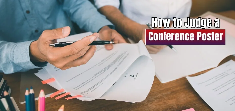
Conferences bring together people who want to share their research, connect with others, and learn from new ideas. Posters play a big part in these events, and sometimes you may even wonder how to judge a conference poster.
Judge a conference poster by checking clarity, visual design, research quality, and presenter communication. Strong posters are easy to read, follow a clear flow, present original work with solid data, and are confidently explained by the presenter during discussion.
Are you curious about how posters are judged, what mistakes lower their quality, or why engagement matters so much? If yes, then keep reading this article because you will find every important detail about conference posters explained here.
How to Judge a Conference Poster?
Posters often become the highlight of the event hall when you visit a conference. They give a quick yet detailed look at someone’s research or project. To fairly judge them, it’s important to check more than just looks. Let’s go deeper into how you can do that.
Clarity and readability
A poster should never feel hard to follow. The text needs to be large enough to read from a short distance. The images and charts should not be blurry or crowded. If the content feels tight and confusing, the message is lost, no matter how strong the research might be.
Visual appeal
Design plays a key role in catching attention. Posters with clean backgrounds, bright but balanced colors, and clear visuals always stand out. Images or diagrams should support the research, not distract from it. A poster that looks neat is always easier to understand than one overloaded with unnecessary decoration.
Logical flow
The information on a poster should take the reader step by step. It usually starts with the background, then explains methods, shares findings, and ends with conclusions. Labels and headings should make it easy to follow the story without skipping around. A strong flow makes even complex research simple to grasp.
Research originality
It is important to judge if the poster shows something new. A strong poster does not just repeat old findings; it adds something fresh. The research should point to a real question or problem. The originality of the work makes it stand apart from others in the same field.
Methodology and data
Good research rests on strong methods. The data should clearly support the conclusions written on the poster. Graphs, tables, and charts must be accurate and easy to interpret. If the process seems weak, the results will not feel convincing, no matter how colorful the poster looks.
Context and insight
Posters should make clear why the research matters. Background details should give readers the bigger picture, while the conclusions should show the outcome and future direction. If you’re preparing for upcoming conferences, you will notice how this balance of context and insight makes some posters more memorable.
Communication skills
Presenters add life to the poster. They should explain the main points clearly and not just read directly from the board. Quick and confident answers to basic questions show that they know their research well. This adds trust and respect to the work being judged.
Knowledge and depth
When asked deeper questions, the presenter’s knowledge really shows. They should be able to talk about their part in the project and why it is important. A confident presenter who explains both simple and complex points proves the strength of their research and preparation.
Engagement and professionalism
The best posters are supported by presenters who are both polite and passionate. Their body language and tone should show interest without being overbearing. Professional behavior builds credibility, and combined with enthusiasm, it creates a positive experience for the judges and the audience.
Judging a conference poster means checking how clear the design is, how strong the research stands, and how confidently it is presented. A winning poster balances all three, leaving a lasting impression on both judges and the audience.
How Important Is Content Quality in a Conference Poster?
What often captures attention in a conference poster is less about the design and more about how well the message comes through. The strength of the content decides whether people understand or ignore it. Let’s explore this in detail.
Clear Research Focus

A poster should clearly show what the research is about. If the main point is hidden or confusing, people may lose interest quickly. A simple, straight-to-the-point explanation makes it easier for the audience to connect with the topic and follow along.
Key Findings Highlight
Research findings should be shared in a way that’s easy to spot and remember. Using short points, charts, or visuals can make results more attractive. Highlighting the main outcome ensures that the most important message does not get lost.
Simple Communication
Clear and simple language works best for posters. People often spend only a few minutes reading, so clarity is more important than long explanations. Straightforward words and short sentences keep the message easy to follow.
Visual Support
Good visuals like graphs, images, or charts should support the text instead of replacing it. They help people understand complex details faster. But too many visuals without explanation can confuse the reader, so balance is important.
Lasting Impression
A poster with strong content leaves an impression even after the session ends. When the message is clear, people remember the key idea and may even want to learn more about the research. This is the real success of a conference poster.
The quality of content in a conference poster is what makes it effective. When research is clear, findings are highlighted, and the message is easy to understand, the poster stands out and makes a strong impact.
What Role Does Audience Engagement Play in Judging a Poster?
A poster is more than just pictures and text on paper. It is a tool to connect with people who stop to see it. The way the presenter communicates makes a big difference in quality. Keep reading to see how engagement plays a major role.

Strong Impressions
The first thing people notice can decide if they stay longer. A simple design, clear points, and neat display attract quick attention. When a poster looks inviting, people will want to know more. This first step of interest can strongly affect the judging process.
Active Interaction
Talking with people while showing a poster makes a strong impact. When the presenter answers clearly and connects ideas, the poster feels alive. Interaction shows confidence and understanding of the topic. Judges see this effort as an important sign of overall quality.
Meaningful Discussion
Posters that bring up discussions usually leave a lasting effect. When the audience asks thoughtful questions, it shows the topic is important. A good discussion also proves the presenter can handle different views. Judges often value this as a clear mark of poster success.
Clear Explanation
Explaining the poster well gives it more impact than visuals alone. The poster may show facts, but spoken words build a connection. Explanation helps people understand the deeper side of the work. Judges usually reward posters that combine visual appeal with clear explanation.
Audience Reaction
The way people react gives a clear idea of poster quality. If the audience looks interested and asks more, it shows good results. Smiles, nods, and curiosity prove the poster has reached them. Judges take these signs as proof of strong audience engagement.
Audience engagement is an important part of how posters are judged. A poster may look nice, but a connection makes it stand out. Interaction and response help judges see the real value. Strong engagement always makes a poster more memorable and effective.
Should Visual Aids and Data Presentation Affect Your Judgment of a Poster?
Posters are not just about words on a page. They use visuals, data, and design to share information quickly. Sometimes these tools help, but sometimes they may create confusion. Let’s look at how they can shape the overall impact.

Clear Message
When data is shown in simple charts, people understand the point quickly. A clear graph can save time and avoid long descriptions that bore the audience. But if the design is messy or too complicated, people lose interest. A good presentation makes communication smooth and effective.
Visual Power
The right use of images, icons, and colors brings strong attention. They help people remember the poster message better and longer. Strong visuals are often the result of careful effort to design a conference poster that is not only eye-catching but also easy for the audience to interpret.
Honest Display
Posters gain respect when the data is shown fairly and honestly. Sometimes graphs can be changed to make results look bigger or smaller. This trick confuses the audience and lowers trust in the poster. Being honest in showing numbers makes the poster more believable.
Simple Layout
A poster should not look like a puzzle of random designs. Too many colors, images, or graphs can be overwhelming to the viewers. A simple and neat design highlights only the key points. People then focus on the main message without distractions and confusion.
Strong Impact
Posters that mix visuals and data correctly stay in memory longer. They are easy to recall and even easier to talk about later. This lasting effect separates average posters from powerful ones. Strong impact makes a poster worth noticing again and again.
Simple, well-structured visuals make a poster more effective. Honest data always makes the information trustworthy for the audience. Clear charts and images help people understand the message faster. Simple designs with balance make posters stronger and memorable.
How Does Presentation Style Influence Poster Evaluation?
When people look at posters, they also notice the presenter’s style. A poster alone cannot always explain everything, so the presenter fills the gaps. The way someone speaks and interacts changes how others value the work. Let’s look at the details now.
Strong Confidence
Audiences often connect better with presenters who show self-belief while speaking. Confidence helps people trust that the work being shared is reliable. Even small things like body language and tone add to the impression. Nervous habits can reduce interest, while steady delivery builds respect.

Clear Delivery
Explaining research in simple words makes the message easy to follow. Listeners pay more attention when the explanation is smooth and structured. Avoiding long or complex phrases helps keep everyone focused. A clear delivery ensures the poster’s key points are not missed or forgotten.
Engaging Presence
The way someone interacts with the audience can keep attention alive. Smiling, using natural hand gestures, and maintaining eye contact are effective. People like it when the speaker feels approachable and open. An engaging presence makes the poster session more memorable and meaningful for everyone.
Question Handling
Questions from the audience show interest, and answers show preparation. A presenter should listen carefully and reply without rushing or sounding unsure. Calm responses create trust and display knowledge. Handling questions well highlights both the presenter’s confidence and the research’s value.
Memorable Impact
Good style leaves a mark long after the session ends. Even if the audience forgets small data points, they remember how it was shared. Clear, confident, and friendly delivery makes people connect strongly. That lasting impression is what sets a poster apart.
Style also shapes how people judge posters during conferences. Presenters who remain confident are often remembered more than the poster itself. Clarity helps the audience grasp details without feeling lost, while good question handling builds trust and makes the work stand out.
What Common Mistakes Lower the Quality of a Conference Poster?
When people prepare conference posters, they often focus only on the research but forget how small mistakes can weaken the overall impact. These mistakes may look simple, but they can stop the audience from noticing the real value.
- Too Much Text: Long paragraphs and heavy wording make posters hard to read, especially from a distance, and discourage people from staying to learn more.
- Poor Visuals: Low-quality images, pixelated charts, or mismatched colors reduce the professional look and distract from the actual research message being shared.
- Unclear Focus: Posters without a clear research question or purpose feel confusing, and the audience struggles to understand the main point or contribution.
- Cluttered Layout: When information is scattered without order, readers cannot easily follow the flow, and the poster quickly loses their attention and interest.
- Tiny Fonts: Fonts that are too small make it impossible to read from a short distance, which defeats the purpose of presenting in poster format.
- Weak Conclusions: Posters that end without clear results or future directions leave the audience unsatisfied, as they do not see the significance of the work.
- Overloaded Graphics: Too many graphs or figures placed close together look messy, and instead of supporting the research, they confuse the reader even more.
A strong poster avoids these common mistakes by keeping information clear, visuals clean, and focus sharp. This balance makes the work easy to understand and helps the audience see the real value behind it.
How Do Conference Posters Contribute to Academic Research?
Conference posters do more than just decorate event halls with colorful charts. They help share ideas in a clear and simple way with others. Posters often give a first look into research before larger works are published. Let’s explore the many ways posters support academic research.

Sharing Ideas
One of the main purposes of posters is to share ideas quickly. A poster allows researchers to present their findings in a short and direct format. This makes it easier for people to understand without reading long reports. It builds a bridge for further discussions.
Early Feedback
Presenting a poster gives the chance to receive valuable early feedback. Other researchers can ask questions, point out gaps, or suggest improvements. These conversations can help make the study stronger before it is published. Feedback also shows which parts of the work attract the most attention.
Networking Value
During poster sessions, researchers meet people who work on similar topics. These meetings often lead to new collaborations or future projects. Posters make it easier to connect because they create a reason for discussion. This networking adds real value to the research and future studies.
Academic Growth
Posters help presenters practice explaining their research in simple terms. This skill is important when presenting at bigger conferences or publishing papers. The ability to explain complex work clearly helps others understand better. Academic growth is often linked with these smaller presentation experiences.
Research Link
In many fields, posters are not just for display; they also inform later publications, where the rules for citing conference posters in research papers must be carefully followed. This connection ensures the information is trusted and contributes to building strong academic knowledge.
Conference posters play a vital role in sharing new knowledge. They help researchers connect with others in meaningful and useful ways. Posters improve studies through feedback and early discussions with experts. They also support later research papers by linking shared work with future publications.
FAQs About How to Judge a Conference Poster?
Your choice of paper can affect how clear your text looks, how bright your colors appear, and even how easy it is to carry and display your conference poster. If you are also curious about how to judge a poster presentation, the answer usually involves looking at clarity, design, and how well the main message is communicated. Here are some common conference poster printing questions and answers.
What Is the Best Paper Type for Printing a Conference Poster?
The most common choice is glossy or matte-coated paper. Glossy paper makes colors look brighter and images sharper, but it can cause glare under lights. Matte paper reduces glare and gives a soft, professional look that is easier to read from a distance. Both are good options, and the final choice often depends on the lighting at the conference venue.
Why Do Many People Use Matte Paper for Conference Posters?
Matte paper is popular because it avoids reflections that can distract the audience. When a poster is placed under bright lights, glossy paper often shines too much, making it hard to see. Matte paper keeps the text and images clear even when the lighting is strong. It also gives a smooth finish that looks neat and professional.
Can Regular Printer Paper Be Used for a Conference Poster?
Regular printer paper is not suitable for conference posters because it is too thin and small. Posters require large sheets that can hold a lot of text and images without tearing. Regular paper also cannot handle the high-quality printing needed for sharp colors and clear visuals. Using proper poster paper ensures durability and professional presentation.
What Is the Standard Weight of Paper for Conference Posters?
Poster papers are usually heavier than normal paper to avoid bending or tearing. A common weight is between 120 and 200 grams per square meter (gsm). Lighter paper may curl at the edges, while heavier paper stays flat and strong. Choosing the right weight helps the poster look polished and last throughout the event.
Why Do Some People Choose Fabric Over Paper for Posters?
Fabric posters are becoming popular because they are easy to fold and carry in a bag. Unlike paper, fabric does not crease permanently and is less likely to tear. Fabric posters also print colors clearly and can be reused many times. This makes them a smart choice for researchers who travel often for conferences.
What Is the Difference Between Glossy and Satin Paper for Posters?
Glossy paper gives a shiny finish that makes images stand out, but may cause glare. Satin paper, on the other hand, offers a middle ground with a slight sheen but less reflection. Satin paper keeps colors vivid while still being easy to read under lights. Many people prefer satin for a balance of style and clarity.
Should Posters Be Laminated for Extra Protection?
Laminating a poster can protect it from wrinkles, water, and scratches. However, lamination makes the poster heavier and harder to roll up. Most conferences last only a few days, so lamination is not always necessary. If you want a durable poster for repeated use, lamination may be a good choice.
Does the Type of Paper Affect Printing Cost for Posters?
Yes, the type of paper affects how much you pay for printing. Glossy and satin papers are usually more expensive than matte paper. Fabric posters cost even more because of the special material. While the price may vary, investing in good paper ensures your poster looks professional and leaves a strong impression.
Can Eco-Friendly Paper Be Used for Conference Posters?
Eco-friendly poster papers made from recycled materials are available. They are strong enough for large prints and help reduce waste. Many conferences now encourage or even prefer eco-friendly options. Choosing this type of paper shows care for the environment while still giving a clean and professional look.
How Do You Choose the Right Paper for Your Poster Based on the Venue?
The venue plays a big role in your paper choice. If the conference hall has bright spotlights, matte or satin paper is better to avoid glare. If the hall has softer lighting, glossy paper can work well and make colors pop. Thinking about the environment helps you pick the right paper that fits the conditions.
Conclusion
Conference posters remain one of the most effective ways to share research clearly and quickly. They help people understand the main ideas without reading long reports. At the same time, posters encourage conversation, feedback, and collaboration, which strengthens the overall research process.
Many presenters also wonder about the technical side of poster printing. The common answer to What paper do you use to print a conference poster? is glossy or matte paper, usually with a heavier weight to keep it sturdy, professional, and easy to display during events.
To end with a few tips, always keep your poster clean, focus on the main findings, and practice explaining your work in simple terms. These small efforts make your poster stronger and more memorable. Best of luck with your next conference poster!

