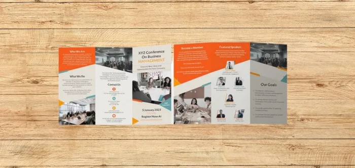
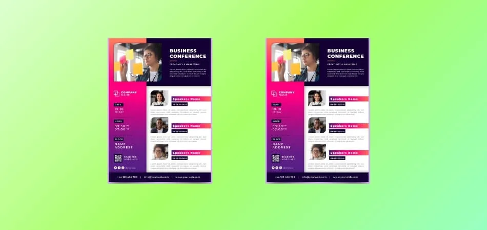
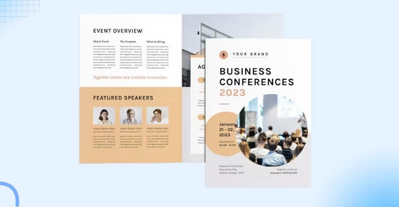
Conference brochures are key in setting the tone for any event, serving as a guide and a teaser for what’s to come. But how do you make a conference brochure that effectively captures the essence of your event?
Making a conference brochure starts with assembling all the necessary information, such as the details of the event, the schedule, and the speakers’ biography. The next step is designing a layout that balances engaging visuals with clear, easy-to-read text. This balance ensures that the brochure is informative and visually captivating.
Whether you’re aiming for a traditional print version or a modern digital format, the focus should be on creating a user-friendly and aesthetically pleasing product. Curious about more tips and tricks? Keep reading as we explore the art of creating a compelling conference brochure.
What is a Conference Brochure?
A conference brochure is a printed or digital compact booklet that provides detailed information about a conference. It includes schedules, speaker bios, venue maps, and other key details to help attendees navigate the event. This is an essential tool for exploring the conference efficiently and effectively.
Designing these brochures requires a blend of creativity and clarity to meet the needs of conference organizers. The layout must be visually appealing but easy to read, ensuring attendees can find information quickly. It’s a balance between aesthetic design and practical functionality, crafted to elevate the conference experience.
Conference brochures often come in both print and electronic formats. While printed versions provide a tangible reference, digital ones offer interactive and easily updatable content. This flexibility caters to a wide range of preferences among conference-goers, making the
How Do You Make a Conference Brochure?
Creating a conference brochure is a strategic process that combines information management with creative design. It’s about presenting all the necessary details in an engaging and accessible way. Organizers must ensure the key steps to create a conference brochure and highlight information regarding the time, schedule, speakers, etc. Here is a step-by-step guide on how to make a conference Brochure.
Before starting the design process, reviewing proven brochure formats can save time and improve structure. Common examples include one-page event overview brochures, multi-page agenda booklets, sponsor-focused brochures, and digital interactive brochures. Many of these templates are available in tools like Canva or Adobe InDesign and can be customized quickly.
Step 1: Gathering Content
Start by collecting all the necessary information about the conference. This includes dates, locations, schedules, speaker bios, and session descriptions. Accurate and comprehensive content is the foundation of a good brochure. Ensure you have approval for all information used.
Step 2: Planning the Layout
Design the layout considering the brochure’s size and how much information needs to be included. Decide on sections for schedules, speaker information, and other details. A well-planned layout ensures ease of reading and logical flow of information.
Step 3: Choosing a Design Theme
Once the theme is defined, apply it using practical design tools. Canva works well for quick layouts without design skills, Adobe InDesign suits professional print brochures, and Visme or Venngage support interactive and digital-friendly designs with structured visuals.
Step 4: Incorporating Visuals
Use high-quality images, charts, and icons to make the brochure visually appealing. Visuals should complement the text, not overwhelm it. They should be relevant to the conference theme and add value to the content.
Step 5: Writing and Editing Content
For structure, use simple copywriting frameworks to keep information clear and useful. Apply the 5 Ws (who, what, when, where, why) for event overviews, use the AIDA approach for welcome notes or keynote highlights, and keep speaker bios within 50 to 70 words focusing on role, expertise, and session relevance.
Step 6: Finalizing the Brochure
Review the brochure design and content comprehensively. Get feedback from team members or a focus group. Ensure that the brochure is user-friendly, visually appealing, and free of errors before finalizing.
Step 7: Printing and Distribution
Decide between digital or printed brochures based on your audience’s preferences. For printed versions, choose quality paper and printing services. For digital versions, ensure the file is compatible with various devices and easily downloadable.
Following these steps will help you create a conference brochure that not only informs attendees but also enhances their overall experience of the event.
Importance of a Conference Brochure
A conference brochure plays a vital role in ensuring the success of any event. It acts as a guide, resource, and branding tool all in one. Let’s explore the importance of a conference brochure in detail.
Provides a Clear Overview
A well-designed conference brochure offers attendees a comprehensive overview of the event. From the schedule and speaker bios to the venue details, it ensures participants have all the information they need at their fingertips.
Sets the Tone and Theme
The brochure helps establish the theme and tone of the conference, giving attendees a sense of what to expect. Through visuals, language, and design, it communicates the essence of the event, building anticipation and excitement.
Increases Professionalism and Credibility
A polished, thoughtfully crafted brochure reflects the professionalism of the organizing team. It shows that every detail of the event has been carefully planned, boosting the credibility of the conference and the organizers.
Acts as a Branding Tool
The brochure serves as an extension of your brand. By using your company’s logo, colors, and style, it reinforces your brand identity. A well-branded brochure leaves a lasting impression on attendees and can help strengthen your conference’s reputation.
Guides Attendees Through the Event
With a detailed agenda, maps, and session descriptions, the brochure acts as a guide throughout the event. It helps attendees navigate the conference efficiently, ensuring they don’t miss out on any key sessions or opportunities.
Offers Sponsorship Visibility
For conferences with sponsors, a brochure provides a platform to highlight sponsors and partners. This exposure adds value for sponsors and improves networking opportunities, benefiting both attendees and sponsors alike.
Overall, a conference brochure is more than just an informational tool—it’s a vital component that adds value to the attendee experience and reflects the professionalism of the event.
Conference Brochure Influencing Conference Success Greatly!
A conference brochure significantly influences the success of a conference. It serves as the attendees’ first impression and a continuous reference throughout the event. A well-crafted brochure can enhance the overall experience, making it a significant element. Practically understanding conference brochures and their significance helps create a detailed and well-informed brochure that plays a critical role in attendees understanding the conference and all.
First Impressions
A conference brochure sets the tone for the event. It’s often the first detailed information attendees receive, shaping their expectations. A professionally designed brochure suggests a well-organized, high-quality event. This initial impression can boost the attendee’s enthusiasm and engagement.
Information Accessibility
The primary role of a conference brochure is to provide essential information in an easily digestible format. It helps attendees plan their participation effectively. Clear schedules and session details reduce confusion, improving the overall event flow. Attendees appreciate having a handy guide to navigate the conference.
Branding and Marketing
Brochures also play a key role in branding and marketing the event. They often feature sponsors and partners, enhancing brand visibility. A visually appealing brochure reflects positively on the event’s image. This can lead to increased interest and higher attendance in future events.
Overall Experience
The brochure contributes to the attendee’s overall experience. It ensures that they don’t miss important sessions and facilitates networking opportunities. A well-structured brochure can even become a keepsake, reminding attendees of their positive experiences. This boosts the reputation of the conference and its organizers.
Different Types of Conference Brochures
Conference brochures come in various formats, each designed to cater to different needs and preferences. These brochures are essential in guiding attendees through the event. Understanding the types available can help organizers choose the best fit for their conference.
Traditional Print Brochures
Print brochures are classic and widely used. They offer a tangible feel, which many attendees appreciate. These brochures typically include detailed schedules and maps. They’re ideal for attendees who prefer physical copies for quick reference.
Digital Brochures
Digital brochures are becoming increasingly popular. They’re eco-friendly and easily accessible on various devices. These versions can be updated in real-time, providing the latest information. They’re perfect for tech-savvy attendees and for reducing print costs.
Pocket Guides
Pocket guides are a condensed version of the main brochure. They’re small, portable, and focus on essential information. These guides are handy for quick schedule checks without the bulk of full brochures. They’re great for on-the-go reference.
Interactive Online Brochures
Interactive online brochures offer a dynamic experience. They often include hyperlinks to speaker bios or session descriptions. This format is engaging and can be accessed from anywhere. It’s ideal for a tech-oriented audience and remote participants.
Fold-Out Schedules
Fold-out schedules focus primarily on the event’s timeline. They’re often designed as easy-to-navigate charts or calendars. These are great for a glance at what’s happening and when. They work well as an adjunct to more detailed brochures.
Multi-Page Booklets
Multi-page booklets are comprehensive and detailed. They provide in-depth information about sessions, speakers, and the event. These booklets are excellent for attendees who want extensive information at their fingertips. They often include articles, interviews, and additional content related to the conference.
Conference Brochure Designing Considerations
Designing a conference brochure requires thoughtful consideration to ensure it is informative and appealing. The goal is to create a guide that effectively communicates the essence of the conference. It is one of the crucial steps to design a conference ticket that impacts participants’ experience. Here are some key points to consider during the design process to maximize the outcome.
- Audience Needs: Personalize the brochure to the audience’s preferences and expectations. Consider their professional backgrounds and what information they value most.
- Clarity of Information: Make sure the schedule, sessions, and speaker details are easy to find and understand. Clear, concise information helps attendees plan their time.
- Consistent Branding: Use colors, logos, and fonts that align with the conference’s brand identity. Consistency in design reinforces brand recognition and professionalism.
- Quality Visuals: Incorporate high-quality images and graphics that relate to the conference theme. Visual elements should enhance the text, not distract from it.
- Readable Layout: Design a layout that is easy to navigate, with well-organized sections. A user-friendly layout ensures attendees can quickly find what they need.
- Contact Information: Include essential contact details like website, email, and phone numbers. Attendees should have easy access to additional information or support.
- Sustainability Considerations: For printed brochures, consider using eco-friendly paper and ink. For digital brochures, ensure they are easily accessible on various devices.
A well-designed conference brochure can significantly enhance the attendee experience. It’s not just about providing information; it’s about doing so in a way that is engaging, accessible, and reflective of the conference’s ethos.
Frequently Asked Questions
People also looking for answers to other relevant questions. Here we have provided some common questions and their answers that might help you understand how do you make a conference brochure and its importance.
What Size Should a Conference Brochure Be?
Common sizes include A4 or letter size for easy handling, but you can choose other sizes depending on the amount of content and design preferences. Ensure it’s convenient for attendees to carry around.
How Can I Make the Brochure More Engaging for Attendees?
Include interactive elements like QR codes linking to the event app or website, engaging visuals, and highlights of key sessions. Adding tips for networking or interactive maps can also enhance attendee engagement.
How Early Should I Start Designing the Conference Brochure?
Start the design process at least a few months before the conference to allow time for content gathering, design, revisions, and printing. This timeline helps ensure everything is accurate and high-quality.
How Should I Organize the Content in a Conference Brochure?
Organize content logically by starting with an introduction or welcome message, followed by the agenda, speaker information, and detailed session descriptions. Use clear headings and sections to make the brochure easy to navigate.
Can I Include Advertisements in the Conference Brochure?
Yes, including ads from sponsors or partners can help offset printing costs and provide added value for stakeholders. Make sure the ads are relevant to the conference audience and do not overwhelm the content.
Bottom Line
Crafting an effective brochure for a conference begins with gathering accurate and comprehensive information. This initial step is crucial as it sets the foundation for the entire document.
The essence of “How do you make a conference brochure?” revolves around attention to detail and clear communication. The design must not only be visually appealing but also functionally informative, guiding attendees through the event seamlessly.
The importance of accuracy in a conference brochure cannot be overstated. Errors or poorly presented information can significantly impact the event’s success, highlighting the need for meticulousness in every aspect of the brochure’s creation.

