You walk into a busy conference hall. Bright lights hang from the ceiling. People move fast, stopping only for posters that are easy to read. You find a poster that looks great on screen, but in real life the lights bounce off it. The text is hard to see. People glance once and walk away. This happens more often than expected.
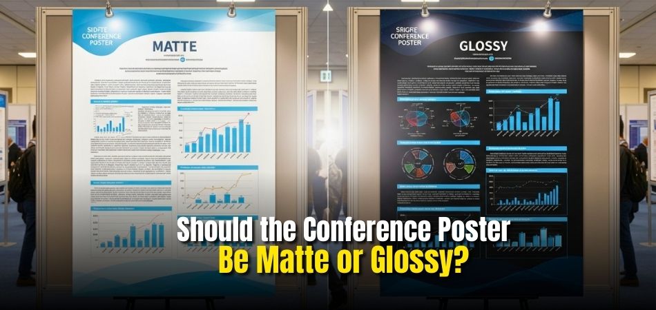
Many presenters spend weeks designing content but lose attention because of one simple choice. The paper finish. Under strong lights and crowded halls, the wrong finish can hide text, cause glare, and reduce impact. That is why many people ask the same question before printing: should the conference poster be matte or glossy?
A conference poster should be matte if the venue has strong or uneven lighting. Matte posters reduce glare, stay readable from all angles, and hide fingerprints. Glossy posters may look sharper but reflect light, making text harder to read. Matte is better for busy halls and text-heavy designs.
This article explains finishes, lighting effects, costs, and common mistakes. Each section uses clear examples to help readers choose confidently. Reading ahead builds understanding and supports better decisions.
What is a Conference Poster and its Purpose?
A conference poster is a large visual display used to share ideas, research, or project results at a conference. It combines short text, headings, charts, and images to explain a topic in a simple and clear way. Instead of giving a long speech, the poster helps people understand the main points by reading and looking at the visuals.
The main purpose of a conference poster is to communicate information quickly. People walking around a conference can stop, read the poster, and ask questions. Posters help start conversations, share knowledge, and get feedback from others. They are often used to explain research findings, new ideas, or ongoing work in an easy-to-follow format.
When preparing for global events like conferences in Canada, USA or any other country where experts from different backgrounds attend, conference posters play an important role. They help presenters explain their work clearly to people who may not know the topic well. A good poster saves time, keeps attention, and makes learning simple for everyone at the event.
Should the Conference Poster Be Matte or Glossy?
Choosing the right poster finish is important for a successful conference presentation. Matte and glossy posters may look similar at first, but they behave very differently under lights and crowds. The table below compares both types, and the explanations help you understand how each feature affects visibility, comfort, and overall impact.
| Feature | Matte Poster | Glossy Poster |
| Surface finish | Smooth and non shiny | Shiny and reflective |
| Light reflection | Does not reflect light | Reflects light strongly |
| Readability | Easy to read from all angles | Can be hard to read under bright lights |
| Color look | Soft and natural colors | Bright and sharp colors |
| Fingerprints | Hardly shows fingerprints | Shows fingerprints easily |
| Glare issue | No glare problem | Glare can hide text and images |
| Best for | Text heavy posters and graphs | Image heavy posters and photos |
| Overall use at conference | Better for busy halls and strong lights | Better for controlled lighting areas |
Surface Finish
Matte posters have a smooth, non shiny surface that feels soft to the eye. Glossy posters have a shiny coating that reflects light and looks polished. This difference affects how the poster looks from distance and how comfortable it is to view for long periods.
Light Reflection
Matte posters absorb most light, so text and images stay clear under strong lights. Glossy posters reflect light, which can create bright spots. These reflections may distract viewers and make parts of the poster difficult to see in halls with overhead lighting during busy conference hours.
Readability
Matte posters are easier to read because there is no shine blocking the text. Viewers can stand at different angles and still read comfortably. Glossy posters may reduce readability when light hits the surface, especially in crowded conference spaces where people move around constantly nearby.
Color Look
Matte posters show colors in a softer and more natural way, which helps with long viewing. Glossy posters make colors look brighter and sharper. This can attract attention quickly, but may feel too strong under bright lights inside large conference halls with many overhead lamps.
Fingerprints
Matte posters do not show fingerprints easily, so they stay clean during the event. Glossy posters show smudges and marks quickly when touched. This can make the poster look messy after many people handle or point at it throughout long conference days with repeated viewing.
Glare Issue
Matte posters have no glare, so all content stays visible at all times. This is helpful in bright halls. Glossy posters often create glare, which can hide text, charts, or images when light reflects directly from ceiling lights or nearby windows during daytime events indoors.
Best For
Matte posters are best for posters with lots of text, graphs, and data. They help viewers focus on information. Glossy posters work better for posters with large photos or designs where visual impact is more important than reading long explanations or detailed charts on display.
Overall Use at Conference

Matte posters are more practical for most conferences because lighting is often strong and uneven. They stay readable all day. Glossy posters can still work, but only when lighting is controlled and reflections are minimal in small rooms or quiet areas with carefully planned setups.
Pros and Cons of Matte vs Glossy Posters
Posters come in two common finishes: matte and glossy. Both look good, but they work best in different situations. Below is a simple breakdown to help you understand their good and bad points.
Matte poster advantages
- No shine, so light does not reflect off the surface
- Easy to read from any angle
- Gives a soft and clean look
- Does not show fingerprints easily
- Works well for text heavy designs
Matte poster drawbacks
- Colors look less bright compared to glossy
- Images may look a bit flat
- Not as eye catching from a distance
Glossy poster advantages
- Colors look bright and rich
- Images appear sharp and clear
- Shiny surface grabs attention quickly
- Great for photos and bold designs
Glossy poster drawbacks
- Light reflection can make it hard to see
- Fingerprints and smudges show easily
- Can look too shiny under strong lights
Is Satin or Semi-Gloss a Better Middle Option for Conference Posters?
Choosing the right paper finish affects how your poster looks under conference lighting. Some finishes reduce glare, while others boost color brightness. The table below shows a simple comparison to help you choose the better middle option.
| Feature | Satin (Luster / Silk) | Semi-Gloss |
| Surface Finish | Has a soft and smooth surface with very low shine | Has a light shine that reflects more light |
| Glare Control | Reduces glare well under strong indoor lighting | Can reflect light under bright spotlights |
| Color Appearance | Keeps colors rich without looking too shiny | Makes colors look slightly brighter |
| Readability | Easy to read text from different angles | Text may reflect light at some angles |
| Best Use Case | Technical, academic, or scientific posters | Posters with strong visuals or images |
| Overall Balance | Strong balance between clarity and color | More color pop but less glare control |
Satin is usually the better middle option for conference posters because it limits glare while keeping colors clear. Semi-gloss works well when brighter colors matter more, but lighting conditions should be considered carefully.
Cost Comparison. Matte vs Glossy Printing
Choosing the right print finish can affect cost, look, and final impact. Many presenters wonder if matte or glossy printing costs more. The answer depends on paper type, quantity, and print shop choices. Read below to compare costs, save money, and choose wisely.
Matte Vs Glossy Printing Costs
Printing prices often differ because of paper coating and finish process. Glossy paper usually costs slightly more due to shine coating. Matte paper skips that layer, lowering costs. Bulk orders reduce gaps. Small print runs may show clearer price differences at local shops. Online printers sometimes price both finishes the same.
Which Finish Usually Costs More
Most of the time, glossy printing costs a little more than matte. The shine needs extra coating and drying steps. These steps raise production time slightly. Some printers balance prices to attract customers. Always check quotes from two shops before deciding. Seasonal deals can change usual price patterns.
Budget Tips For Students Or First-Time Presenters
Saving money starts with smart planning and simple design choices. Choose standard paper sizes and avoid rush printing fees. Print fewer colors when possible. Ask about student discounts. Many online guides share helpful budget printing tips that explain deals clearly. Comparing quotes online saves time and cash.
When Matte Is Worth Paying Extra
Matte printing works better for text-heavy posters and bright rooms. It reduces glare from lights and windows. Viewers can read content easily from angles. Photos look softer but clean. For presentations with charts, matte helps clarity and focus. This matters during long viewing times. Schools and halls often use strong lighting.
When Glossy Is Worth Paying Extra
Glossy printing suits photo-heavy designs and colorful visuals. Colors appear deeper and more lively. Images stand out during quick viewing. Marketing posters often benefit from shine. If your poster relies on photos, glossy can be worth extra cost. It grabs attention from a distance. Short events favor bold visual impact.
Matte and glossy both have strengths depending on your purpose. Cost differences are usually small but matter on tight budgets. Think about lighting, content, and viewing distance before choosing finish. Smart choices help your work look good without overspending money.
Printing Tips Before Finalizing Your Conference Poster Finish
Printing a conference poster needs careful checks so the final result looks clear and professional. Small errors can affect size, color, or image quality. Following the steps below helps avoid common printing problems and last minute stress.
- Sizing and Dimensions: Always double check conference poster size rules like 36″x48″ or 24″x36″ and confirm portrait or landscape layout before design. Set the page size first in PowerPoint or Canva to avoid distortion. Add 3mm bleed if edges touch borders, and keep text 10–15mm away from edges.
- Image and Graphics Quality: All images, photos, and logos must be at least 300 DPI at final print size to avoid pixel blur. Use vector formats like EPS, SVG, or PDF for charts and logos. Insert images properly instead of copy paste to keep full resolution intact.
- Color Management (CMYK vs. RGB): Screens use RGB colors but printers use CMYK, so convert all colors before printing to avoid color mismatch. Make sure text stands out clearly from the background so it stays readable under bright lights.
- File Format and Proofing: Save the final poster as a print quality PDF to lock fonts and layout. Print a small test copy on 8.5″x11″ paper to catch layout issues, spelling mistakes, or blurry images. Ask another person to proofread carefully.
- Material and Finish Choices: Matte paper reduces glare and works well indoors. Satin or semi gloss gives sharp colors without heavy shine. Glossy paper suits photo posters but reflects light. Fabric posters are light, foldable, and resist wrinkles during travel.
- Timing and Logistics: Allow at least 24–48 hours for professional printing and add extra buffer days. Always use a professional printer for consistent results. Carry a digital backup on USB and, if possible, bring a smaller printed copy as backup.
Good printing preparation protects your work and saves time. Clear text, sharp images, and correct colors improve presentation quality. Early checks reduce stress close to the event. A well printed poster helps your research stand out confidently.
When to Choose Matte or Glossy for Your Poster?
Choosing the right poster finish helps your message look clear anywhere. Matte and glossy finishes work differently based on light, images, and text. Picking the wrong option can cause glare, dull colors, or hard reading. Below, learn when to choose each finish for better poster results.

Bright Rooms
Spaces with strong lights often create reflections on shiny surfaces. Glossy posters can bounce light and hide details. Matte paper reduces glare and keeps colors steady. This makes words and images easier to see in offices, classrooms, or stores. For lighting issues, these poster printing tips help.
Photo Heavy Posters
Posters filled with images benefit from deep color and sharp contrast. Glossy finishes boost brightness and make photos pop fast. Small details look richer and more lively. This finish works well for event photos, art prints, or product shots. Learn more through this photo poster printing guide.
Text Heavy Posters
When posters rely on words, clear reading matters most. Matte finishes stop glare and reduce eye strain. Letters stay sharp under bright lights or close viewing. This helps menus, charts, or schedules stay readable longer. For clean layouts, follow this text poster design guide for everyday use.
Both finishes can work well when matched to room and content. Think about light, viewing distance, and purpose before choosing carefully. Using the right paper makes posters clearer and more enjoyable. If unsure, test both finishes to see what looks best.
Which Poster Finish Lasts Longer for Reuse and Travel?
Choosing the right poster finish matters when travel and reuse are important. Some finishes handle handling better than others. Scratches, folds, and moisture can damage posters quickly. Review the options below to see which finish lasts longer.
Laminated Matte Finish
This finish works best for posters used many times or displayed often. A protective layer makes it tear resistant and water resistant. It does not scuff easily during transport. Laminated matte posters stay clean and strong even after repeated rolling, packing, and handling across multiple conferences.

Satin Or Silk Finish
A satin or silk surface gives a professional look with good strength. It resists normal wear better than basic paper finishes. Colors stay clear without heavy shine. This finish rolls smoothly into tubes and travels well, making it a strong choice for reuse across several events.
Glossy Finish
Glossy posters look bright but handle travel less well. The surface shows scratches and marks more easily. Frequent rolling or packing can damage the shine. While easy to wipe clean, glossy posters are better for short term use rather than repeated transport or long term storage.
Uncoated Matte Finish
This finish has no protective layer, so damage happens quickly. Edges can bend, tear, or stain during travel. Moisture and handling cause visible wear. Extra care is required when packing and storing. Uncoated matte posters are not ideal for reuse or frequent movement.
Quick Durability Comparison
For long lasting use, laminated matte offers the strongest protection. Satin provides a good balance of durability and appearance. Glossy handles light reuse but scratches easily. Uncoated matte wears out fastest. Choosing based on travel needs helps avoid reprinting costs and keeps posters looking presentable longer.
Picking the right finish saves time and money later. Travel conditions affect poster lifespan more than expected. Durable finishes reduce damage from handling. A smart choice keeps your poster ready for future events.
Common Mistakes People Make When Choosing Conference Posters
Choosing a conference poster seems simple, but small mistakes reduce its impact fast. Many people rush choices without thinking about readers or viewing distance. Others focus on looks and forget clear message and structure. Read below to learn common mistakes and how to avoid them.

Choosing Style Over Readability
Many people focus only on colors or price and forget that a truly well- designed conference poster should be easy to read from a distance and clear at first glance. Small text, weak contrast, and crowded layouts make viewers walk past without stopping or understanding the message clearly.
Ignoring Viewing Distance
Posters are usually read while standing several feet away. If text is too small, people cannot read it comfortably. Long paragraphs also push readers away. Short lines, big headings, and clear spacing help people understand key points quickly without effort or confusion.
Overloading With Too Much Text
Trying to include every detail often hurts the message. Posters work best when they share highlights, not full reports. Too many words slow readers down. Clear sections, short sentences, and simple visuals help people grasp the idea and ask questions if they want more.
Using Weak Or Confusing Visuals
Images and charts should support the message, not distract from it. Low quality images or unclear graphs confuse readers. Visuals should be simple and labeled clearly. When visuals match the topic well, people understand faster and remember the message longer.
Forgetting The Audience Perspective
Some posters are made only from the presenter’s view. Readers may not know the topic deeply. Using simple words and clear explanations helps everyone follow along. When posters respect the reader’s time and knowledge level, conversations start more easily and feedback becomes more useful.
Mistakes happen, but small fixes make posters stronger and clearer. Focus on readability, structure, and reader comfort first. Simple design choices often create better understanding and attention. Use these tips to make smarter poster decisions with confidence.
Frequently Asked Questions
Here are some common questions people often have after reading about conference poster finishes. These FAQs clear up small doubts and help you feel confident before printing your poster.
Can Poster Finish Affect How Long People Look at It?
Yes, the poster finish can affect how long people stay in front of it. A matte poster feels easier on the eyes, so people are more comfortable reading it for longer time. Glossy posters may look attractive at first, but glare can push viewers away quickly. Comfort matters a lot in busy conference halls.
Does Poster Finish Change How Professional It Looks?
Both matte and glossy posters can look professional when designed well. Matte posters give a calm and serious feel that suits research and academic topics. Glossy posters look bold and polished, which fits creative or visual topics. The professional look depends more on clarity than shine.
Is Matte or Glossy Better for Long Conference Days?
Matte posters work better for long events that last many hours or days. They stay readable under changing light throughout the day. Glossy posters may look good early on but can become tiring to view due to reflections. Comfort over time is important at long conferences.
Does Poster Finish Matter for Outdoor or Window Nearby Areas?
Yes, finish matters a lot near windows or outdoor light. Glossy posters reflect sunlight and become hard to see clearly. Matte posters reduce reflection and stay visible even with natural light around. This makes matte a safer choice for bright locations.
Can the Finish Affect How People Take Photos of the Poster?
Poster finish can change how photos look on phones or cameras. Glossy posters often reflect flash or lights, causing white spots in photos. Matte posters photograph better because they reduce glare. Clear photos help people share or remember your work later.
Is One Finish Better for Posters That Will Be Reused?
Matte posters usually last better for reuse. They hide small marks and fingerprints well. Glossy posters may look worn quickly after handling and rolling. If you plan to use the poster again, matte is often the smarter choice.
Final Words
Choosing the right poster finish shapes how people see and understand your work at a conference. Light, crowd movement, and viewing distance all matter. A finish choice keeps content clear, reduces strain, and helps viewers focus on ideas.
So, should the conference poster be matte or glossy? In short, matte suits most conferences because it avoids glare and stays readable under strong lights, while glossy fits controlled spaces with photos that need color impact.
Before printing, test samples under real lights, keep text large, and balance images wisely. Match finish to room and content, not trends. With careful choices and calm planning, your poster can shine clearly. Best wishes for your presentation.

