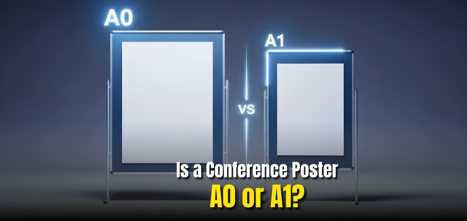
Have you ever wondered why some posters at conferences look huge while others appear compact and easier to carry? The question often arises among new presenters and researchers: Is a conference poster A0 or A1? Choosing the right size can make your work stand out or fade into the background.
Most conferences prefer A0 posters (841 x 1189 mm) because they offer more space for visuals, charts, and detailed explanations. However, A1 (594 x 841 mm) is also widely accepted, especially when venues have limited board space or when travel convenience matters most.
Understanding the difference between these two sizes helps presenters communicate more clearly and confidently. Keep reading to learn which size best fits your research, event type, and audience expectations.
Is a Conference Poster A0 or A1?
When preparing for a professional or academic event, choosing between A0 and A1 poster sizes is one of the first and most important design decisions. Each size offers unique benefits based on your research content, display setup, and conference type. Understanding how they differ in size, visual space, and impact can help you select the best fit for your presentation.

Size and Dimension Differences
The most obvious distinction between A0 and A1 posters lies in their physical dimensions. An A0 poster measures 841 x 1189 mm, while an A1 measures 594 x 841 mm, which is exactly half of A0. This means A0 provides nearly double the surface area, allowing for larger text, graphics, and images. At busy academic or professional conferences, a larger display can make your research more noticeable from afar, while A1 might appear subtler and compact.
Space for Content and Layout Flexibility
A0 posters offer generous room for structured layouts, which is especially useful for detailed research projects involving data-heavy visuals, graphs, and multiple sections. With more available space, you can maintain comfortable spacing between elements and use larger font sizes for readability. In contrast, A1 posters are best suited for concise studies, short presentations, or single-focus topics. Presenters often choose A1 when display boards or travel constraints limit larger prints.
Visual Impact and Audience Engagement
When it comes to visual impact, A0 posters have a clear edge. The larger format naturally captures attention, giving your work a more commanding presence on the display board. This advantage is particularly useful at international events and conferences in USA, Canada, or other countries, where dozens of posters compete for visibility. However, A1 posters can still be highly effective if designed with balance and simplicity, using contrast, color, and strong imagery to draw focus even with less space.
Quick Comparison
| Feature | A0 Poster | A1 Poster |
| Dimensions (mm) | 841 x 1189 mm | 594 x 841 mm |
| Dimensions (inches) | 33.1 x 46.8 in | 23.4 x 33.1 in |
| Surface Area | 1 m² | 0.5 m² |
| Content Capacity | Ideal for detailed data and visuals | Best for concise summaries |
| Portability | Bulky, requires careful handling | Lightweight, easy to transport |
| Visual Presence | Highly noticeable in large halls | Subtle and compact on smaller boards |
In short, A0 posters deliver a stronger visual presence with more space for detailed information, while A1 posters focus on portability and concise presentation. Your choice should reflect both the conference environment and your project’s communication goals.
Why the Choice Between A0 and A1 Matters for Presenters?
Selecting the right poster size shapes how your audience interacts with your work. It affects how easily they can read, engage, and remember your research. Let’s explore why this choice goes beyond size and directly influences your presentation experience.
Readability and Audience Connection
Choosing the right size helps maintain strong communication with your audience. Larger posters allow smoother eye flow and more relaxed viewing, while smaller ones invite closer interaction. The goal is to ensure your viewers can easily follow your key ideas without feeling overwhelmed or losing interest midway.
Presentation Impact and First Impressions
Your poster is often the first thing visitors see before you speak. A well-sized poster ensures your message is instantly noticeable and visually inviting. Presenters often find that properly scaled visuals lead to longer discussions and stronger engagement, regardless of whether they use A0 or A1 format.
Display Board and Venue Readiness
Before finalizing your print, always confirm the conference poster board size provided by event organizers, as it determines whether A0 or A1 will fit properly. Matching your design to available board space ensures a professional presentation setup and prevents last-minute resizing or layout compromises.
Matching Size to Event Type
Different event settings favor different approaches. Research conferences often value large A0 posters for detailed displays, while business or networking events lean toward smaller, easy-to-carry A1 formats. Aligning poster size with event style helps maintain both professionalism and convenience throughout the day.
Your poster’s size should match your presentation goals, audience style, and venue layout, not just standard dimensions. The right decision supports both clarity and confidence during your session.
Which Poster Size Is Best for Your Research Display?
Choosing the best poster size depends on your field, research depth, and presentation setting. Each discipline benefits from different layouts and space requirements. Let’s compare which size works best for various research areas and how to select the most effective display format.

Science and Engineering Research Posters
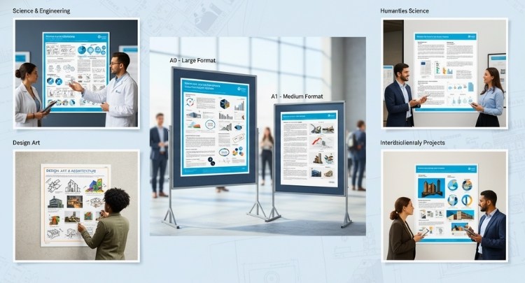
For technical projects, the ideal size of a science conference poster is usually A0, as it provides ample space for large charts and datasets without clutter. This format allows scientists and engineers to display complex visuals clearly while maintaining readability from a moderate distance.
Humanities and Social Science Posters
In humanities or social science presentations, where visuals often complement written explanations, an A1 poster generally works well. It provides enough room for concise text and key visuals while keeping the design clean and approachable for closer audience engagement.
Design, Art, and Architecture Displays
Design-focused disciplines rely on strong visuals rather than dense data. A1 posters suit these fields since they emphasize creativity, layout, and color over large text blocks. Their compact size makes them easier to manage during exhibitions or when displaying multiple works in limited spaces.
Summary
| Research Type | Recommended Size | Reason |
| Science & Engineering | A0 | Best for detailed visuals, data-heavy charts, and technical layouts |
| Humanities & Social Science | A1 | Balances clarity and space for focused explanations |
| Design & Architecture | A1 | Highlights creative visuals with limited text for clean presentation |
| Interdisciplinary Projects | A0 | Offers flexibility for both visuals and narrative content |
The ideal poster size is the one that best supports your content and audience interaction. By choosing a format that matches your research type, you ensure both clarity and professional appeal during your presentation.
Practical Factors to Consider Before Printing Your Poster
Printing your conference poster involves more than selecting a size. Small details like cost, material, and transport can affect the final presentation quality. Let’s look at the key practical factors you should review before printing your research poster.
Budget and Printing Costs
Printing costs vary significantly between A0 and A1 posters. A0 prints are usually more expensive due to their larger paper size and higher ink usage. If you are managing a tight budget, A1 may be more cost-effective while still maintaining professional quality and clarity.
Printing Material and Finish
The choice between matte and glossy finishes can influence how your poster appears under different lighting. Matte finishes reduce glare, making them suitable for brightly lit venues, while glossy finishes enhance color contrast and visual richness, ideal for dimmer or controlled lighting environments.
Transport and Handling Convenience
Consider how you will carry your poster, especially when traveling. A1 posters are easier to roll and store in smaller carrying tubes, while A0 posters may require larger containers or extra care to avoid bending. Proper protection ensures your poster remains smooth and professional-looking.
Venue and Mounting Requirements
Each event may have its own poster display rules. Some require specific backing materials or orientation types. Always review the event’s mounting guidelines in advance to ensure your poster size, format, and attachment method comply with the venue’s display setup.
Proper preparation before printing ensures your poster looks its best during the event. By planning early, verifying specifications, and considering your travel and budget needs, you can avoid unnecessary stress and focus entirely on delivering a confident presentation.
Design and Layout Tips for A0 and A1 Posters
The layout and design of your poster determine how clearly your research is communicated. Good visual balance and readable text can elevate your presentation. Here are some essential design and layout tips to keep your poster professional and effective.
- Choose the right orientation: Portrait orientation suits most conferences, offering natural reading flow from top to bottom. Landscape layouts work better when emphasizing visuals or side-by-side data comparisons.
- Use readable font sizes: For A0 posters, maintain 80–100 pt for headings and 40–50 pt for body text. For A1 posters, slightly smaller fonts like 60–80 pt for headings ensure readability up close.
- Balance text and visuals: Leave enough whitespace between sections to prevent clutter. A clean arrangement helps viewers focus on key findings and navigate smoothly across your content.
- Maintain strong color contrast: Dark text on light backgrounds improves clarity under artificial lighting. Avoid color overload; two or three primary shades are enough to keep the poster visually consistent.
- Ensure visibility from a distance: Design your key visuals and headings to remain readable from about three to four feet away. This helps attract attention even before the audience approaches closely.
Even with smaller A1 posters, a clean layout can create a strong visual impact. Prioritizing readability, balance, and visual flow ensures your poster captures attention and communicates your research effectively to every viewer.
Common Mistakes When Choosing a Conference Poster Size
Even experienced presenters sometimes make avoidable errors when preparing their posters. Knowing these common mistakes can help you plan better and present confidently. Let’s look at what to avoid when selecting the right conference poster size for your display.

Ignoring Event Size Guidelines
Many presenters overlook official event requirements, leading to printing errors or resizing issues. Always check the organizer’s poster size instructions before finalizing your design. Following these guidelines ensures your poster fits properly on the display board and looks professional during the event.
Overcrowding Information on A1 Posters
Trying to fit too much content into a smaller A1 poster can reduce readability and overwhelm your audience. Focus on concise text and high-impact visuals instead. Keeping only the essential data helps your viewers grasp your message quickly and clearly.
Overlooking Printing Bleed and Resolution
Low-resolution images or missing bleed margins can make even a great design appear unprofessional. Use high-quality visuals at 300 dpi and add a small bleed area to prevent edges from cutting off during trimming or mounting.
Skipping a Visibility Test
Many presenters skip testing how their poster appears at full size. Always print a small sample or view it at actual scale before printing. This helps you spot readability issues, blurry text, or uneven alignment before final submission.
Avoiding these mistakes ensures your research is presented with clarity and impact. Choose the poster size that lets your research shine, not shrink, and give your work the professional presence it truly deserves.
Frequently Asked Questions
After learning about A0 and A1 conference posters, you might still have a few doubts about preparation, presentation, and printing. Here are some common questions that many presenters ask when getting ready for their next conference display.
Can I Use Digital Posters Instead of Printed Ones?
Yes, many modern conferences now allow digital poster presentations. These can be displayed on large screens or interactive panels. Digital posters save printing costs and are easy to update, though they require careful formatting for on-screen clarity.
How Early Should I Print My Conference Poster?
It’s best to print your poster at least one week before your presentation. This gives you time to check for printing errors, color mismatches, or layout issues. Having extra time helps ensure a smooth, stress-free setup on the event day.
What Paper Type Is Best for Conference Posters?
Heavyweight satin or matte paper is often recommended for posters. Satin offers vibrant colors and durability, while matte reduces glare under bright lights. Always confirm with your printing shop if the paper suits your design and ink type.
Can I Travel With A0 Posters on Flights?
Yes, you can, but it requires some preparation. Use a sturdy carrying tube to protect the poster from folds or moisture. Airlines usually allow poster tubes as carry-on items, but checking their policy in advance is always wise.
Should I Include a QR Code on My Poster?
Adding a QR code is a great idea, especially for large conferences. It allows viewers to scan and access your paper, data, or contact details instantly. This helps extend your research reach beyond the event hall.
How Can I Make My Poster More Interactive?
Include visual elements like infographics, flowcharts, and short QR-linked videos. You can also design sections with questions or callouts that invite discussion. Interactive designs make your presentation more memorable and spark meaningful conversations with attendees.
What Are the Common Printing Mistakes to Avoid?
Avoid using low-resolution images, incorrect color modes, or uncalibrated screens during design. Double-check text alignment, font consistency, and margins before printing. Taking a final digital proof helps you catch errors that could otherwise affect quality.
Concluding Words
Selecting the perfect poster size goes beyond dimensions—it’s about impact and clarity. When deciding is a conference poster A0 or A1, think about how your research will appear to the audience and how easily they can follow your message.
A0 posters deliver strong visual appeal and accommodate in-depth data, while A1 posters focus on mobility and simplicity. Both can look professional when designed thoughtfully and printed with attention to detail.
Ultimately, your choice should balance readability, travel ease, and presentation goals. By choosing wisely, you ensure your poster draws attention and leaves a lasting impression at any conference.


