Have you ever walked through a conference hall filled with bright posters and wondered what makes some stand out more than others? These posters aren’t just decorations; they’re powerful tools for sharing ideas and sparking conversations among professionals.
So, what does a poster for a conference look like? It’s a visual summary of research, innovation, or case studies, designed to grab attention from a distance and explain key points clearly. With a mix of visuals, concise text, and balanced layout, it turns complex information into an engaging story.
A well-crafted poster can make your work unforgettable. Whether you’re presenting for the first time or refining your design skills, keep reading to discover how the right layout and structure can elevate your next presentation.
What Does a Poster for a Conference Look Like?
A conference poster visually communicates your research, project, or idea in a summarized and attractive way. It blends text, graphics, and structure to capture attention and guide readers through key information quickly. Whether for research or industry, a well-designed poster tells your story clearly. Continue reading to discover how different layouts can bring your message to life.
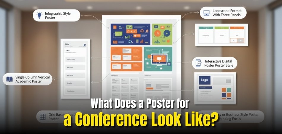
Single-Column Vertical Academic Poster
This traditional layout is most common in academic settings. It features one long, vertical column that flows naturally from title and authors to introduction, methods, results, and conclusion. Its simplicity ensures clarity and easy scanning, making it perfect for research-focused presentations during upcoming conferences anywhere.
Landscape Format With Three Visual Panels
This format divides content into three horizontal panels, often labeled background, findings, and discussion. It allows for balanced spacing between text and visuals like graphs or images. The landscape view encourages natural left-to-right reading, making it ideal for scientific or professional events where eye movement and flow matter.
Grid-Based Modular Poster
This structured layout organizes the poster into square or rectangular sections. Each block focuses on a specific theme, such as objectives, data visuals, or conclusions. It’s especially useful for complex projects with multiple datasets, helping maintain balance and visual order without overwhelming the viewer.
Infographic-Style Poster
This creative format emphasizes visuals over text, using icons, data charts, and color-coded elements. It’s designed for fast comprehension, allowing audiences to absorb insights quickly. Popular in business, marketing, and tech events, this layout makes complex topics visually appealing and easy to remember.
Interactive Digital Poster Styles
Modern conferences are increasingly adopting digital posters displayed on screens or tablets. These formats include animations, interactive charts, and videos to present information dynamically. They are convenient to update, easy to share, and effective for engaging audiences in large conference settings.
Industry or Business-Style Posters with Branding Focus
Corporate posters often focus on branding consistency, with clean visuals, company logos, and strong color schemes. Instead of heavy text, they showcase results, case studies, or key messages that reflect the brand’s identity. This approach enhances recognition and draws professionals to learn more about your work or organization.
Tip: Before finalizing your poster, review the event’s guidelines for size, layout orientation, and display type. Every conference has specific requirements that can influence your final design.
Conference posters vary widely in appearance, from academic columns to digital and infographic designs, but all serve one purpose: to make complex information easy to understand at a glance. Choose a format that best fits your message, audience, and event type.
Key Sections Every Conference Poster Should Include
Every successful conference poster follows a clear structure that helps readers understand your work at a glance. Knowing what to include and where to place it ensures strong visual flow and impact. Let’s explore each essential section in detail.
- Title and Author Information: The title should instantly reflect your study or project, followed by author names and affiliations. Keep it short, precise, and large enough to read from a distance.
- Introduction or Background: Provide context about your topic, the problem you’re addressing, and why it matters. This section sets the stage for your research and draws viewers into your work.
- Methodology or Approach: Summarize how the research was conducted, mentioning tools, samples, or processes. Keep it concise and visual, using flowcharts or short bullet points for clarity.
- Results or Findings: Present key outcomes using visuals like graphs, tables, or charts instead of long paragraphs. Focus on the most significant data that supports your conclusion effectively.
- Discussion or Interpretation: Explain what your results mean and how they relate to previous studies or practical use. Encourage readers to think about the significance of your findings in a simple way.
- Conclusion and Recommendations: State the main takeaway clearly and offer suggestions for future research or applications. Keep sentences short so that viewers can grasp the message quickly.
- References and Acknowledgments: Include important citations and credit contributors or institutions that supported your work. This adds credibility and completes your poster professionally.
When understanding conference poster boards, it’s important to know how each section contributes to overall readability and organization. A well-structured poster guides the audience smoothly from the title to the conclusion, helping them grasp your work quickly and effectively.
How Does the Layout Reflect Your Research or Idea?
A well-structured poster layout is more than design; it mirrors the way your research or idea unfolds. Every alignment, section, and color choice guides readers through your findings smoothly. Continue reading to learn how layout decisions shape message clarity.
Creating a Logical Flow Through Columns
Using a column-based layout helps organize content into digestible sections. Academic posters often use two or three columns, allowing information to move naturally from introduction to results. This logical flow makes it easier for viewers to follow your research story without confusion.
Highlighting Core Ideas With Visual Balance
Balancing text and visuals ensures that no section overpowers another. Large visuals near the center can draw attention to key findings, while smaller text areas provide context. Proper spacing and alignment encourage readers to explore every section in a natural sequence.
Using Color Hierarchy for Emphasis
Colors play a crucial role in defining the tone of your research. Subtle shades can separate sections, while brighter colors can highlight results or key points. Consistent color hierarchy gives your poster an organized appearance that reflects professionalism and thoughtful presentation.
Aligning with Research Type and Purpose
Technical research posters tend to be data-heavy with clean lines and minimal colors. Creative or business-focused posters often use bold visuals and branding elements. The layout you choose should align with your audience’s expectations and the nature of your presentation.
Directing the Viewer’s Eye Movement
A successful poster tells a visual story, guiding the audience from the title at the top to the conclusion at the bottom. Using headings, arrows, or subtle visual cues helps control eye movement and ensures no important detail is overlooked.
The layout you select speaks for your work before you begin presenting. It silently communicates organization, creativity, and confidence. When your layout matches your research style, your poster becomes a strong visual representation of your ideas and achievements.
What Makes a Poster Easy to Read from a Distance?
A clear and readable poster ensures your audience can understand your work even from several feet away. Good readability combines thoughtful font choices, visual balance, and layout precision. Let’s explore the key factors that make a conference poster easy to read.
Choosing the Right Font and Size
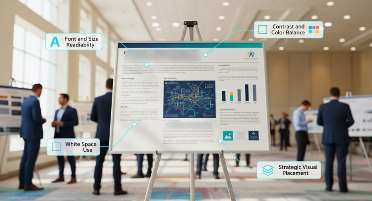
Fonts should be clean, simple, and consistent across the poster. Headings should be large enough to catch attention, while body text remains easily legible. Choosing the right business or academic conference poster size helps ensure your content remains readable from a distance without feeling crowded or cluttered.
Using Contrast and Color Balance
High contrast between text and background improves visibility. Light text on dark backgrounds or vice versa can make content stand out. Keep your color palette minimal with two or three complementary shades, ensuring your visuals highlight rather than compete with the main message.
Utilizing White Space Wisely
White space, or empty space around elements, gives the viewer’s eyes room to rest. It separates sections clearly and makes the poster appear organized. A well-balanced use of white space ensures that each section receives attention without overwhelming readers.
Placing Visuals Strategically
Images, graphs, and charts should be placed near related text so readers can easily connect visuals with explanations. Avoid overloading the layout with too many visuals. A few strong, high-quality graphics are more effective than multiple small or unclear ones.
Building a Clear Heading Hierarchy
Organized headings guide readers smoothly through your content. Use consistent font sizes and styles for each level of information. This visual hierarchy helps readers follow your story, from introduction to conclusion, without losing track of the key message.
An effective conference poster balances readability, color, and spacing to attract attention instantly. When designed thoughtfully, it invites viewers to explore your work comfortably, even from a distance, making your presentation both engaging and memorable.
Design Elements That Create a Professional Look
A professional-looking conference poster leaves a strong first impression and reflects attention to detail. From color choices to alignment, every design decision shapes how your work is perceived. Let’s look at the elements that help your poster appear polished and visually appealing.
Selecting Complementary Fonts and Styles
Pairing fonts correctly gives your poster a cohesive and readable appearance. Use one font for headings and another simple style for body text. Avoid decorative or overly stylized fonts. Consistency across headings, captions, and labels ensures a smooth, professional presentation.
Maintaining Color Consistency and Harmony
Stick to a clear color scheme that supports your theme. Use consistent shades across backgrounds, text, and visuals. Neutral tones with one or two accent colors create balance and sophistication while preventing visual overload that distracts from your main message.
Aligning Elements for Visual Order
Alignment helps organize content, guiding the viewer’s eyes naturally from one section to another. Keep margins equal, align text boxes neatly, and ensure visuals are evenly spaced. A balanced layout demonstrates professionalism and makes the poster easier to navigate.
Using Logos, Icons, and Infographics Thoughtfully
Logos should be placed at the top or bottom corners, maintaining visibility without dominating the layout. Icons and infographics can simplify complex ideas, making data more engaging. Limit their use to essential points so that visuals enhance clarity rather than clutter.
Choosing High-Quality Images and Printing Finishes
Crisp, high-resolution images add credibility to your work. Blurry or pixelated visuals can weaken an otherwise strong design. When printing, select a matte or semi-gloss finish that prevents glare and ensures your colors remain sharp under different lighting conditions.
Professional design depends on harmony, balance, and precision. When every visual element aligns with your message and maintains quality, your poster stands out for all the right reasons, making a lasting impression on your audience.
Common Mistakes That Weaken a Conference Poster
Even a well-intentioned poster can lose its impact due to design and content errors. Recognizing these mistakes early helps you create a cleaner and more effective presentation. Let’s look at the most frequent issues and how to avoid them.

Overloading the Poster With Text
Adding too much text makes your poster difficult to read and visually overwhelming. Readers prefer short summaries and visual cues instead of long paragraphs. Use concise sentences and bullet points to maintain interest and make your message clear at a glance.
Using Poor Color Contrast
Low contrast between text and background can reduce readability. Avoid placing light-colored text on bright backgrounds or dark fonts on heavy tones. High contrast, like black on white or blue on light grey, keeps content visible and easy on the eyes.
Ignoring Alignment and Margins
Uneven spacing, misaligned elements, or inconsistent margins disrupt the visual balance of your poster. Proper alignment ensures that every element looks intentional and structured. Keeping equal margins creates a neat and organized layout that attracts professional attention.
Choosing Unreadable Fonts or Sizes
Decorative or inconsistent fonts can make your content hard to read. Select simple, professional typefaces and maintain consistent sizes for headings, subheadings, and body text. Readability should always come before style when designing a conference poster.
Using Low-Quality or Pixelated Images
Blurry or stretched visuals can weaken the overall impression of your poster. Always use high-resolution images and check them before printing. Clear visuals signal attention to detail and help maintain credibility with your audience.
Avoiding these common mistakes ensures your poster looks polished, professional, and easy to engage with. Each improvement strengthens your message and leaves a positive impression. Use these insights to create a clear, confident, and visually strong conference poster.
Frequently Asked Questions
Choosing the right layout, design, and structure for a conference poster often raises many practical questions. Here are some of the most common ones that participants usually ask after learning the essentials of professional poster creation.
How Do I Choose the Best Software to Design My Poster?
You can use tools like PowerPoint, Canva, or Adobe Illustrator to design a conference poster. PowerPoint is beginner-friendly, while Illustrator offers more flexibility. Choose software that matches your skill level and allows easy image and text adjustments.
What Is the Ideal File Format for Printing a Poster?
The most common formats are PDF and TIFF since they preserve image quality and text clarity. Always export your file in high resolution (at least 300 DPI). Before printing, confirm with your printer which format they prefer.
How Far in Advance Should I Start Designing My Poster?
Starting at least two to three weeks before your conference is ideal. This timeline allows time for layout revisions, proofreading, and test prints. Early preparation helps you avoid rushed design mistakes and ensures a polished final product.
Can I Include QR Codes or Links on My Poster?
Yes, QR codes are becoming popular additions to posters. They let viewers access your paper, presentation, or website instantly. Place the code in a visible corner and ensure it leads to relevant and mobile-friendly content.
How Can I Transport My Poster Safely to a Conference?
Use a sturdy poster tube to prevent creases and damage during travel. Roll your poster loosely and label the tube with your name and event details. For digital posters, always keep a backup on a USB drive.
Should I Add Contact Information to My Poster?
Including your email or institutional address helps others reach you after the event. Place it neatly in the lower corner of your poster. It’s a great way to encourage collaboration and build professional connections.
Is It Acceptable to Use Humor or Creativity in My Poster?
Yes, if done thoughtfully. A light, relevant touch of humor or creative visuals can make your poster memorable. Just ensure it fits your topic and audience while keeping your content professional and easy to understand.
Concluding Words
Understanding what does a poster for a conference look like helps you see that it’s not just about color or text, it’s about clarity and communication. A good poster visually connects your audience to your core message.
When each section, image, and headline aligns perfectly, your poster becomes a silent storyteller that speaks even when you’re not present. The best designs feel effortless but are built with thoughtful structure and purpose.
With the right mix of creativity and focus, your conference poster can leave a lasting impression. Every detail you refine brings your work one step closer to being remembered long after the event ends.

