Standing in front of your poster at a conference is your moment to share your research, spark curiosity, and connect with others who care about your work. A well-designed poster makes complex ideas simple, catches attention, and tells your story at a glance. It’s not just about data, it’s about communication and impact. Are you wondering, how to make a research poster for conference?
To make a research poster for a conference, include the title, your name, introduction, purpose, methods, results, and conclusion. Use charts and pictures to show data. Keep text short and easy to read. Use large fonts and clear labels. Make sure your poster looks clean, not crowded, and easy to follow.
Ready to design a poster that stands out? Let’s explore step-by-step how to create one that truly impresses your audience.
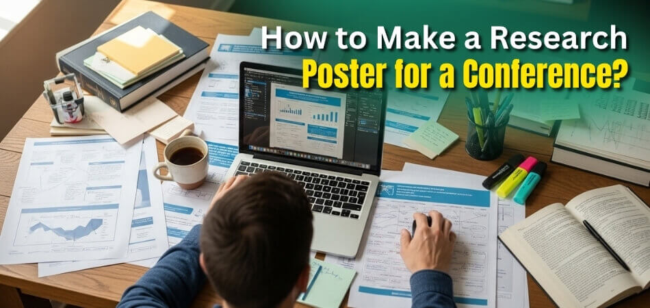
How to Make a Research Poster for Conference?
Creating a research poster for a conference is more than just arranging text and images; it’s about visual storytelling. A great poster communicates your research quickly, draws interest, and invites conversations that extend beyond the session hall. With the right layout, words, and visuals, your poster can truly make an impact.
Plan Your Content Before You Design
- Start by outlining your main sections clearly to keep your poster focused and easy to navigate for viewers. Each part must highlight what matters most.
- Choose information that answers your research question without drowning readers in unnecessary background or heavy descriptions. Clarity always builds trust.
- Identify your key findings early, so your design choices emphasize results instead of overloading the introduction with lengthy text.
Organize Essential Sections Effectively
- Include your title, author names, affiliations, and institutional logos so viewers can immediately recognize your academic identity. This builds authority.
- Keep the introduction brief, focusing on the background and purpose, while letting visuals support your key arguments and data presentation.
- Place the results section at the center since it should be the heart of your poster, guiding readers directly toward your discoveries.
Design With Simplicity and Space
- Maintain a clean layout that balances visuals, text, and empty space to help readers focus without feeling visually overwhelmed. Simplicity engages minds.
- Use a good ratio of about forty percent graphics, twenty percent text, and forty percent white space for better balance and readability overall.
- Stick to one or two fonts, ideally sans-serif, and keep them large enough so information remains visible from a short distance.
Use Clear Visuals and Graphics
- Incorporate charts, graphs, and flow diagrams to explain methods or show relationships within your data more clearly and quickly. Visuals communicate better.
- Label every figure or image directly rather than using separate legends; this saves space and helps readers connect ideas instantly.
- Combine color schemes thoughtfully by pairing light backgrounds with dark text to create visual contrast that draws attention effortlessly.
Focus on Font and Readability
- Make your title around eighty points, headings about fifty-four, and body text near thirty-six for smooth, comfortable reading.
- Avoid decorative fonts that distract from the message; instead, choose simple typefaces that reflect professionalism and academic clarity always.
- Keep sentences short, use sentence case for better flow, and highlight section titles in bold to guide the reader’s eyes naturally.
Prepare for Presentation and Interaction
- Rehearse a short three-minute explanation of your poster so you can engage visitors with enthusiasm and confidence easily.
- Be ready to answer questions, elaborate on methods, and offer context to your results while keeping your explanations simple.
- Respect confidentiality; double-check that your supervisor has approved any sensitive or unpublished data before public presentation day.
Learn From Conferences Around the World

- When attending events, study posters presented at upcoming conferences in Canada, the United States, or the United Kingdom for design inspiration.
- Notice how successful presenters combine visuals, storytelling, and audience engagement, helping you adapt new approaches to your own field.
- Explore global trends such as fabric posters or interactive QR elements, which add freshness and innovation to traditional poster designs.
Review, Refine, and Finalize
- Print a small draft version to evaluate layout balance, font clarity, and text spacing before final printing begins.
- Ask peers to review your poster; honest feedback from others often helps catch errors or confusing visuals that you overlooked.
- Save your file in high resolution, keep extra copies on a drive, and check colors under natural light for better accuracy.
Bad vs. Good Research Posters
A research poster can make or break how people see your work. A bad poster confuses, crowds, and tires the reader, while a good poster invites, explains, and inspires interest. Let’s look at what separates the two:
| Aspect | Bad Research Poster | Good Research Poster |
| Layout | Text fills every corner, leaving no breathing space for the eyes. It looks messy and rushed. | Sections are balanced with clear white space, guiding the reader naturally through the story. |
| Text | Long paragraphs filled with jargon and complex sentences slow readers down. | Short sentences and bullet points summarize key ideas quickly and keep attention focused. |
| Fonts | Tiny or decorative fonts make reading hard, especially from a distance. | Large, simple sans-serif fonts ensure clarity and easy viewing from several feet away. |
| Colors | Harsh colors clash, and backgrounds compete with text, making information hard to see. | Light backgrounds with dark text and soft accent colors make everything easy on the eyes. |
| Graphics | Random charts, blurry images, or figures without labels confuse viewers. | High-quality charts and photos are well-labeled and directly explain the findings. |
| Organization | Information feels scattered, with no logical flow from start to conclusion. | A clear sequence—Introduction → Methods → Results → Conclusion—tells a smooth visual story. |
| Presentation | The presenter reads the poster word-for-word without engaging the audience. | The presenter summarizes confidently, answers questions, and encourages real discussion. |
Why Good Research Poster Matter?
A good research poster speaks before you even say a word. It grabs attention, shares your ideas clearly, and makes people want to know more. A messy poster can hide even the best research, but a neat one builds curiosity fast. When your poster looks good, people remember your work long after the conference ends.

First Impressions
Your poster is often the first thing people see about your research. If it looks clean and colorful, it gives a strong and positive impression right away. A good layout makes people stop and look instead of walking past your board. It shows that you care about your work and took the time to present it properly. First impressions can make your research stand out among many others.
Easy to Read
A clear poster helps people understand your topic without needing you to explain every detail. When text is short and fonts are big, viewers can follow your ideas quickly. Simple words and short sentences make reading easy, especially in a crowded conference room. People are more likely to read everything if it feels comfortable to their eyes. A readable poster keeps the audience interested from start to finish.
Tells a Clear Story
A well-designed poster guides the reader like a short story. It starts with your question, shows your methods, and ends with what you found. Every part connects smoothly, so people can understand your results without confusion. You can even use arrows or boxes to show the flow of information. When your story is easy to follow, your message stays clear in the reader’s mind.
Better Communication
Good posters use pictures, charts, and colors to share ideas faster than long paragraphs. Visuals help people see patterns, results, and key points in seconds. Even someone new to your topic can easily understand what you discovered. When remembering key points for poster presentations for conferences, it becomes easier to decide what to highlight and what to simplify. This way, your poster becomes a strong tool for communication.
Builds Confidence
If your poster looks good, you naturally feel more confident standing beside it. You know that it represents your hard work well and that it’s easy for others to follow. This confidence helps you explain your research more clearly and answer questions without hesitation. People can sense your excitement when you talk about something presented with pride. A good poster boosts both your confidence and credibility.
Encourages Questions
Strong posters invite people to ask questions and start conversations. Visitors may point to a chart or image and want to know more about it. These small talks can turn into valuable discussions or even new ideas. When people feel comfortable approaching you, your poster has done its job well. Great posters don’t just show information—they spark meaningful exchanges.
Lasting Impact
A good research poster doesn’t end when the conference does. People often take photos of posters they like or note down names to follow up later. Your clean design, simple layout, and easy words help them remember what they saw. The clearer your message, the longer it stays in their mind. In the end, a good poster can leave a lasting mark on your audience.
Research Poster Examples and Templates
Seeing real examples always makes learning easier. Research posters can look very different depending on the topic, design style, and audience. Some posters focus more on visuals, while others highlight data and results. The goal is to find a balance between beauty and clarity. Below are a few popular styles, layout ideas, and free templates you can explore to create your own stunning poster.
Academic Style Poster
This type of poster is perfect for science fairs, university conferences, or research symposiums.
- Structure: Follows a formal layout — title, abstract, introduction, methods, results, and conclusion, arranged in clear columns.
- Look: Uses light backgrounds with dark text and minimal color for a professional and simple appearance.
- Best For: Students or researchers presenting technical or experimental findings in fields like biology, chemistry, or engineering.
Visual-Centric Poster
A visual-focused poster uses more images and less text to tell a story.
- Structure: Large photos, illustrations, or diagrams take center stage, with short captions that explain each visual clearly.
- Look: Uses bright but balanced colors and icons to help explain data without overwhelming the audience.
- Best For: Presentations in design, art, communication, or any field where visuals enhance understanding of your message.
Infographic-Style Poster
This type of poster turns your research into a clean, flow-based design that feels more like an infographic.
- Structure: Information is arranged in steps or sections connected by arrows or lines to guide the reader smoothly.
- Look: Bold colors and creative shapes make complex information easy to follow at a glance.
- Best For: Social science, environmental studies, or projects that combine data with storytelling.

Minimalist Poster
Less can sometimes say more — and minimalist posters prove that point beautifully.
- Structure: Uses a clean grid with fewer words, focusing on key phrases, short bullet points, and one large visual.
- Look: White background, soft colors, and balanced spacing give it an elegant and modern feel.
- Best For: Fast-paced conferences where people glance at many posters in a short time.
Creative Layout Poster
Creative posters break traditional column layouts and experiment with curved shapes or diagonal lines.
- Structure: The design flows naturally with creative typography and eye-catching visuals to make it stand out.
- Look: Uses color gradients or background images to add depth while keeping the content readable.
- Best For: Art, media, or innovation conferences that encourage bold and imaginative presentation formats.
Digital and Virtual Poster
As many conferences now include online sessions, virtual posters are becoming more common.
- Structure: Designed in a widescreen format suitable for digital displays or PDF viewers.
- Look: Uses clickable elements, QR codes, and animations for interactive engagement.
- Best For: Online symposiums, hybrid conferences, and ePoster sessions where a digital format is preferred.
Common Mistakes to Avoid While Making a Research Poster for Conferences
Making a research poster seems simple, but small mistakes can easily ruin your effort. A cluttered design or unreadable text can stop people from noticing your hard work. Paying attention to simple details can make your poster look professional, clean, and easy to follow.
Too Much Text and Data
- Many posters try to include every piece of information, which makes the layout messy and tiring to read. People lose interest when they see long paragraphs that feel like a wall of words.
- Focus on the most important points and express them with short phrases or bullet lists that highlight the meaning quickly. Visuals often explain ideas better than long descriptions or repeated details.
Weak Design and Layout
- Poor design choices often confuse the reader because information doesn’t flow smoothly from one part to another. Misaligned boxes, uneven spacing, and random colors make it difficult to focus on what matters.
- Always plan your layout before starting to design, keeping sections balanced and easy to scan in just a few seconds. That simple step helps your poster look tidy and welcoming.
Tiny Fonts and Hard-to-Read Text
- Small font sizes, like ten or twelve points, make reading difficult from even a short distance at conferences. Viewers should never need to squint just to understand your title or data labels.
- Choose big, clear fonts for headings and body text, so your message stays readable even from five feet away. Good readability attracts people and keeps them interested longer.
Low-Quality Images and Graphics
- Blurry pictures or pixelated charts make a poster look careless and unprofessional, even if the research is strong. Always use high-resolution images that stay sharp when printed large.
- Avoid stretching or resizing images unevenly, as it makes figures look distorted and unappealing. Quality visuals reflect the care and accuracy behind your research work.
Missing Proofreading Steps
- Typos, spelling mistakes, and incorrect data can distract readers and lower your credibility instantly. A few small errors might make the audience question your attention to detail.
- Before printing, check every word carefully and ask a friend or teacher to review it as well. Fresh eyes often catch things you might have missed earlier.
Misuse of QR Codes and Extra Links
- Relying too much on QR codes can frustrate readers who want quick answers on the spot. If the main results are only available online, your poster feels incomplete.
- Use QR codes only for extra information, like related research or examples of different types of conference posters from past events. The essential message should always be clear right on the poster itself.
Tips to Prepare Before Presenting Your Research Poster at a Conference
Standing beside your research poster can be exciting and a little scary at the same time. You’ve worked hard, and now it’s time to show your ideas to others. The way you present matters just as much as what’s on your poster. These smart tips can make your presentation calm, clear, and memorable.

Know Your Poster Well
Before the conference, spend time going through every part of your poster carefully. You should understand what each chart, sentence, and number means. When someone asks a question, you’ll feel more confident if you already know where to find the answer. Practice explaining your ideas in simple words so anyone can follow. Confidence comes when you know your work inside and out.
Keep Your Talk Short
Nobody wants to listen to a long speech when many posters are waiting nearby. Keep your talk short—around three to five minutes—so it stays fresh and clear. Focus only on the main points like your research question, method, and results. If someone wants more details, they’ll ask. Short, strong talks leave a better impression than long ones full of extra information.
Make Eye Contact
When people stop by your poster, smile and look at them while talking. Eye contact shows you’re confident and interested in sharing. Don’t stare too much, but make sure you’re friendly and open. If someone looks confused, slow down or use simpler words. Good eye contact builds a small but strong connection with your listener.
Use Simple Language
Complicated words make it hard for people to understand your research quickly. Try explaining your study as if you’re telling a story to a friend. Clear and simple language helps more people enjoy your work, even if they’re from different subjects. Using plain words doesn’t make your research weaker—it makes it stronger because everyone can follow it.
Prepare for Questions
Expect people to ask about your work, and that’s a good thing! Questions mean they’re interested. Listen carefully before you answer so you can respond clearly and kindly. If you don’t know an answer, say you’ll look into it later—it’s perfectly fine. Remember, you’re there to learn and share, not to have every answer memorized.
Mind Your Body Language
The way you stand and move can say a lot without any words. Stand straight, keep your shoulders relaxed, and don’t cross your arms. Use small hand movements when you explain your data, but don’t wave too much. A calm, open posture makes people feel welcome to come closer and talk with you about your research.
Bring Extra Materials
Sometimes people want to learn more after the session ends. Bring a few handouts or small cards with your name, email, and research title. You can also print mini versions of your poster for them to take home. Having extra materials shows you’re prepared and professional. It helps others remember your work long after the conference finishes.
FAQs About Making a Research Poster for a Conference
Creating a research poster can feel tricky at first, but a few clear answers can make it easier. Below are some common questions students often ask when designing or presenting their posters for the first time.
What Is the Best Software to Design a Research Poster?
PowerPoint, Canva, and Google Slides are the easiest tools to use for making research posters. They offer ready-to-use templates and simple editing options. For advanced users, Adobe Illustrator or InDesign gives more design control and professional-looking results.
How Do I Choose the Right Color Scheme?
Use colors that make your text easy to read and your visuals stand out clearly. Light backgrounds with dark text work best for clarity. Stick to two or three main colors, and avoid using overly bright shades that distract from your content.
How Can I Make My Poster More Engaging?
Add visuals like charts, icons, or images that connect directly to your topic and data. Use short phrases instead of full sentences to keep it simple. A clean layout with plenty of white space naturally draws attention to the most important sections.
What Should I Include in the Conclusion Section?
Summarize your main results and explain what they mean in simple terms. Add one short line about how your research contributes to your field. If relevant, mention future directions or what questions your study could inspire next.
How Do I Print My Research Poster Correctly?
Before printing, check your poster’s size, resolution, and color balance carefully. Use a high-resolution PDF file to avoid blurriness. Always print a small test copy first to see how fonts and colors appear on paper before finalizing.
Final Considerations
Making a research poster is not just about showing data; it is about telling your story clearly. When your layout looks neat and your message is simple, people enjoy learning from your work.
Knowing how to make a research poster for conference helps you share your ideas in an easy and interesting way. Use clear text, bright pictures, and short sentences so people understand your study quickly. A good poster makes others stop, ask questions, and remember your research even after the event is over. Simple design and clear words always leave a strong impression.

