Despite its modest appearance, a conference badge is very useful at any event. It helps people recognize each other and makes every interaction smoother. Many people often wonder what details should appear on it or simply think about what information goes on a conference badge.
A conference badge should include the attendee’s name, job title, organization, and event logo. Adding QR codes, role colors, and contact icons improves networking. Extras like pronouns, flags, or hashtags make badges more personal and engaging for attendees.
Are you curious to know more about how to design a useful badge? Keep reading, because this article covers every important point about what to include and how to arrange it clearly.
What Information Goes on a Conference Badge?
Conference badges are more than just a name tag. It helps people connect quickly and remember who they meet. The right design makes it easy to read and understand. Let’s look at what important details should be on a good badge.
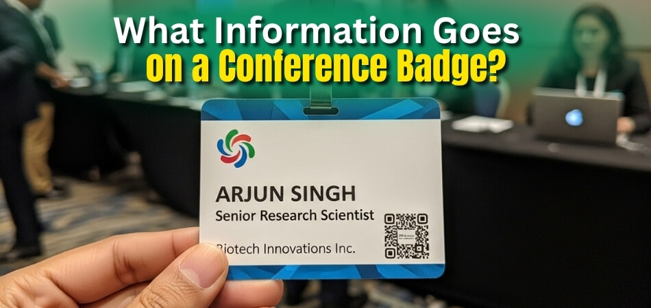
- Attendee Name
- Affiliation or Organization
- Job Title or Role
- Event Name and Logo
- QR Codes
- Role Indicators
- Location or Country
- Contact or Social Info
Attendee Name
The name should stand out and be easy to see from a distance. It helps others remember you and start friendly talks during the event. Clear and bold text makes introductions smoother. A visible name creates comfort and confidence while meeting new people.
Affiliation or Organization
Including the company or organization name gives context about the attendee. It helps others know what field or business they belong to. This small detail can start useful conversations. People often remember others by the company or group they represent.
Job Title or Role
Adding a role helps people understand what the attendee does. It builds quick connections between similar professions. For example, a “Graphic Designer” might connect easily with a “Marketing Head.” Clear roles make networking simpler and more meaningful.
Event Name and Logo
A badge looks complete when the event name or logo is added. It builds trust and shows unity among all attendees. Simple branding helps others recall the event later. It also looks good in photos and social media posts.
QR Codes
Many badges today include QR codes for digital contact sharing. These codes can lead to profiles, company sites, or check-in links. They make information sharing fast and simple. This works well for large or international events like upcoming conferences in USA and other places.
Role Indicators
Color bars or small icons can show different roles easily. A blue line might show a speaker, while green could mean staff. This makes it quicker to find people in specific roles. Small visual signs make big events easier to manage.
Location or Country
Listing the city or country gives a personal touch. It helps start friendly talks about travel or local culture. People feel connected when they find others from nearby places. It also helps event organizers spot guests from around the world.
Contact or Social Info
Adding simple contact icons makes it easy to stay in touch later. LinkedIn, email, or website icons can be enough. Keeping it short avoids clutter on the badge. Clean and neat layouts look better and are easier to read.
A well-designed badge can make meeting people much easier. It helps others remember your name, company, and role clearly. Each part of the badge plays a small but helpful role. Use these simple tips to make every event connection more meaningful and easier.
Extra Details That Make a Conference Badge More Useful?
A good conference badge is more than just a name tag. It helps people connect, communicate, and feel included. Adding a few simple details can make the badge more useful and enjoyable for everyone attending. Here are the details that make badges more practical and meaningful for attendees.
- Pronouns: Including pronouns helps others address people correctly and respectfully. It makes conversations smoother and helps create a friendly and welcoming environment for everyone.
- Badge Color Strips: Color strips can quickly show special roles like speakers or organizers. This helps attendees easily spot who to ask for help or information.
- Badge Lanyard Color Codes: Different lanyard colors can show attendee types or access levels. It helps event staff and guests recognize each other faster during busy sessions.
- Language Icons: Small icons can show which languages a person speaks. It helps break the ice and encourages friendly chats in shared languages.
- Country Flags: Flags on badges show where attendees come from. It helps start conversations and builds a sense of global friendship at the event.
- Social Handles: Adding social media handles like LinkedIn or X makes it easy to stay connected and continue networking after the event ends.
- Session Interests: Listing favorite topics or sessions helps others find people with similar interests. It makes conversations and networking more natural and engaging.
- Company Logo: Including a company logo adds a professional look. It helps others recognize your brand and connect you with your organization.
- Event Hashtag: Showing the event hashtag reminds people to use it online. It connects all event posts and helps create a shared online experience.
- Emergency Contact Info: Having emergency contact details ensures quick help in case of an emergency. It adds an extra layer of safety during large events.
Adding these small but smart details makes badges more than name tags. They help people connect, communicate, and stay safe, turning a simple badge into a helpful part of the whole event experience.
How to Arrange Information on a Conference Badge?
A good badge design helps people notice the right details first. A clear layout makes it easy for others to read names and roles. It also helps the event look neat and well planned. Let’s look at how to set each part in the right order and position for a professional look.
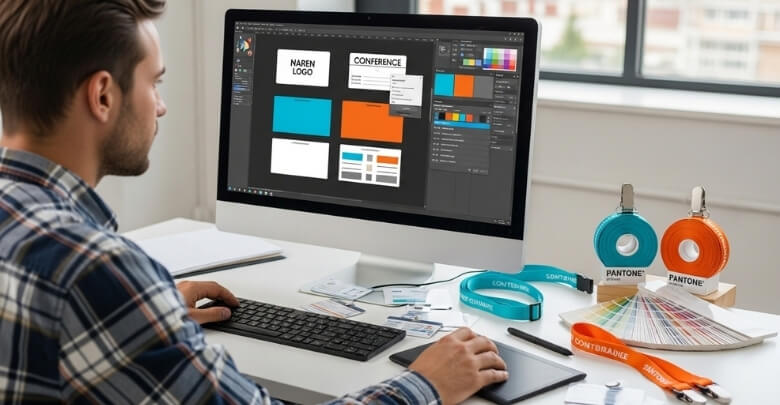
Order of Information
Start by putting the full name at the top so it stands out right away. The title or role should go under the name in smaller text, such as “Speaker” or “Guest.” Then add the company or organization name. Include the event name or logo to show where the badge belongs. Add the QR code or sponsor logo only if there is enough room.
Placement Tips
Keep the name near the top or center where it’s easy to see. The title and organization should sit right below it for a clean look. The event logo can go in a corner so it doesn’t distract from the name. When planning the layout, following the basic steps to design a conference badge can help you place each detail clearly and professionally. Place QR codes near the bottom so they can be scanned easily.
Space and Balance
Use about two-thirds of the badge for the name, title, and organization. The rest can be for logos, QR codes, or extra icons. Avoid putting too much text in one area. Make sure each section has enough space to stay clear and readable. Keep font sizes simple so people can read names even from a short distance.
A clean badge layout helps people recognize others fast at any event. It makes names, roles, and companies easy to see at a glance. Simple design choices can make a big difference in how the badge looks. With a little planning, you can create a clear and friendly design that works well for everyone.
How Does Design Affect the Information on a Conference Badge?
A good badge design helps people read names and details quickly. Small choices like color, font, and shape make a big difference. If the badge is hard to read, it loses its main purpose. Let’s look at how smart design choices keep your badge clear and useful.
Font and Readability
Select clean sans-serif fonts such as Arial, Helvetica, or Open Sans. These fonts stay sharp when printed and are easy to read from a distance. Use big letters for the name so it can be seen several feet away. Smaller text is fine for titles or company names, but should still be clear. Avoid writing names in all capital letters since mixed case is faster to read.
Shape and Layout
Rectangular badges are simple and work well for most events. Rounded corners can give a friendly and neat look while avoiding sharp edges. Vertical layouts are common, but wide logos may look better in horizontal ones. Keep enough empty space around each part so the badge doesn’t look crowded or messy.
Colors and Contrast
Pick a strong color contrast so words stand out clearly. Dark text on a light background or light text on a dark background works best. This helps people read easily even in low light. Avoid light gray text on white or soft pastel mixes because they fade quickly. While choosing fonts and colors is important, it’s also smart to think about material options for badges, as the surface type can affect print quality and how clearly the information appears.
A well-made badge helps people connect easily and avoid confusion. It saves time for attendees and looks more professional. Focus on clear colors, neat fonts, and balanced space. Good design always helps your event feel more welcoming and organized.
Mistakes to Avoid When Adding Information to a Conference Badge
Creating a clear and easy-to-read badge helps everyone connect better. Small design errors can confuse people or make names hard to see. Paying attention to small details keeps the badge useful and neat. Below are common mistakes and how to fix them easily.
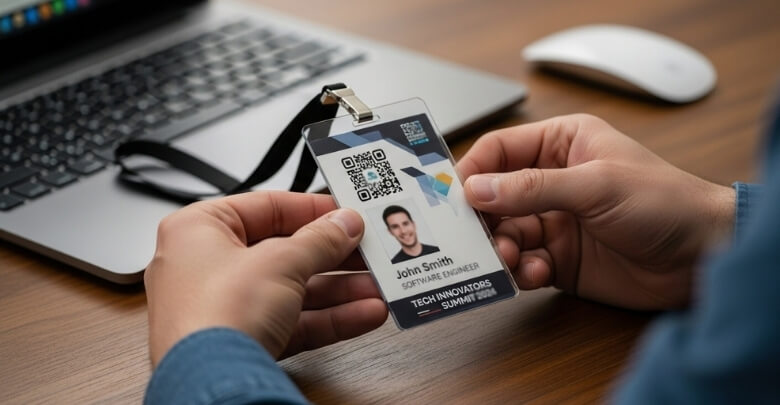
- Text Is Too Small: Make sure names are big enough to read from far away. Print a sample badge and check it from a few meters to confirm clear visibility.
- Cluttered Design: Avoid putting too many graphics, shapes, or logos that take away focus. Keep enough white space and make the badge simple and balanced.
- Poor Contrast: Choose colors that make the text easy to read on any background. Use dark text on light colors or the other way around.
- Missing or Inconsistent Hierarchy: Let the attendee’s name stand out before the title or company name. Use font size and spacing to separate details clearly.
- Neglecting Edge Margins: Always keep a safe border around the edges of the badge. This prevents text or logos from being cut off when printing.
- Not Checking a Proof: Before final printing, look at a sample badge closely. It helps catch spelling errors, color mistakes, or alignment issues early.
- Overloading With Sponsor Logos: Sponsors are important, but should not crowd the design. Keep their logos in one area, like the lower part or back.
- Ignoring Accessibility: Make sure everyone can read the badge without trouble. Use readable fonts, strong color contrast, and avoid hard-to-see color pairs.
A clean and readable badge helps your event feel well-organized. Take time to plan and test the layout before printing. Paying attention to these points avoids confusion and keeps attendees happy. Simple steps often make the biggest difference.
FAQs About What Information Goes on a Conference Badge?
A good conference badge does more than show your name. It helps people connect, remember faces, and find others quickly. Many small details can make a badge easy to read and useful. Below are some common questions and answers that can help you design a better conference badge.
What Size Should a Conference Badge Be?
The badge should be big enough to show names and roles clearly. A size around 4×6 inches works well for most events. This size gives enough space for text, logos, and QR codes without looking crowded. Small badges are harder to read, so always test a printed sample before final use.
What Font Works Best for Conference Badges?
Clean and simple fonts like Arial, Helvetica, or Open Sans are best. These fonts are easy to read from a short distance and stay clear when printed. Avoid using fancy or curly fonts because they can make names hard to see. Keeping the font size large for names and smaller for other text gives a nice balance.
Should Conference Badges Be Printed or Digital?
Printed badges are still the most common because they are easy to wear. However, digital badges work well for online or hybrid events. Some events use both, so people can check in digitally and still wear a printed one. The choice depends on the event type and how people will use it.
What Material Is Best for Conference Badges?
Most badges are made from paper or plastic, depending on the event length. Paper badges are good for one-day events, while plastic ones last longer. You can also laminate paper badges to make them stronger. Choosing the right material helps the badge stay neat and readable through the event.
How Can I Make a Conference Badge Eco-friendly?
You can use recycled paper or biodegradable materials instead of plastic. Avoid lamination if it’s not needed. Reusable lanyards and holders are great for cutting waste. Eco-friendly designs help events stay green and show care for the environment.
What Makes a Badge Easy to Scan at Events?
Place QR codes or barcodes in open areas without covering them. Avoid putting text or images near the scanning zone. Use dark code on a light background for quick scans. Test the badge with a scanner before printing to make sure it works fast and smoothly.
Should Conference Badges Include Event Schedules?
You can add a small schedule on the back if space allows. This helps attendees know when and where key sessions happen. Keep it short with only the main times and places. A quick glance at the badge can save people time during busy events.
How Can Color Help in Conference Badge Design?
Colors help organize and guide people at big events. You can use different colors for roles like speakers, staff, or guests. Bright colors catch attention, but too many can confuse people. Use colors wisely to make badges easy to understand at a glance.
Is It Useful to Add Emergency Information on Badges?
Yes, it’s a smart idea for large or international events. Having an emergency contact or help number can be important in unexpected situations. It gives quick access to help if someone needs it. Even a small line of contact info can make a big difference for safety.
How Can I Make Conference Badges Look Professional?
Use neat layouts, clear fonts, and balanced spacing. Avoid clutter or too many logos in one place. Matching the badge style with the event theme also helps it look polished. Simple, well-placed details always make the badge look more professional and easy to read.
Conclusion
A well-made badge helps people connect, communicate, and remember faces easily. It shows key details like name, title, company, and contact info in a clear and friendly way. Every element adds meaning and purpose to make networking easy. That’s the simple answer to what information goes on a conference badge?
When creating your next badge, keep it clean, balanced, and readable from any angle. Focus on clarity, color contrast, and space for comfort and style. Always test before printing to avoid mistakes. Wishing you all the best for your next event or conference design!

