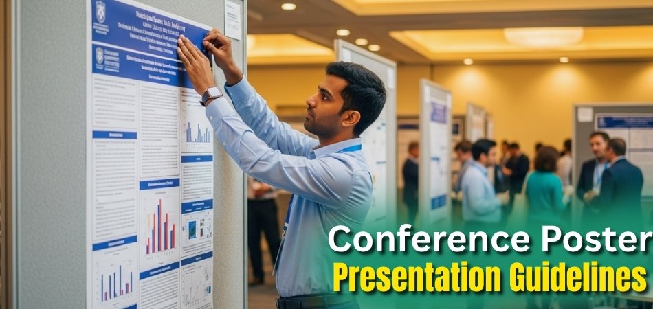
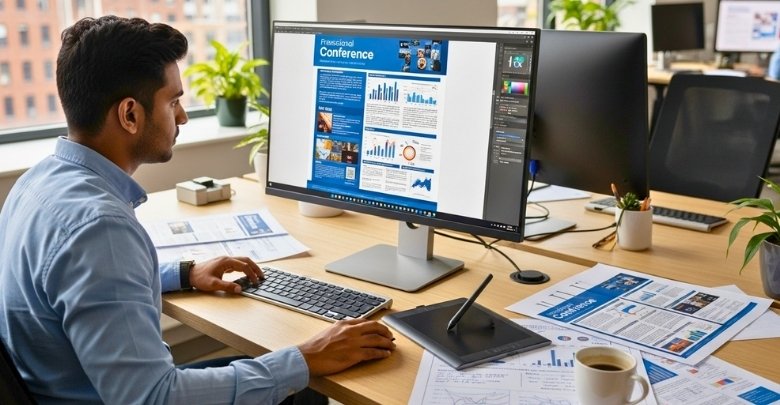
Making a poster for a conference should feel simple. Think of it as a big picture of your research that people can understand quickly. Your poster should be neat, easy to read, and clear from far away. Using big text, short words, and more pictures than long paragraphs will help people focus on what matters. A good poster isn’t just about looks—it helps share your ideas in a way that anyone can follow.
So, what are the best conference poster presentation guidelines?
Conference poster guidelines say to keep your poster neat, clear, and easy to read. Use large text and simple words. Add sections like Introduction, Methods, Results, and Conclusion. Use charts and pictures more than text. Make sure your poster fits the size rules and is easy to see from far away.
For easy tips on how to create a poster that will stand out from the crowd, keep reading.
Conference Poster Presentation Guidelines
Creating a great conference poster doesn’t need to feel complicated or overwhelming. With simple steps, you can design something clear and inviting. A poster should grab attention quickly, tell your story, and spark conversations with curious readers. Here are the key guidelines for conference poster presentation:
Poster Size and Layout
- Posters must fit conference boards, so always check the required dimensions carefully before starting the design process. Presenters usually arrange information in columns, moving smoothly from the top left introduction to the bottom right conclusion.
- Text must remain easy to read from 1.5–2 meters away, so large fonts are necessary. Clear headings guide attention, and neat spacing ensures readers never feel lost while scanning the content.
- Place the title, authors, and affiliations clearly at the top because this section receives the first attention. Use bold, readable letters, and ensure important names never blend into other surrounding poster sections.
- Columns create an organized rhythm for information, keeping the content visually tidy without overwhelming viewers scanning across. Always remember that flow matters, so ensure smooth transitions lead from one section to another.
- White space is essential because crowding text or visuals will strain the viewer’s eyes. Giving content breathing room creates balance, so posters feel open and professional throughout.
Content and Structure
- Every poster must feature a clear title with author names and affiliations displayed properly above everything else. This establishes credibility early, while large lettering ensures visibility even from several feet away.
- Organize information into four key sections: Introduction, Methods, Results, and Conclusion, ensuring readers follow easily. Break ideas into small pieces, avoiding jargon, because simple wording guarantees a stronger understanding across many different audiences.
- Use bullet points and short sentences instead of long, dense blocks. This approach improves readability and allows viewers to engage without unnecessary effort.
- Avoid long explanations because they distract fromthe main points. Instead, let readers ask questions, keeping the poster flexible for meaningful conversations.
- Emphasize figures, graphs, and charts more than sentences, because visuals communicate information faster. Supplement graphics with minimal text for additional explanations where needed.
Visual Design
- High-contrast colors grab attention effectively, but avoid using too many shades together. Limit yourself to two or three consistent colors.
- Use non-serif fonts like Arial because they look clean from a distance. Serif fonts create difficulty in posters since details blur.
- Pictures, diagrams, and charts should explain themselves without extra sentences. A viewer must immediately understand the message without searching elsewhere.
- Avoid visual clutter by removing non-essential items. Crowded posters confuse readers, while clean design elements highlight important points more clearly.
- Leave extra space around every element, so the poster feels balanced and comfortable. A tidy design helps viewers explore calmly.
Presentation Tips
- Poster sessions encourage discussion, not one-way reading. Avoid filling every space with words, letting conversations provide deeper details.
- Prepare simple explanations for each section, so you can explain ideas naturally. Viewers appreciate clarity and prefer engaging interaction.
- Don’t rely on projectors or sound devices, because the poster must communicate everything visually. The design alone should tell your story.
- Answer questions with confidence, but keep responses short and approachable. Encourage dialogue by letting viewers share interpretations and ideas.
- Keep a friendly posture near your poster, smiling to welcome attendees. An approachable attitude helps people feel invited.
Submission and Setup
- Submit a high-quality PDF of your poster before the deadline, when the conference requires digital copies. Clear resolution ensures printing accuracy later.
- Arrive early to set up your poster at the assigned board location. Secure all corners properly to avoid curling edges.
- Double-check the dimensions before mounting, making sure the poster does not exceed the provided space. Overlapping panels look unprofessional and distracting.
- Carry extra pins or clips because supplies may run short at busy sessions. Being prepared ensures a smoother poster setup always.
- Review the placement once displayed. Adjust angles and heights if needed, ensuring visibility for both shorter and taller attendees.
Why Poster Presentations Matter at Conferences?
When you walk into a conference hall, the posters instantly catch your eye with bright colors and big text. Each poster feels like a small world, waiting to be explored by anyone who pauses and looks closer. Behind those posters stand researchers, eager to explain their work and ideas directly to you. Here is why poster presentations matter at conferences:
Sharing Ideas

Poster presentations make it simple to share important ideas. Instead of long talks, researchers explain their work using clear visuals and short text. This style helps everyone understand the message quickly without getting lost in complicated words. It creates a space where knowledge feels easy to grab.
Easy Communication
Talking near a poster feels relaxed compared to a stage presentation. Researchers can answer questions in a friendly way, making learning more comfortable for the listener. People often feel less nervous asking questions when the setting feels casual and welcoming. This makes the communication two-sided and enjoyable.
Visual Learning
Humans naturally understand better with visuals. Charts, graphs, and images make complicated topics simple and clear to see. Posters use these tools to highlight the main findings instead of drowning people in long paragraphs. This makes the learning experience more fun and memorable.
Building Connections
Conferences are not only about science or projects; they are about meeting people. Standing by a poster often starts conversations with others interested in the same field. These talks can lead to friendships, study opportunities, or even future teamwork. A poster becomes the start of something bigger.
Quick Understanding
Not everyone has hours to sit in lecture halls. Posters give a short version of research that’s easy to absorb. People can walk by, take a glance, and understand the main message in minutes. This way, knowledge spreads faster and wider.
Real Examples
Posters give real-life examples of what researchers are studying. Instead of reading long reports, viewers see the results clearly on display. Whether it’s a medical breakthrough or an environmental project, the poster brings the work closer to the audience. This makes science feel more real and practical.
Global Reach
Conferences happen everywhere, from Canada to the United States, Germany, and Japan. For example, upcoming conferences in Canada will also have poster sessions where researchers proudly share their discoveries. Posters make sure knowledge doesn’t stay locked in one place but reaches people worldwide. They connect countries, cultures, and bright minds across the globe.
How to Design an Effective and Professional Poster?
A poster should stand out and catch attention even from far away inside a crowded room. The design must look neat, colorful, and organized so that people enjoy reading it with interest. A professional poster feels simple to understand but still looks creative and smart. When done right, posters leave a strong impression on the viewers who stop to read them.
Clear Title
Every poster needs a title that is bold and easy to read from far away. Use short words that tell people exactly what your poster is about. A clear title helps your audience quickly decide if they want to stop. Make sure it is big, bright, and placed at the top.
Simple Text
Don’t fill the poster with long and boring paragraphs that nobody wants to read. Use short sentences that explain your ideas directly without confusion. Bullet points are a good choice to make text easier for the eye. Remember, less writing makes your poster stronger.
Strong Visuals
Pictures, charts, and graphs always make your poster look more interesting and easier to understand. People like visuals because they explain things faster than long text. Make sure the images are clear and not blurry at all. Always choose visuals that match your topic and support your message.
Right Colors
Colors make a big difference in how your poster looks and feels to the viewers. Use two or three colors that work well together and do not distract. Bright colors grab attention, but too many can confuse people. Keep the background simple so your text and visuals shine.
Easy Layout
Arrange your information in a way that guides the reader from start to finish smoothly. Most posters flow from the top left corner to the bottom right corner naturally. Divide your content into clear sections with visible headings. A clean layout makes reading the poster less stressful.
Big Fonts
Tiny letters are hard to read, especially in a busy conference or classroom setting. Choose a large font size that people can read from a distance. Use bold for headings and keep the main text simple. This ensures your audience never struggles to see your words.
Practice Presentation
A poster is not just something to read; it is something you explain as well. Stand by your poster and be ready to answer questions politely. Speak in clear words and keep your explanations short. A smile and a friendly tone always make your presentation better.
What Content Should You Include in Your Poster?
When you look at a research poster, it should tell a clear and interesting story. A poster is not just a sheet with words; it is a tool for sharing ideas. Every section has its own job in guiding the reader. Together, they make the poster easy, engaging, and meaningful for everyone. Here is what content should you include in your poster.
Title
The title is the first thing people will notice, so it needs to be short and strong. It should tell the main subject clearly without confusing words. Big, bold letters make it easy to read from far away. A good title will invite people to stop and learn more.
Author Names
Right under the title, you should include your name and the names of your teammates. This gives credit to everyone who worked on the research. Adding your school or institution shows where the study comes from. Viewers can also recognize researchers they may already know.
Abstract
The abstract is like a quick summary that explains what your research is about. Keep it short so people understand it at a glance. Include the purpose, methods, and key findings in clear sentences. It helps readers decide if they want to explore more details.
Introduction
This section explains why your research matters and what problem it tries to solve. Mention background information and what past studies have missed. This gives viewers a reason to care about your project. A strong introduction makes people curious about the results.
Research Question
Your poster should clearly show the main question or idea you are testing. Keeping it short helps everyone understand the goal. Sometimes, a diagram or model works better than words here. A focused question tells the audience what to expect in the results.
Methods
Here you explain how you did your study in simple words. Share the steps, tools, or experiments used to collect data. Flowcharts or simple visuals work well to make this part clear. Readers should understand your process without needing extra explanations.
Results
The results section is where you show what you found in your study. Use graphs, tables, and charts instead of heavy text. Short captions can explain what each figure means. Clear visuals will help people see the outcome quickly.
Discussion
Here you explain what your results mean and why they are important. Mention if anything surprising happened during your study. This part can also suggest what should be done next in the field. It connects your findings to the bigger picture.
Conference Context
A poster is not read in isolation; it is part of a larger event. Knowing the academic conference structure helps you understand how posters fit with talks, workshops, and discussions. This context shows why posters are designed to be short and clear. It also explains why visuals matter more than long text.
References
References give credit to the sources and books you used in your research. They also let others find more details if they want. Always write them in the correct format for your subject. Even though this part is small, it adds professionalism to your poster.
Acknowledgements
This section is where you thank the people or groups who helped you with your study. It could include teachers, friends, or even funding support. Showing gratitude is important and leaves a positive impression on readers. It makes the poster feel more complete.
Tips for Organizing Text, Graphics, and Data Clearly
A well-organized poster helps people understand your research faster without feeling confused or bored. Clear text, neat visuals, and smart data placement can change how others view your work. The goal is to guide the reader’s eye smoothly across the poster. Balance between words, images, and numbers creates a poster that feels both professional and easy to read. Here are more tips on it.
- Simple Headings: Clear section titles quickly guide readers where to look next. Large and bold words make navigation natural and comfortable throughout.
- Short Sentences: Breaking ideas into smaller pieces reduces confusion and stress. People absorb messages better when every sentence communicates one clear thought.
- Clean Layout: Organize columns or rows to help the eyes move naturally. Logical flow from left to right creates smooth reading order.
- Strong Visuals: Pictures, charts, or graphs often explain results much faster than text. Viewers connect with visual information almost instantly during reading.
- Consistent Fonts: Using the same font type across all sections avoids distraction. Mixing many styles can make information look unprofessional and messy.
- Balanced Colors: Colors highlight important details but too many shades confuse readers. Select two or three colors that complement each other clearly.
- Focused Data: Show only the numbers that matter most to your findings. Extra details distract from your main points and meaning.
- White Space: Empty areas around text and visuals make posters easier to read. Without spacing, information looks crowded and less appealing.
How Do You Present Your Poster to Attendees?
Presenting your poster well is just as important as designing it clearly. It’s your chance to share ideas face-to-face and connect with people who care about your topic. A good presentation helps others understand your work and may even lead to exciting opportunities. Learn the basics of presenting from below:

Be Welcoming
- Standing beside your poster instead of in front allows others to see your content easily without being blocked. A warm smile and open body language make people feel more comfortable when approaching your space.
- Saying hello or making eye contact can help break the silence and start a friendly conversation about your work. Simple greetings often open the door for deeper questions and meaningful discussion.
Use Good Body Language
- Using hands while speaking helps explain points clearly and keeps people interested in your explanation. It also shows you’re confident and involved in what you’re saying.
- Make sure to keep eye contact with your audience without staring too much. This builds trust and shows that you’re really paying attention.
Guide with the Poster
- Pointing to sections as you talk helps people follow along and stay focused on what you’re explaining. It also gives structure to your presentation, making the flow smoother.
- Keep moving your hand gently across visuals or data while describing them. This helps others understand how each part connects to your main point.
Give a Quick Summary
- A short summary should explain your research clearly in just five to ten minutes using everyday words. This helps people understand your topic quickly without feeling lost.
- Tell your story step by step: what problem you studied, what you did, and what you discovered. Keep your voice friendly and easy to follow.
Stay Friendly with Questions
- Let visitors choose if they want to listen to your explanation or read the poster on their own. This shows respect and keeps things relaxed.
- Some questions might surprise you, and that’s okay—say you’re not sure and ask for their thoughts instead. Being open brings better conversations.
Connect with People
- During breaks or free time, walk around and meet other presenters with similar topics. Sharing ideas can lead to cool future projects.
- Always keep a notebook or phone ready for contact details if someone wants to keep in touch. This can help grow your research circle.
Keep Clear and Confident
- Speak at a calm pace so people don’t feel rushed or confused. A relaxed tone makes your words easier to understand.
- The way you explain things can reflect the qualities of an effective conference poster, especially if you speak with clarity and care.
Stay Near Your Poster
- Try to stay close to your poster during the entire session so you don’t miss curious visitors. Stepping away too often might make people skip your work.
- If you do have to leave for a short time, leave a note or card with your name and contact info. That way, interested people can still reach out.
Common Mistakes to Avoid in Poster Presentations
Posters can be powerful, but small mistakes often make them harder to follow. Many people overload their posters with too much text. Others forget about design balance, making their work look messy and unprofessional. Avoiding these common errors keeps your poster clear and strong.
- Too Much Text: Large blocks of writing push people away because reading them feels tiring. Short, clear sentences make posters more inviting overall.
- Tiny Fonts: Small letters confuse viewers who stand further away. Always use bold, readable text that can be seen without strain.
- Cluttered Layout: Overcrowding sections with graphics, numbers, and words creates confusion. A clean design gives eyes space to rest between elements.
- Weak Titles: Unclear or boring titles fail to catch attention. A sharp and bold title immediately draws people toward your poster content.
- Distracting Colors: Using too many bright colors can make your poster look chaotic. Limit yourself to two or three matching shades only.
- Poor Visuals: Low-quality or blurry images take away from credibility. Clear charts and sharp visuals strengthen your message much better overall.
- Ignoring Questions: Not paying attention to visitor questions makes interactions awkward. Friendly answers build trust and encourage more meaningful conversations instead.
- Blocking Poster: Standing directly in front hides important sections from others. Position yourself to the side while still staying available nearby.
Final Checklist Before Your Poster Presentation
Standing in front of your poster can feel exciting but also a little stressful without the right preparation. A checklist helps you stay organized and avoid last-minute mistakes that might cause problems. Every small detail matters when you want people to notice your work. Being ready makes your presentation smooth, clear, and enjoyable for both you and your audience.
Poster Size
Always confirm the exact poster size required by the conference before printing. A wrong size might not fit on the board. Printing mistakes can waste time and money, so double-check measurements carefully. A perfect size looks professional and neat.

Readability
Your poster should be easy to read from a distance without struggle. Large fonts, bold headings, and clear spacing make a big difference. Avoid putting too many words that might feel crowded. Simple, neat writing helps people enjoy reading more.
Content Sections
Make sure all important sections are included before finalizing the poster. Add Title, Authors, Introduction, Methods, Results, and Discussion clearly. Don’t forget References and Acknowledgements to give proper credit. A complete structure makes your poster more reliable and trustworthy.
Visual Quality
Check every image, chart, and graph for sharpness and clarity. Blurry visuals make your work look careless and unprepared. Captions and labels should always explain figures quickly without confusion. Good visuals instantly catch the audience’s eye.
Extra Copies
Bring a few extra printed summaries or abstracts of your poster. Handing them out helps people remember your work. Visitors often like to carry information home for later reading. Small copies keep your research fresh in their minds.
Digital Backup
Keep a digital copy saved on a USB drive or cloud storage. Emergencies happen, and last-minute reprints may be needed. Having a backup saves stress when printing issues occur. Being prepared keeps everything running smoothly.
Setup Early
Arrive early to place your poster in the assigned spot. Use push pins or Velcro to secure it tightly. Setting up early gives you time to check alignment. A clean display attracts attention right away.
Removal Time
Take down your poster when the session ends. Leaving it behind may cause it to be discarded by staff. Quick removal shows respect for the organizers’ rules. Keeping your poster safe also means you can reuse it later.
Presentation Practice
Practice a short explanation of your poster before the event. Be ready to explain your study in clear steps. Knowing your content well helps you speak with confidence. Preparedness makes people trust your work more.
Materials Ready
Always carry essentials like pins, tape, or Velcro. Sometimes supplies run out at the conference, and extras save the day. Having your own tools avoids last-minute stress. Small things like this keep your session smooth.
How to Make a Lasting Impression with Your Poster in a Conference?
Posters at conferences stand among many others, so yours must grab attention quickly and hold interest. Strong design choices help highlight your work without drowning viewers in confusing details. A clear presentation makes your ideas easy to remember long after the session ends. With the right approach, your poster can spark conversations and create a strong impression.

- Catchy Title: A title with bold words quickly pulls people closer to your poster. Short, strong phrases help spark immediate interest.
- Neat Layout: Well-arranged sections guide readers smoothly through your content. Balanced spacing prevents clutter and makes information easier to follow.
- Readable Fonts: Large, clear fonts ensure visitors can read text without effort. Consistent styles make your poster appear clean and professional.
- Color Balance:
Two or three colors keep visuals attractive without distraction. Too many shades make the overall design messy and tiring. - Strong Visuals: High-quality graphs, charts, and images communicate ideas faster. Clear labels and captions strengthen understanding and avoid unnecessary confusion.
- Engaging Summary: A quick explanation in simple language keeps visitors interested. Talking naturally helps your audience connect with your research better.
- Friendly Interaction: Smiling and answering questions leaves visitors with a good impression. Warm conversation encourages people to remember your poster longer.
- Memorable Handouts: Small copies or contact details allow people to revisit your work later. Extra materials keep your ideas fresh afterward.
FAQs About Conference Poster Presentation Guidelines
Conference posters are an important way to share your research with a large audience. Many presenters have questions about the rules and best practices for posters. Here are 10 fresh FAQs with clear answers to help you prepare.
What Materials Are Best for Printing Posters?
Posters are usually printed on glossy or matte paper, though fabric posters are becoming popular for easy transport. Glossy paper looks vibrant but may reflect light, while matte provides better readability. Always follow conference printing recommendations before finalizing your choice.
How Much Text Should a Poster Contain?
A poster should not look like a full paper. Keep text short and concise with bullet points. Use visuals to tell most of the story. Ideally, no more than 800 words should appear across the entire poster.
Can QR Codes Be Added to Posters?
Yes, QR codes are now common on posters because they give access to additional material. Attendees can scan them for full papers, data sets, or videos. Place the code in a visible corner and ensure it functions properly.
How Should Figures and Tables Be Designed?
Figures and tables should use clear labels, bold headings, and simple designs. Avoid clutter and tiny fonts that reduce readability. Use contrasting colors for clarity. Every visual should communicate a single point without needing long supporting text or explanation.
What File Format Should Be Submitted for Printing?
Most conferences require posters in PDF format because it maintains layout and quality. Some printing services also accept high-resolution JPEG or TIFF files. Always check guidelines for dimensions, resolution, and deadlines before submission to avoid last-minute issues.
How Can You Attract Viewers to Your Poster?
A bold title, eye-catching visuals, and neat layout will draw people to your poster. Standing confidently beside it, greeting visitors warmly, and offering summaries further build engagement. First impressions matter, so ensure your design looks clean and inviting.
Should Logos Be Included on Posters?
Yes, logos for institutions or sponsors should appear neatly, usually at the top corners. They build credibility and acknowledge support. Keep logos small enough to avoid distraction, but large enough to be recognized clearly by readers from a distance.
What Is the Best Way to Use White Space?
White space keeps posters from appearing crowded and overwhelming. It separates sections and gives viewers’ eyes a place to rest. Use margins and spacing consistently throughout the design. Balanced white space improves both clarity and professional appearance.
How Early Should a Poster Be Prepared?
Start working on your poster at least three to four weeks before the conference. Early preparation allows time for feedback, revisions, and professional printing. Rushing often leads to overlooked errors, poor quality visuals, or formatting mistakes that weaken impact.
Are Digital Posters Different from Printed Posters?
Yes, digital posters often allow animations, embedded videos, or interactive charts. Printed posters rely only on visuals and text. Digital sessions may require landscape layouts instead of portrait. Always read the conference guidelines to adjust design for the specific format.
Bottom Lines
A poster works best when it feels clear, simple, and inviting. Good design, short text, and strong visuals help people understand your research quickly. By following the right conference poster presentation guidelines, you make sure your work stands out.
A neat layout, friendly talk, and easy explanations can leave a lasting impression on visitors. When you prepare well and stay confident, your poster becomes more than a display. It becomes a way to share ideas, start conversations, and connect with people who care about your topic.

