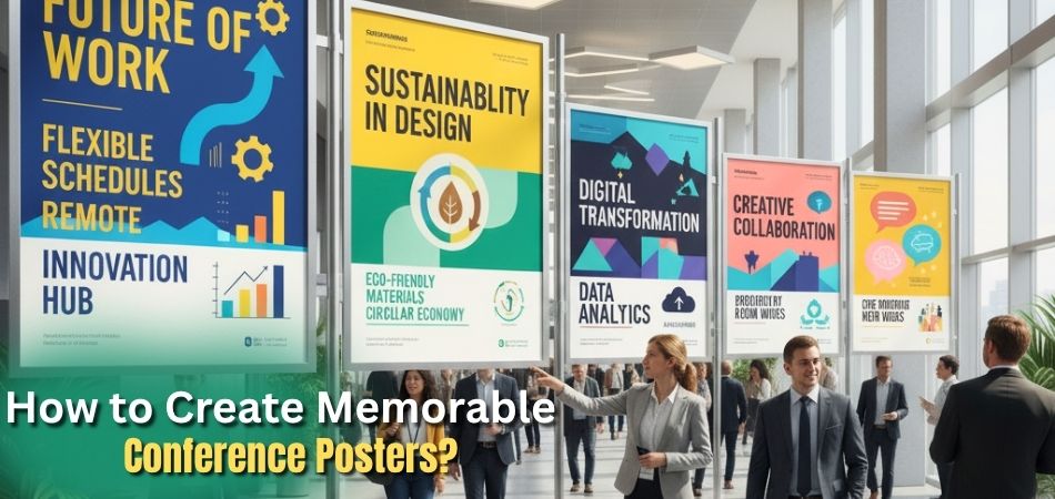
Your poster is what grabs attention first at a conference. If it looks clear and simple, people will want to stop and learn more. A good poster doesn’t just show facts, it tells your story in a way that’s quick to read and easy to follow. With the right design, you can make your work stand out and stay in people’s minds.
So, how to create memorable conference posters?
To create a memorable conference poster, use big, clear titles and short text. Choose two or three matching colors and add simple charts or pictures. Make sure everything is easy to read and follow. Use bullet points, avoid long paragraphs, and check for mistakes. Add a short summary to explain your poster quickly.
Keep reading to see easy steps for making a poster that people remember.
How to Create Memorable Conference Posters?
Making a conference poster is not just about adding text and pictures. It is about sharing your ideas in a way that is clear, simple, and attractive. With the following steps, you can design a poster that catches attention and explains your work quickly to everyone.
Step 1: Understand the Conference Rules
- Check the poster size, layout style, and font rules before you start. This will help you avoid mistakes and make sure your poster is accepted.
- Always look at the submission deadlines and format needs. Staying organized prevents last-minute stress.
Step 2: Plan the Layout First
- Sketch a rough design and divide your poster into clear sections like introduction, methods, results, and conclusion.
- Arrange the content so that the reader can follow the story in a natural flow from top left to bottom right.
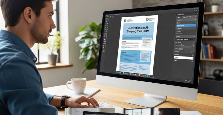
Step 3: Pick Fonts That Are Easy to Read
- Use large font sizes for the title and section headings so that people can read them from a distance.
- Choose simple and professional fonts like Arial or Helvetica, and avoid fancy decorative ones.
Step 4: Use Colors the Right Way
- Select only two or three colors that go well together. This keeps the poster simple and attractive.
- A light background with dark text is best for clear reading. It also works better for people with color blindness.
Step 5: Keep the Content Short

- Write in short sentences and use bullet points to explain your ideas. Long paragraphs make posters hard to follow.
- Avoid difficult words and heavy jargon. Use simple language so even someone new can understand your topic.
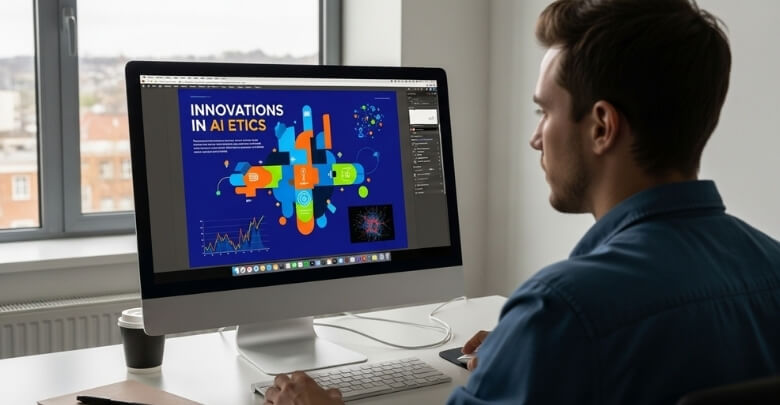
Step 6: Add Clear Visuals
- Use charts, diagrams, and pictures to explain your ideas. Each visual should tell one clear story.
- Make sure your images are high quality (PNG or TIFF) so they look sharp when printed.
Step 7: Final Check and Save Properly
- Proofread your poster carefully to fix spelling mistakes and wrong details. Asking a friend to review can be very helpful.
- Save your file in the format the conference requires, usually as a PDF, and check that it meets the size rules.
Step 8: Practice Your Poster Pitch
- Prepare a short 1–2 minute talk to explain your poster. This will help you answer questions and engage with people easily.
- You can also add a QR code that links to more details online. This is useful, especially if someone wants extra information about upcoming conferences in Canada and related research opportunities.
Why Is It Important to Design Eye-catching Posters for a Conference?
Posters at conferences are more than just paper with words and pictures. They are a way to share ideas with many people at once. A good poster can attract attention even in a busy room full of others. When designed well, it helps your work stand out and makes people stop to learn more.
First Impressions
The first thing people see at a conference is your poster. If it looks dull, they may walk past without even reading it. But if the design is bright and neat, people will be curious. A strong first impression can pull them closer to your work.
Easy to Read
A poster should be simple enough for anyone to understand quickly. If the text is too small or messy, people may not bother reading it. Large titles and clear fonts make information stand out right away. Easy reading makes people spend more time with your poster.
Attracts Attention
With so many posters in one place, yours needs to grab attention. Eye-catching colors and neat visuals make a big difference. People are more likely to stop when something looks interesting from far away. Attention is the first step toward sharing your ideas.
Tells Your Story
A poster is not just decoration—it tells the story of your work. The design guides the reader from start to finish. Good visuals and short text make the story simple to follow. When readers understand your story, they will remember it better.
Sparks Interest
Neat colors and clear designs naturally make people curious about your topic. They may stop to ask questions, giving you the chance to explain your work in more detail. Curiosity often grows into a deeper interest when people connect with your ideas.
Builds Confidence
When your poster looks good, you feel more confident standing beside it. A clear design makes it easier to explain your points. You can use the poster as a guide when talking to people. Confidence helps you share your knowledge without feeling nervous.
Lasting Memory
People see many posters in a single conference, and it’s easy for most of them to blend together. An eye-catching design, built with effective academic poster design techniques, makes yours stand out and stay in memory. Even after leaving, people may recall your visuals or key points, keeping your work discussed longer.
Common Mistakes to Avoid While Designing a Conference Poster
Making a poster for a conference looks easy, but small errors can hurt your work. A poster should be clear, short, and attractive. Many students add too much or forget simple rules that matter most. Knowing these mistakes early helps you design better.
- Too Much Text: Long sentences make posters look boring and difficult. Readers quickly lose interest when words cover the entire space.
- Tiny Fonts: Small letters confuse readers and waste effort. People should read your poster from a distance without extra effort.
- Cluttered Layout: Crowded designs stop the flow of reading. Neat spacing helps guide the eye from one point to another.
- Bad Colors: Using many colors distracts readers quickly. Two or three matching shades keep the poster simple and easy to follow.
- Weak Visuals: Low-quality images look unprofessional. Clear charts and high-resolution pictures help explain your point without adding too many words.
- Ignoring Rules: Every conference gives poster guidelines. Ignoring these instructions can make your poster rejected before anyone even sees it.
- Skipping Proofreading: Spelling mistakes harm your work. Checking carefully and asking a friend to review keeps your poster polished and correct.
Best Layout Sizes and Orientations for Conference Posters
Choosing the right layout is one of the first steps to designing a strong conference poster. The size and orientation you pick affect not only how your work looks but also how easily people can read and understand it. Before diving into design, it’s important to know the common poster dimensions and orientations that work best for conferences. Here are the details:
Standard Sizes
- The most common size is 48 inches by 36 inches (121.9 cm x 91.4 cm), usually in landscape orientation. This size offers ample space to present detailed content while fitting standard poster boards.
- Other popular sizes include 36 x 24 inches (91.4 cm x 61 cm) for more compact posters and 42 x 30 inches (106.7 cm x 76.2 cm) as a medium format option.
- For international conferences following metric standards, A0 (84.1 x 118.9 cm), A1 (59.4 x 84.1 cm), and A2 (42 x 59.4 cm) are common.

Orientation
- Landscape orientation (width greater than height) is favored for ease of layout, especially for scientific and engineering posters with multiple graphs and images.
- Portrait orientation can be used when vertical display boards are required or preferred by some conference organizers.
Considerations for Virtual Posters
- For virtual or digital conference posters, sizes are typically defined by screen resolution, with common formats like 1920 x 1080 pixels (HD) in a 16:9 aspect ratio or 1600 x 1200 pixels in a 4:3 aspect ratio.
How to Choose Fonts and Sizes for Readability at Distance?
When people look at posters in conferences, they usually check from a few steps away before coming closer. If your text looks too small, many will simply walk past without reading. Fonts and sizes matter more than people think. Here are some tips on choosing poster fonts and sizes for better readability at a distance:
Clear Title Fonts
The title should be big enough to catch the eye even from several meters away. Using clean fonts like Arial or Helvetica keeps things simple and professional. Avoid fancy fonts that are hard to read. Remember, the title is your first chance to draw attention.
Proper Heading Size
Headings guide readers through the sections of your poster. They should be large but smaller than the main title. A bold font style can help them stand out clearly. Clear headings make the poster feel organized and easy to follow.
Easy Body Text
The body text should be simple and comfortable to read. Medium-sized fonts are perfect because they look balanced on posters. Never use text that feels cramped or squeezed together. Good spacing between words also makes reading easier for everyone.
Font Style Choice
Choose fonts that look neat and clear on paper. Professional fonts like Helvetica or Garamond are safe options. Avoid using playful or decorative fonts because they distract readers. A clean font style gives your poster a serious and trustworthy look.
Balance and Space
Too much text in one place makes reading difficult. Proper spacing helps the eye move smoothly across the poster. White space around sections gives the design a cleaner feel. A balanced layout improves readability without adding extra effort for viewers.
Reader Distance
Think about how far people will stand while looking at your poster. Titles should be readable from three to four meters away. Headings and body text should be clear from a closer distance. This ensures no detail gets missed by your audience.
Conference Context
When designing, remember the setting of the conference itself. Large posters in busy halls need bold fonts and clear sizes. This is especially important when talking about topics like understanding academic conferences, where posters must stand out in crowded spaces. Adapting font size to the place ensures better results.
Frequently Asked Questions
Creating a conference poster takes both planning and creativity. Many people have common questions about what makes a poster effective. Here are some helpful FAQs with clear answers that guide you in making a strong and memorable poster.
What Role Do Colors Play in a Poster?
Colors help guide the reader’s eyes and create a mood. Using two or three matching shades keeps the design simple, professional, and appealing. Overusing bright colors can confuse readers, while a balanced scheme makes the poster easy to read and follow.
Why Should Posters Have Visual Hierarchy?
Visual hierarchy makes important details stand out. By using bigger fonts for headings, medium fonts for subpoints, and smaller fonts for details, readers know what to focus on first. This keeps the message clear, organized, and easy to understand.
How Important Is Image Quality in Posters?
High-quality images make a poster look professional and sharp. Low-resolution images appear blurry and distract from the content. Using at least 150–300 dpi ensures clarity when printed, helping visuals support the message clearly instead of causing confusion or doubt.
What Is the Right Balance Between Text and Visuals?
A poster works best when visuals and text support each other. Too much text makes reading tiring, while only visuals may confuse viewers. Short bullet points paired with clear visuals strike the right balance, making content engaging, simple, and understandable.
Why Should Posters Include a Takeaway Message?
A takeaway message helps the audience remember the main point of your research. Without one, the poster feels incomplete. Placing a short, strong conclusion at the bottom ensures people walk away with a clear idea of your study’s importance.
Should Posters Be Tested Before Printing?
Testing is very important because mistakes are easier to catch on screen than on paper. Printing a small draft lets you check font size, colors, and image clarity. This step saves time, avoids errors, and improves final presentation quality.
How Can Posters Encourage Interaction?
Posters should invite questions and discussions. Adding QR codes, simple links, or small prompts allows people to explore further. When readers want to know more, they often approach the presenter, turning a simple poster into a great conversation starter.
What Role Does Consistency Play in Poster Design?
Consistency makes posters neat and easier to follow. Using the same font style, color scheme, and layout style creates harmony. Inconsistent design confuses the reader, while consistency builds trust and ensures the poster looks professional throughout all sections.
Why Is Audience Awareness Important for Posters?
Knowing your audience helps you choose the right words and visuals. A poster for experts may include technical terms, while one for general viewers needs simple explanations. Matching design and content to the audience makes your poster more effective and memorable.
How Does White Space Improve Posters?
White space prevents posters from looking crowded. Leaving space around sections allows readers to focus without feeling overwhelmed. It gives the design room to “breathe,” making information easier to follow, while also making the overall poster look cleaner and sharper.
Closing Remarks
Making a poster for a conference is not just about adding pictures and words. It is about helping people understand your work quickly. Clear text, big titles, and matching colors make your poster easy to read. Good design helps people remember your message.
The key to how to create memorable conference posters is keeping things simple and neat. Use short sentences, helpful visuals, and a layout that flows well. When people enjoy looking at your poster, they will want to know more. A strong poster shows your effort and helps you share your ideas with confidence.

